These are what some of the biggest websites looked like 20 years ago and you won't believe it...
Since the World Wide Web was invented in 1990 designers and web developers have been constantly working to improve its original clunky basic text design into a simple, fast and eye-catching user experience.
Check out some of these amazing web design transformations from the past 20 years!
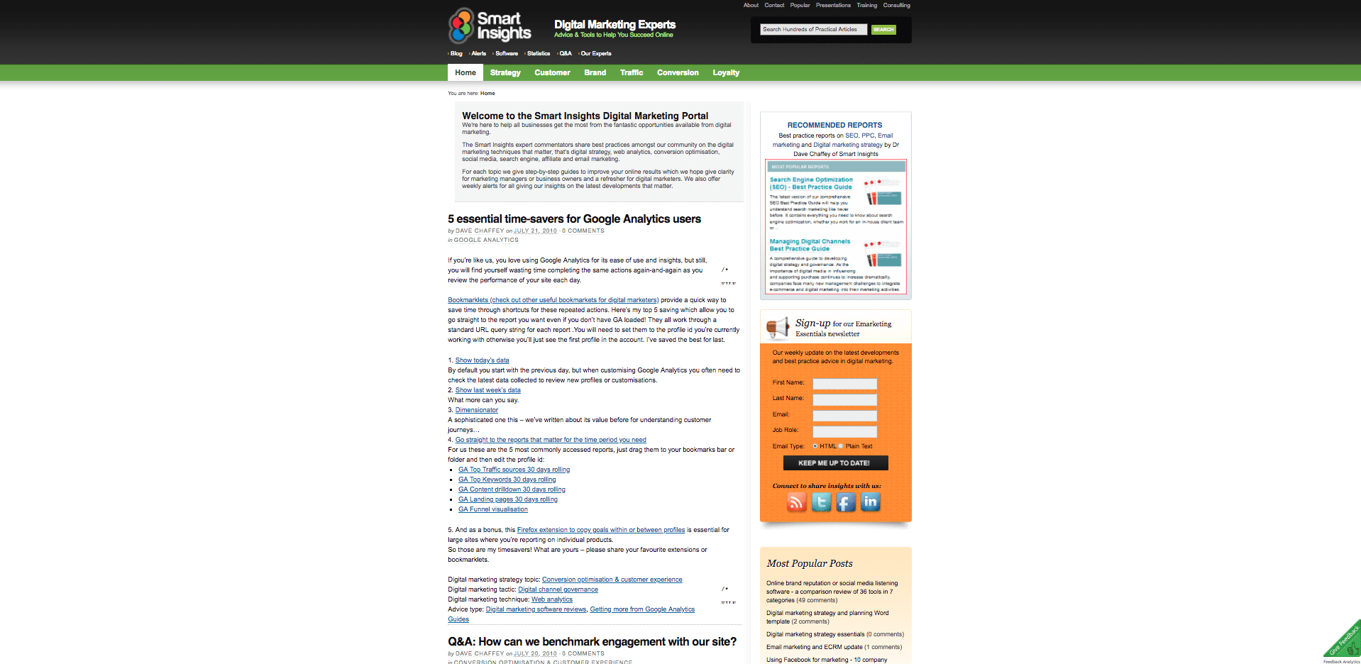
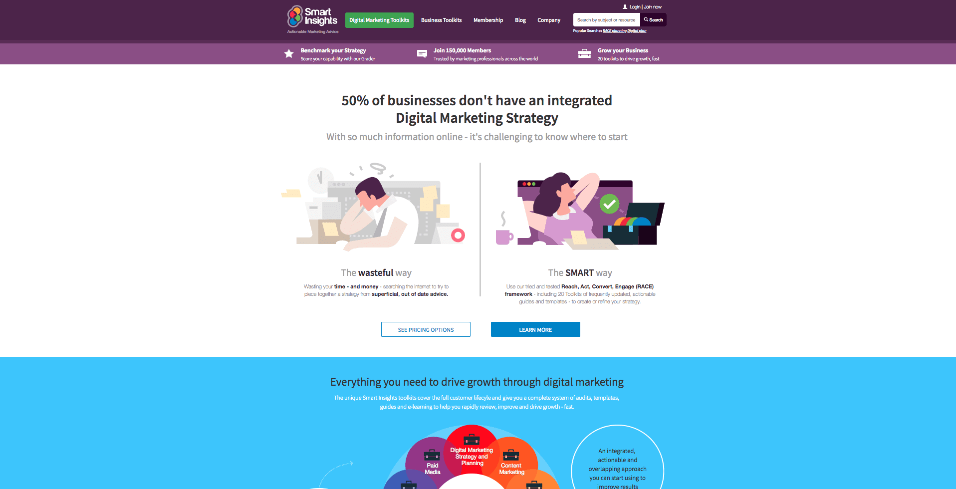
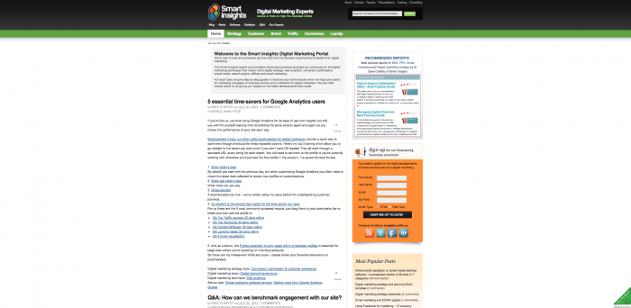
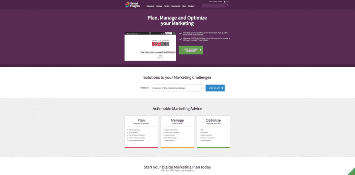
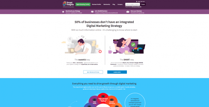
1. Smart Insights
Smart Insights is only 8 years old, but we wanted to highlight the design transformations we've gone through. The site originally started as a blog as seen on the home page in 2010. It's evolved into a marketing publisher - keeping its roots in content, but now offering premium services and elearning for members.
2010
2015
2018
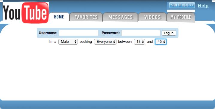
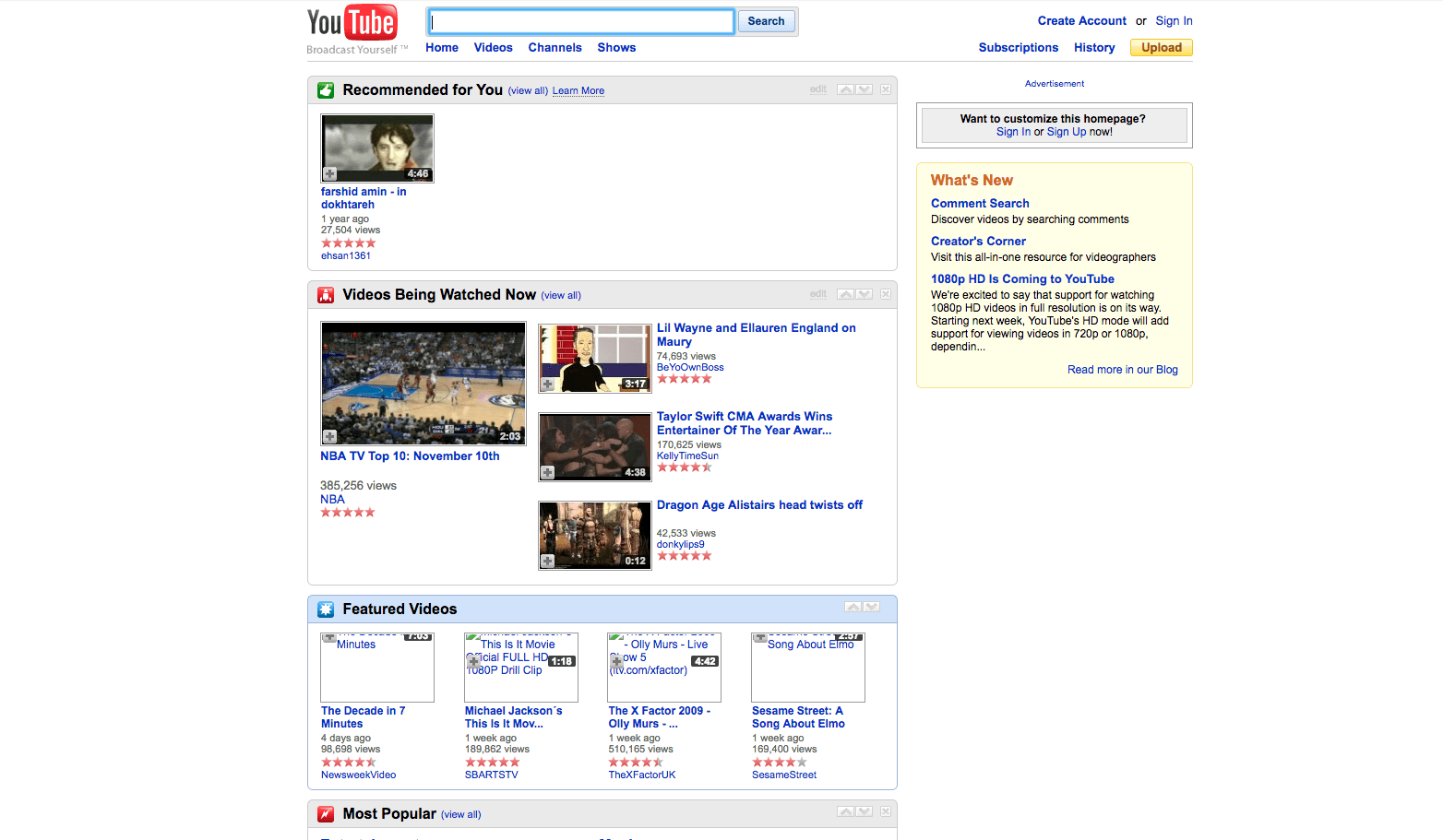
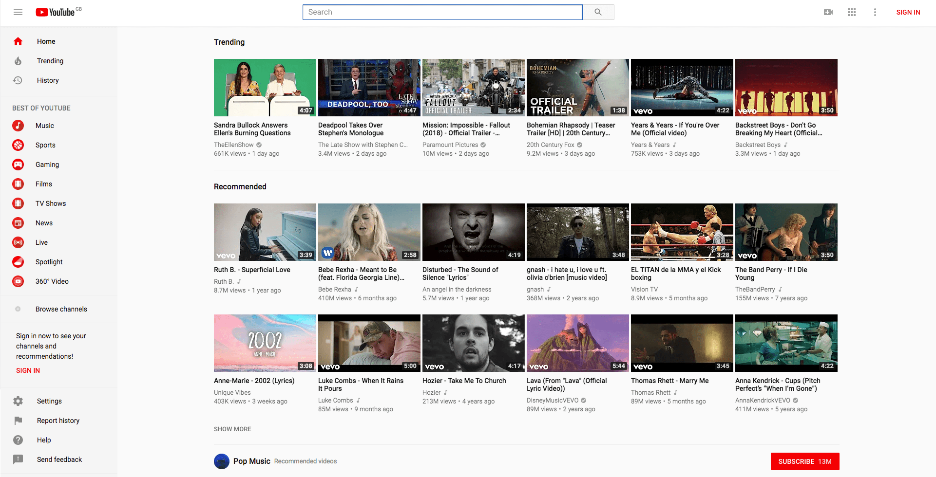
2. YouTube
YouTube didn't start as a video sharing platform - it's original concept/origins was an online dating site and since 2005 has evolved not only it's design and UX, but its product too. However, it's logo hasn't changed much throughout the years.
2005
2009
2018
3. Facebook
Like YouTube, Facebook has changed is services since it's original conception. Facebook started as an online platform that would connect students together, find people in your groups and look up people in your school. It's come a long way since then - having not only changed its design but offering a full range
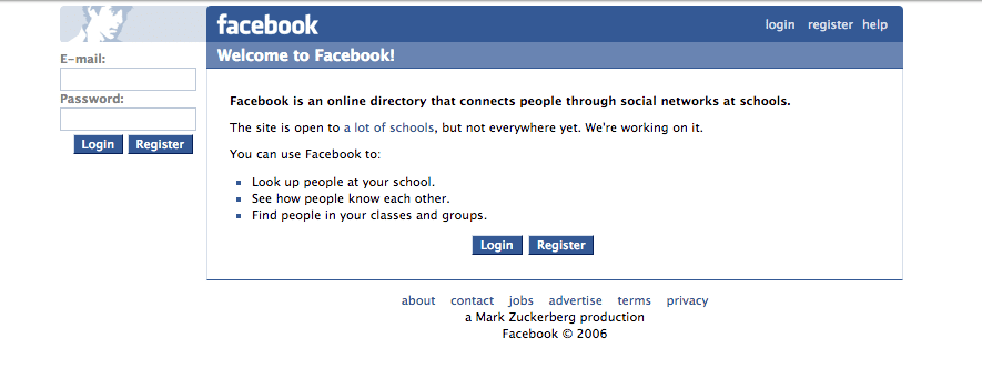
Unfortunately, there's no way of seeing the logged-in version of Facebook.
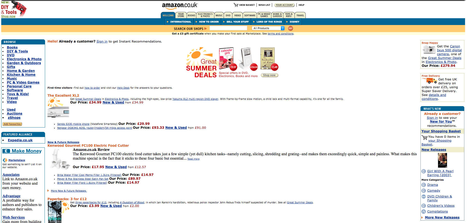
4. Amazon
2004
2009
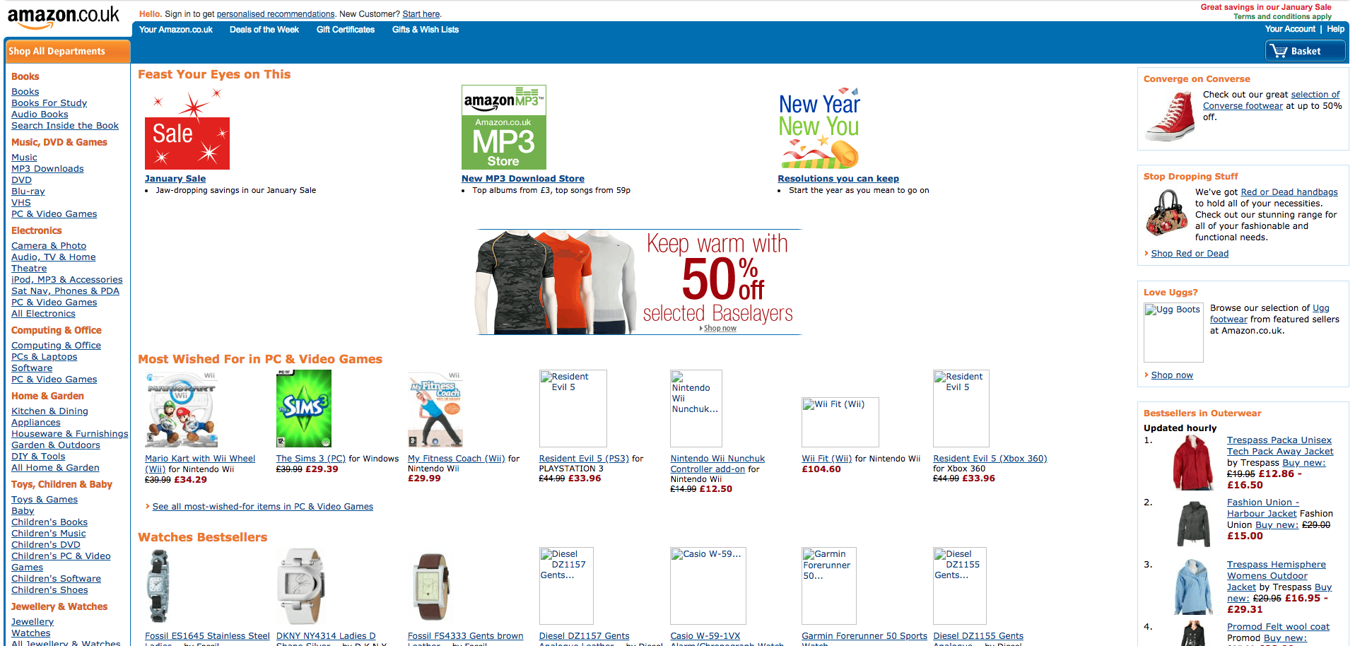
There isn't too much difference between 2004 and 2009 - more imagery was introduced on the homepage, but the page is still text heavy.
2013
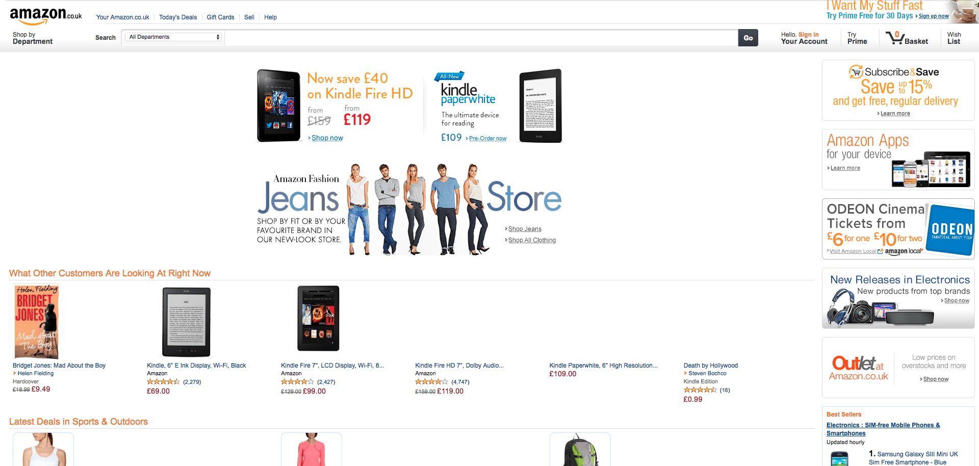
Amazon has evolved throughout the years from a bookseller to one of the biggest ecommerce sites online, but in reality, the style and layout of the website has not changed massively.
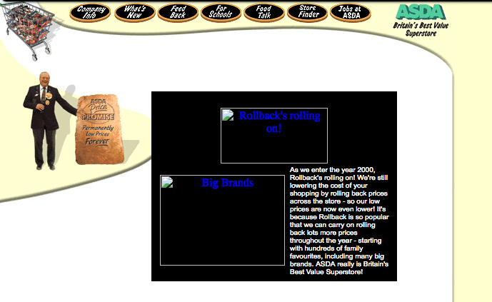
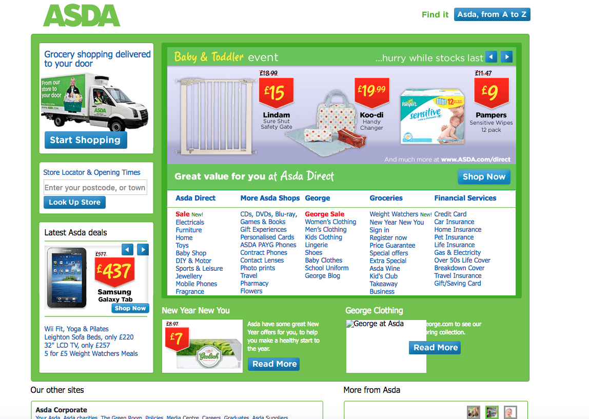
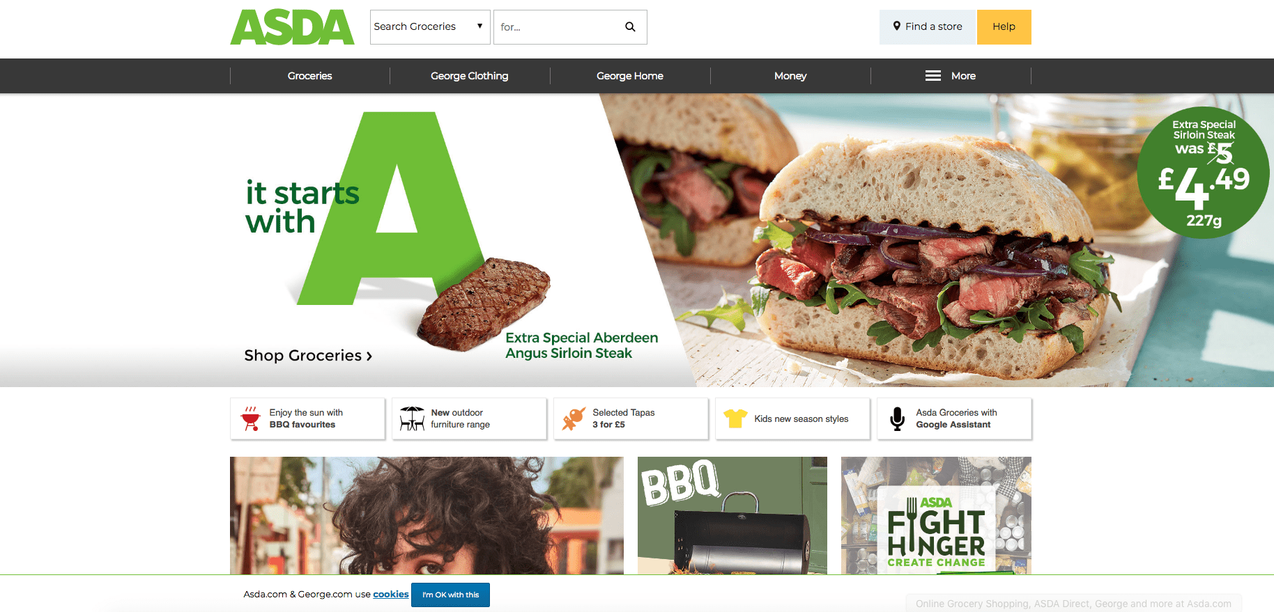
5. ASDA
The evolution of the ASDA website is probably the most shocking of them all...
2000
2011
2018
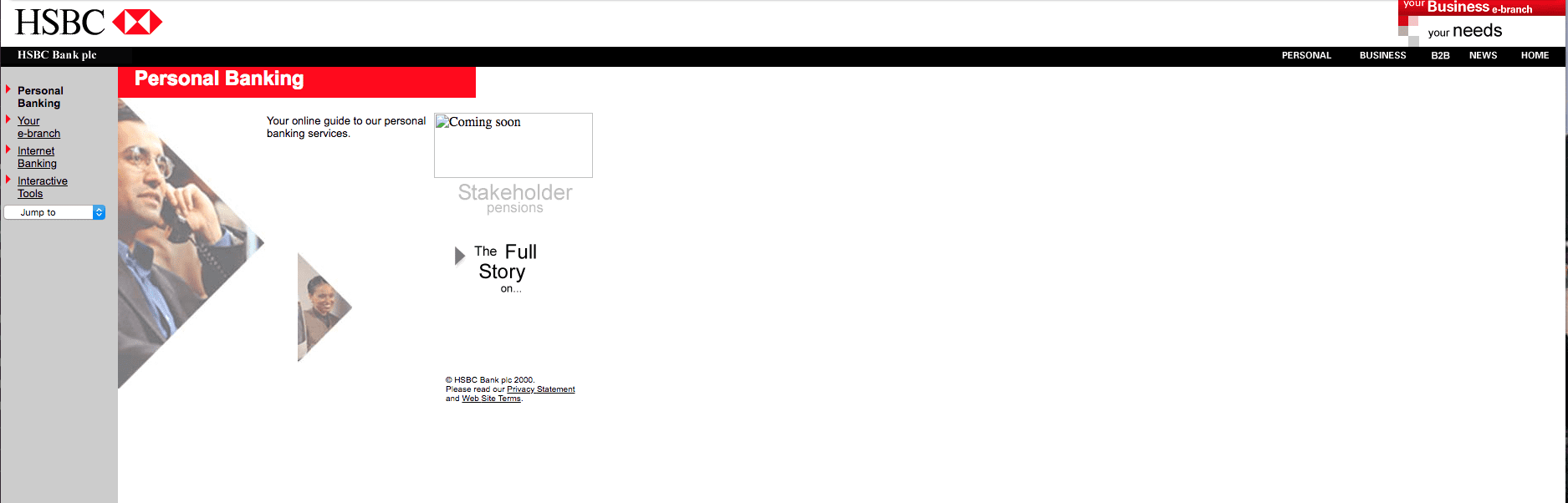
6. HSBC
2001
2018
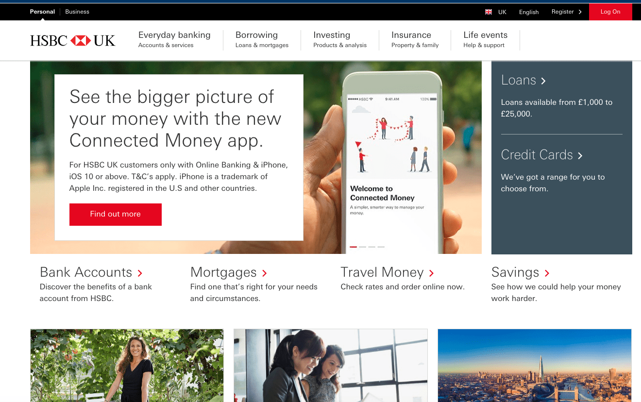
The HSBC site is not very different in reality, it simply contains more visuals, as most ISP's would cope with image-heavy websites these days.
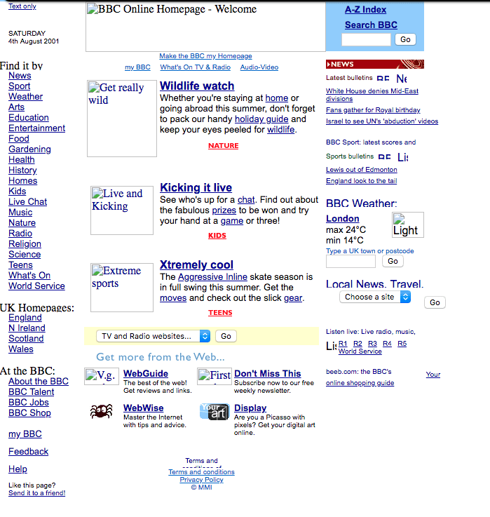
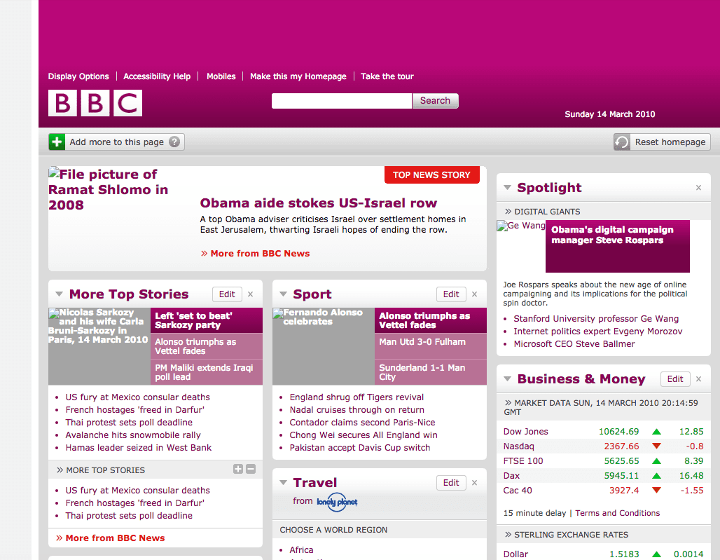
7. BBC
2001
2010
2018
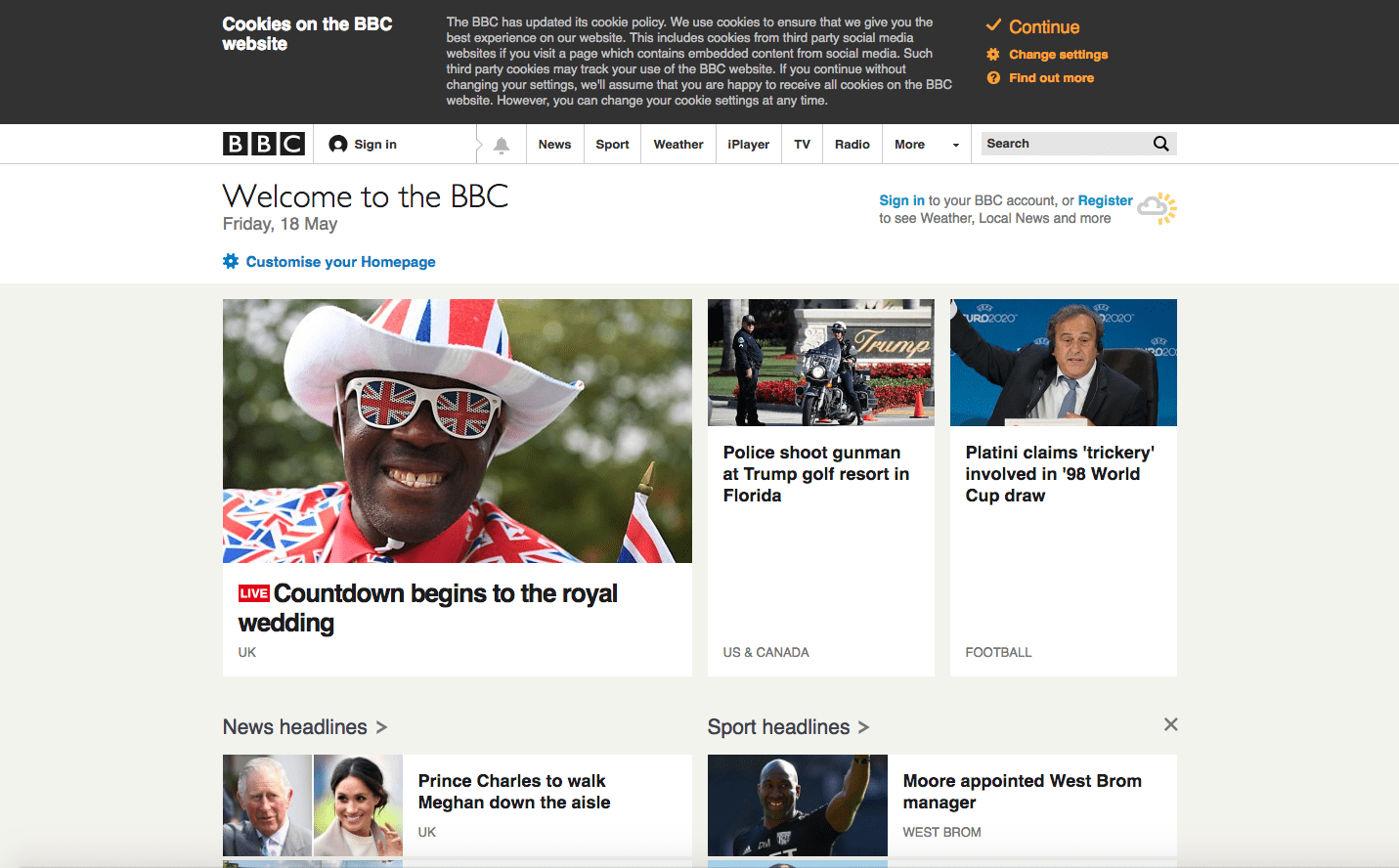
BBC remains very content heavy over the years up to today, but for a huge organization, this makes sense.
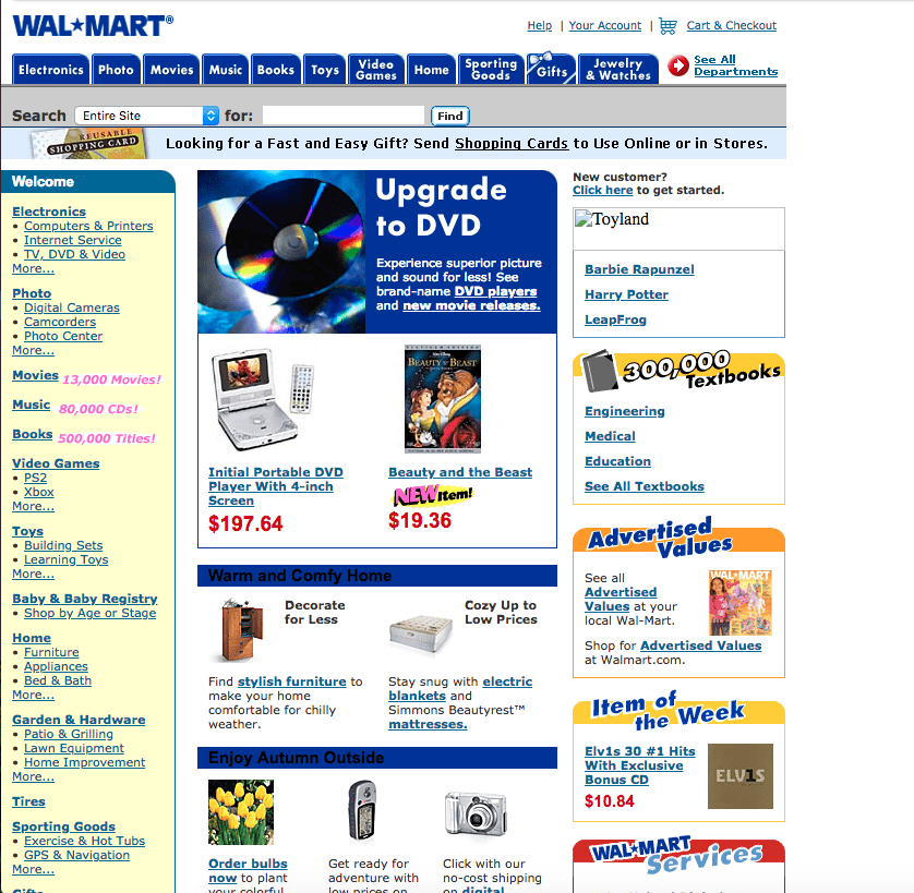
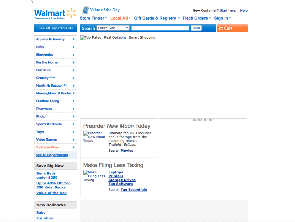
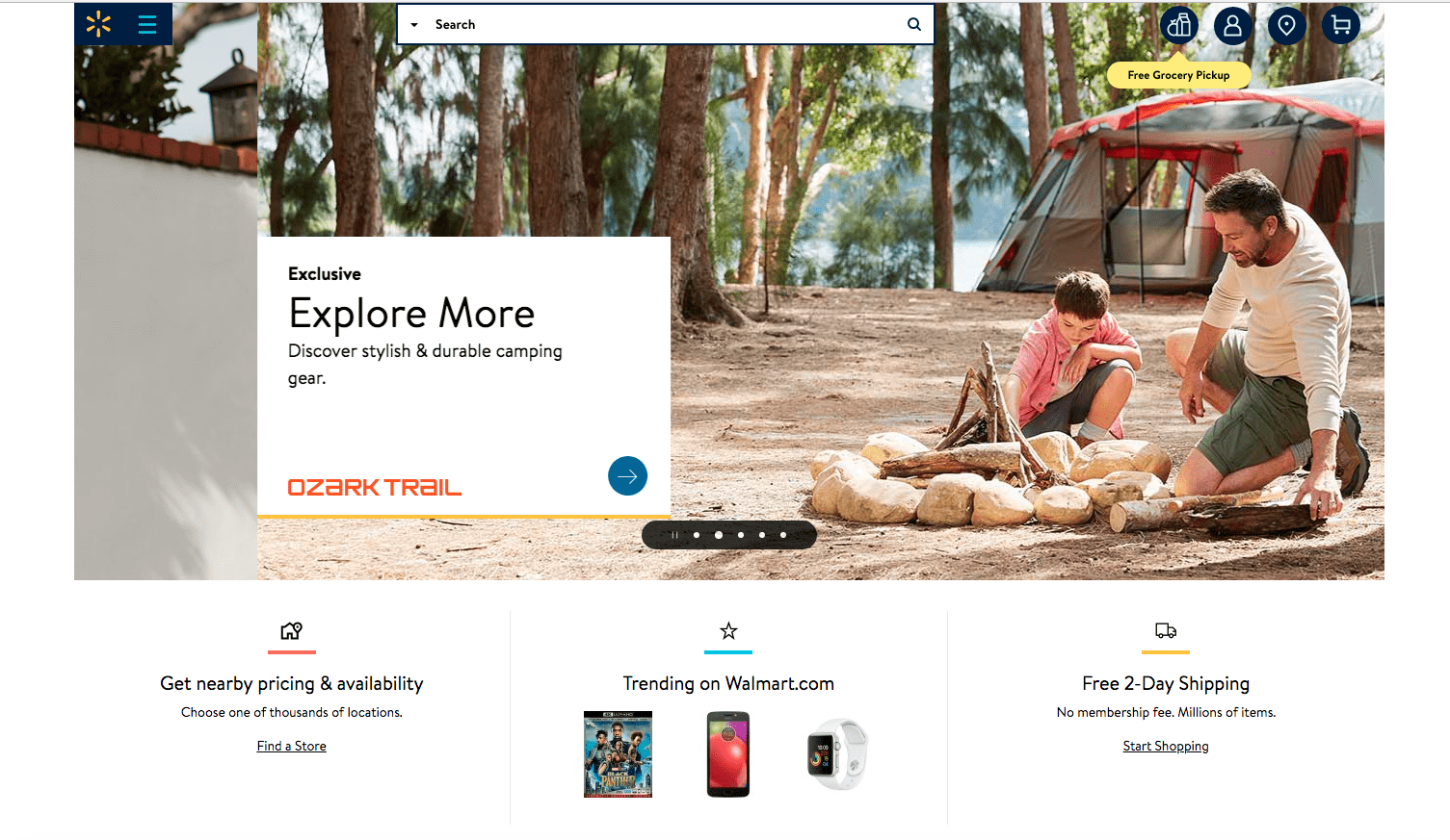
8. Walmart
2002
2010
2018
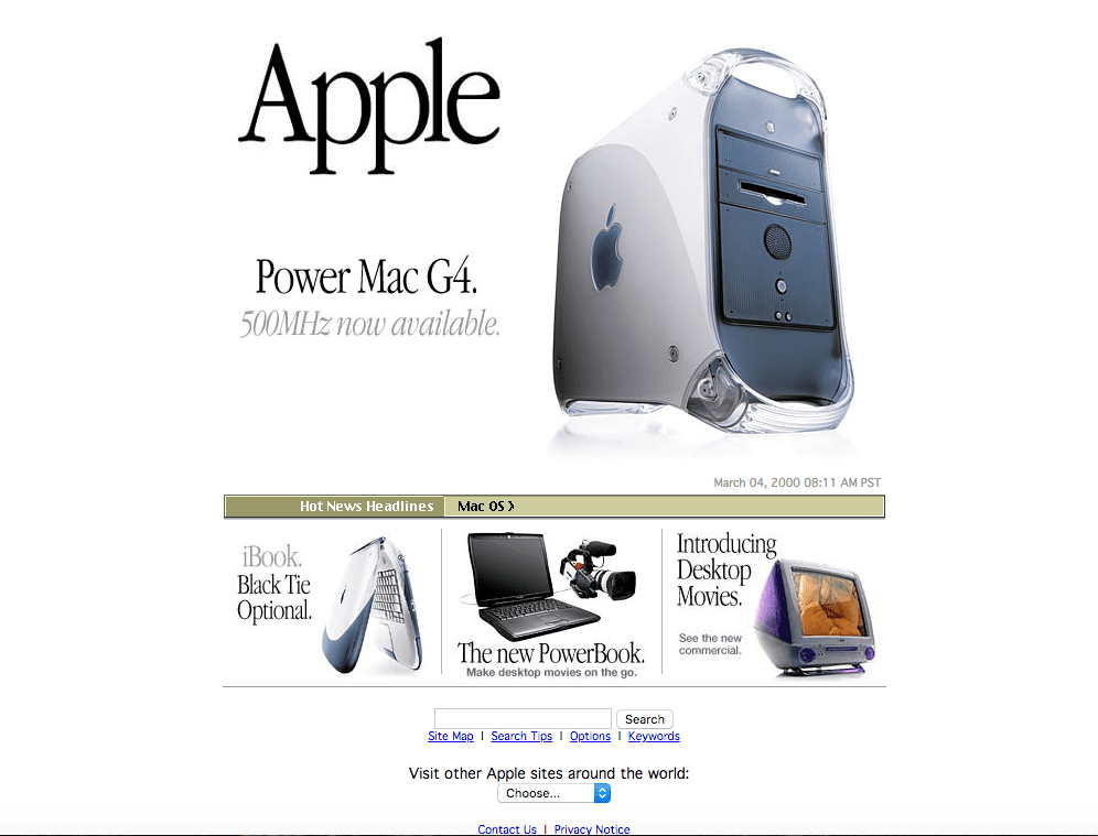
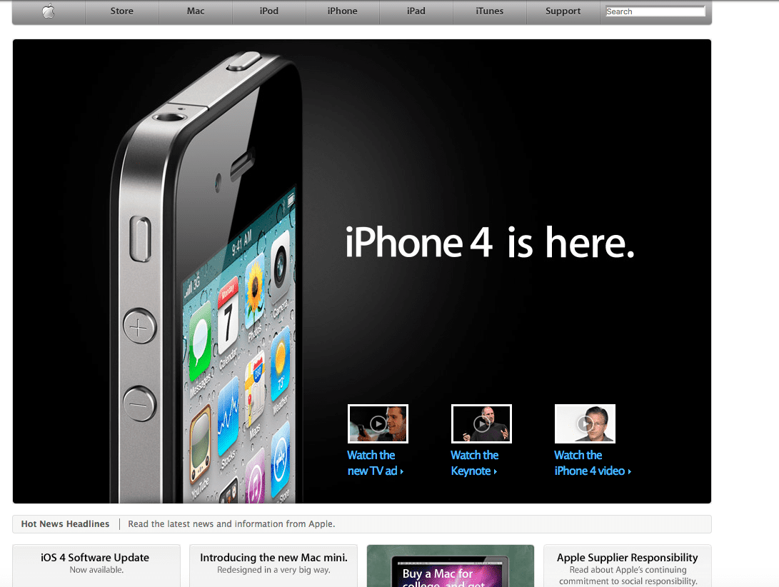
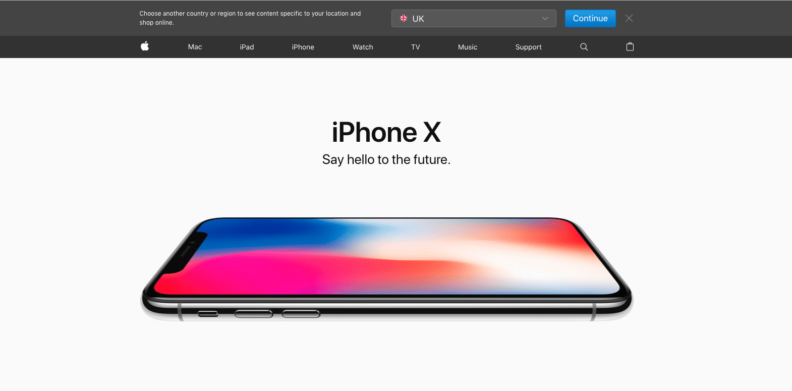
9. Apple
Apple has always favoured a minimalistic design throughout the years with one main image positioned in the top middle to catch browsers' attention. This works well in highlighting their feature product and creating an emotional demand for the product.
2000
2010
2018
Apple has always been very image heavy and minimalistic, their site has not changed much over the years.
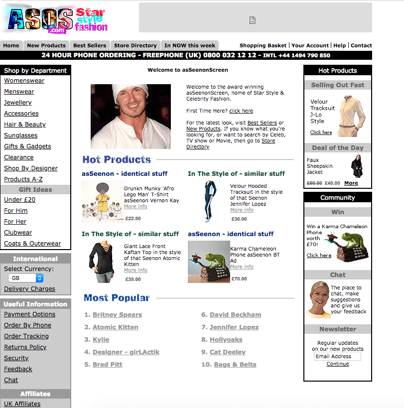
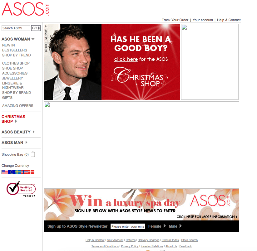
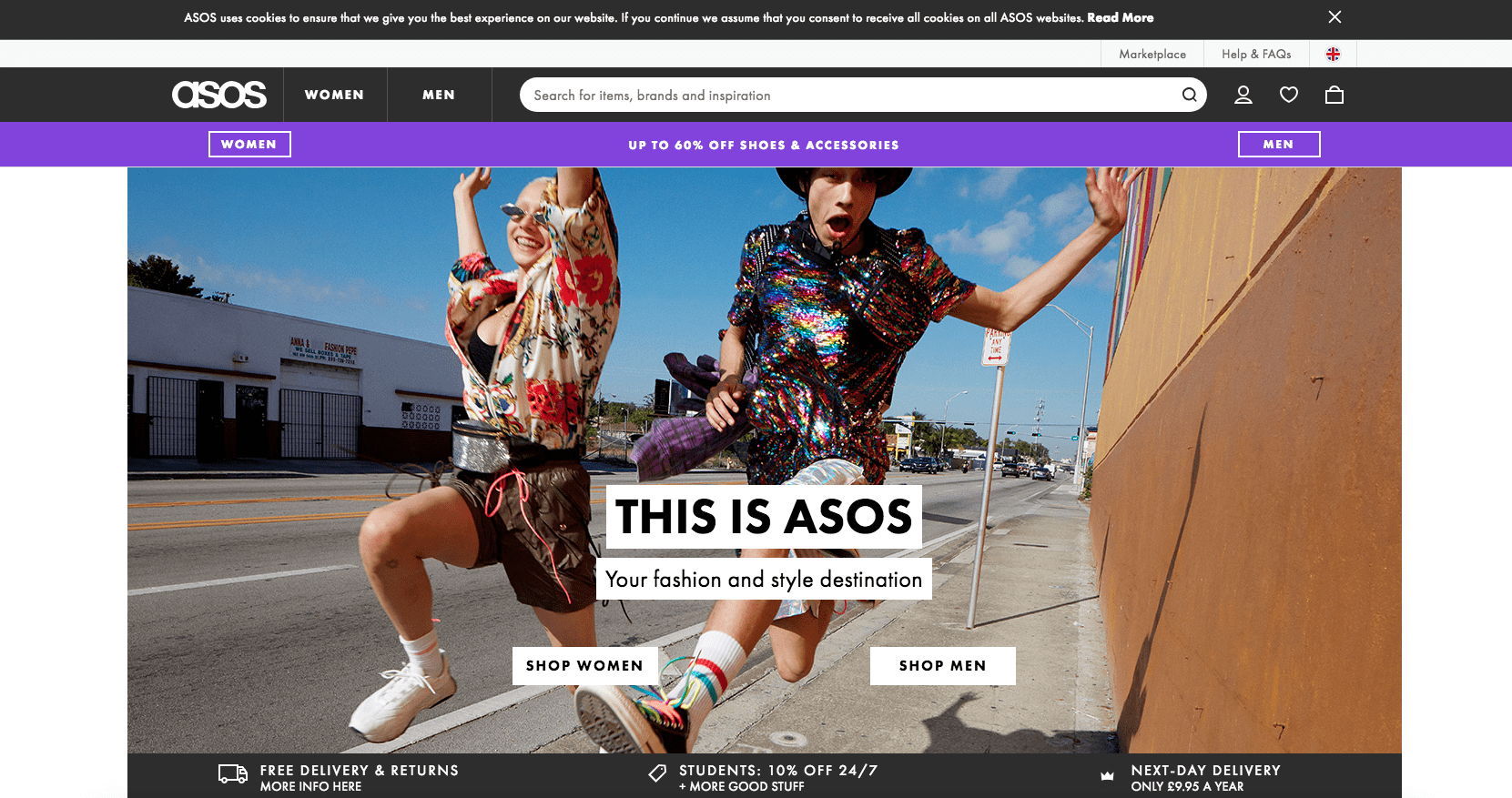
10. ASOS
2002
2005
2018
One thing is for certain, web design has slowly been favouring sites that are image-heavy and look visually appealing. Big images and very few CTAs help direct users unconsciously to certain pages of the company's choice. It's a cleaner and quicker experience and helps take the user on their customer journey down the company's customer funnel via their site.