Graphic design is one of the most important components of any successful marketing campaign
The right design does everything from establishing credibility with the audience to strengthening brand messaging, and using the right combination of design elements - like color, typography, and layout - can mean the difference between a marketing campaign converting like crazy or completely falling flat.
While there are some evergreen design rules that you’ll always want to follow, for the most part, graphic design is a constantly evolving medium. What worked yesterday might not work today, and if you want to drive maximum results with your marketing campaigns, you need to stay on top of the trends and keep your finger on the pulse of what’s happening in the world of graphic design.
Which brings us to the question: which graphic design trends should you follow in 2018 to knock your marketing campaigns out of the park?
Download FREE Resource – Digital marketing megatrends
Megatrends across the 5 pillars of marketing today which every business should action.
Access the
Responsive mobile design
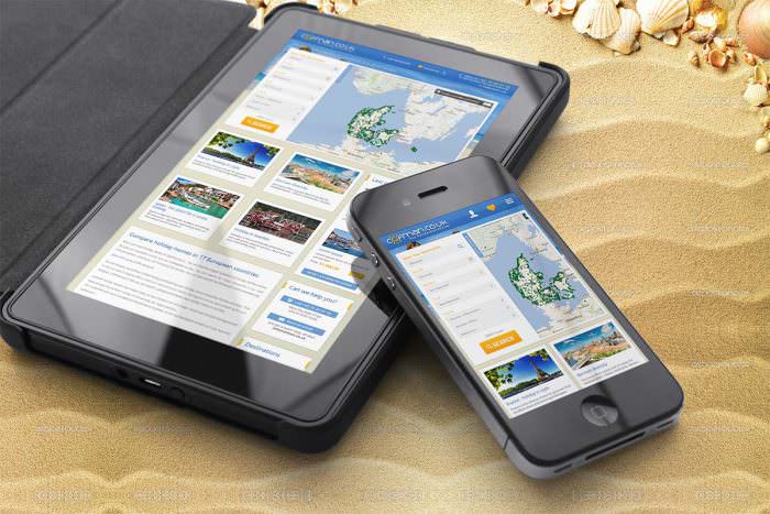
Source: Responsive mobile design by Googa
In 2018, everyone - and we mean everyone - will be surfing the web on their smartphones. The scales tipped towards mobile’s favor in 2016 when worldwide mobile internet use surpassed desktop for the first time ever, and that trend has just continued to grow over the past two years. And if most people are using their phones to interact with brands, you need to create an experience that’s tailored to mobile.
We’re talking about responsive mobile design, and if you want your marketing campaigns to succeed in 2018, it needs to be a non-negotiable.
Responsive mobile design is when you design your websites, landing pages, and other digital assets so that they automatically resize when being viewed on a mobile device. This ensures that your design isn’t distorted when a potential customer looks at it on a smaller smartphone screen.
Not only is having a responsive site important from a design standpoint, but it’s also important from a marketing standpoint; Google penalizes sites with a less-than-stellar mobile experience, which will tank your rankings and make it harder to reach your ideal customer.
Do yourself a favor and embrace the responsive mobile design trend. It’s not going anywhere.
Responsive logos
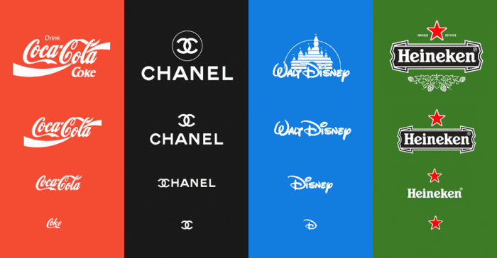
Source: Examples from Responsive Logos by Joe Harrison
Set to piggyback off of the responsive mobile design trend in 2018 is responsive logos.
While most all major brands have created responsive mobile sites, none have made their logos fully responsive; while many have simplified their logos to make them smaller and easier to capture on a smartphone screen, none have actually adjusted their logo type based on the size of a screen.
But it looks like 2018 might be the year that changes. In 2017, digital designer Joe Harrison put together “Responsive Logos,” an exploration into how the logos of the world’s largest brands could be scaled to create fully responsive logos for mobile and tablet experiences. And the results have got the design world buzzing and considering how to turn responsive logos a reality in 2018.
Having a responsive logo can help to keep branding consistent throughout your marketing campaigns, no matter where or how consumers interact with them, so it’s definitely something you’ll want to consider in the upcoming year.
Retro pallets and patterns
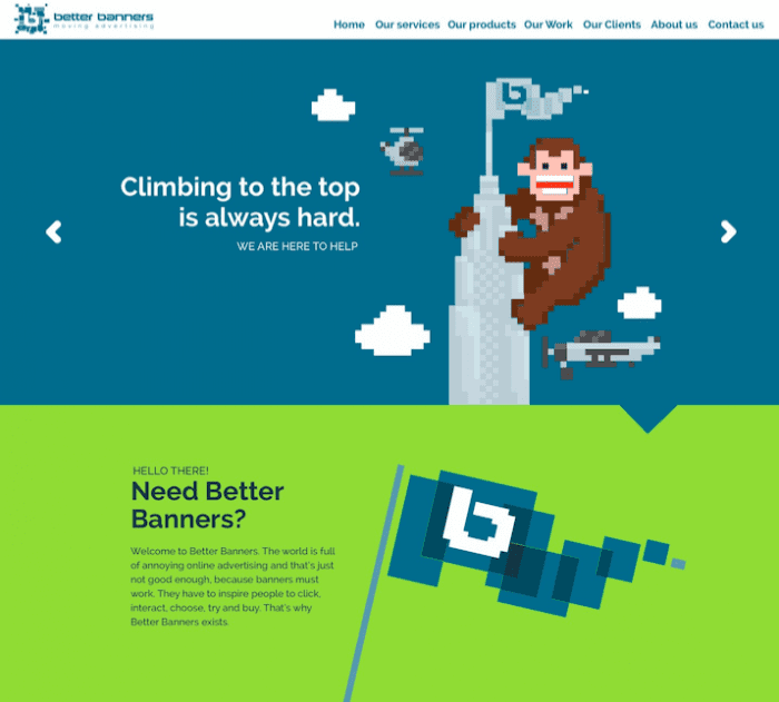
Source: Web design by Mahuna
This web design feels very Nintendo-era 80’s.
In 2018, everything old is new again - particularly anything having to do with the 80’s or 90’s. Scrunchies are back in style, 80’s-era Levi jackets are all over the fashion blogs, and retro-inspired color palettes and patterns are all the rage in the world of design.
Using a retro-inspired color palette or pattern can help your marketing campaign feel both nostalgic and current at the same time - something that’s especially helpful if you’re trying to capture the attention of the much-sought-after millennial demographic.
Bottom sticky elements
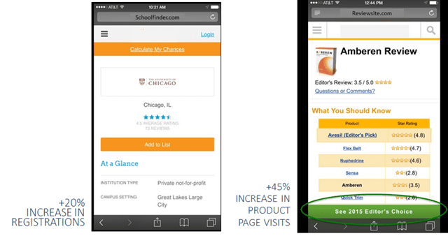
Source: Conversion Sciences
Up until recently, most sticky elements on a webpage were on the top. But now that more users have moved to mobile, it’s time to rethink that strategy.
When you’re using a mobile device, you’re used to using the bottom of the screen to navigate. So why would you put your most important messaging - the messaging that stays with your audience no matter where they scroll on the page - on the top?
2018 will see brands moving their sticky design elements from the top of the page to the bottom to create a more intuitive user experience - and, more importantly, to increase conversions. And if you want your marketing campaigns to convert, you should consider doing the same.
Scalable vector graphics
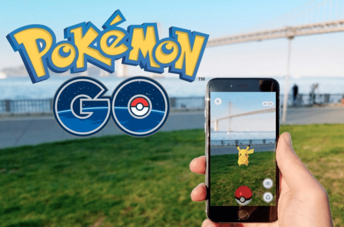
A key component of many marketing campaigns is creating interactive multimedia experiences. Whether you’re marketing a property and want to give an interactive 360-degree tour or you’re marketing a product and want to give consumers the ability to view the product in 3D, you need a way to create these multimedia experiences without slowing your website down to a crawl.
And the way to do that? Scalable vector graphics.
Scalable vector graphics (SVGs) are nothing new. But they’re definitely going to be a huge trend in 2018.
SVGs don’t require HTTP requests, which means that you can have an animated SVG (like a 3D product image that visitors can manipulate to view at all angles) without it slowing down your page speeds. This creates a better user experience which can help boost conversions and make your marketing campaigns more successful.
SVGs are also going to play a huge part in VR and AR - two other trends that are set to take off in 2018.
Custom graphics and illustrations
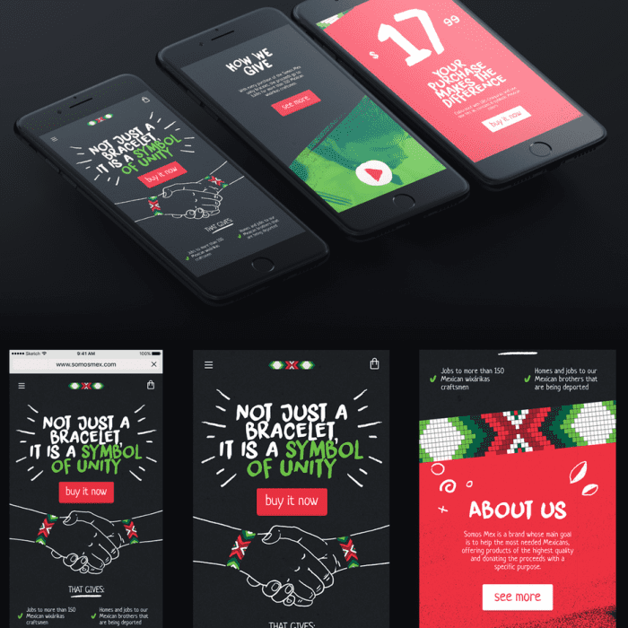
Source: Custom illustrations by boorykin
If you want your marketing campaigns to succeed in 2018, they’ve got to be original. And the best way to craft an original design? Go custom.
Custom graphics and illustrations have always been popular in print, but they’ve played second fiddle to generic stock imagery in the digital space for years. But 2017 saw a major shift in the way imagery was used online. As more brands sought to break through the clutter and establish themselves as a unique presence, they started to incorporate more custom graphics and illustrations - including in their marketing campaigns.
In 2018, custom imagery like calligraphy, hand-drawn graphics and illustrations, artistic typography, and original photos will become more common - which, ironically, will make each brand feel more and more individual.
If you want to create marketing campaigns that stand out, you need to get on top of the custom graphics and illustration trend. Using custom graphics will help create a strong brand personality, be visually impactful, and establish your brand’s unique style and tone in the market.
2018 is poised to be an exciting year in the world of graphic design. If you embrace these emerging design trends and use them to your advantage, it can also be an exciting year in the world of your business’s marketing. And make sure to check these digital marketing trends 2018 when executing your campaigns.

Thanks to Laura McLeod for sharing their advice and opinion in this post. Laura heads up the European Marketing team for
99designs in Berlin. Having studied History of Art in the UK’s capital city, she is passionate about the visual arts, design and aesthetics, and has over a decade of digital marketing experience behind her. When she’s not championing the 99designs brand you’ll likely find her hanging out with friends, family or co-workers across continents or soaking up her favourite music around the city of Berlin.


 Thanks to Laura McLeod for sharing their advice and opinion in this post. Laura heads up the European Marketing team for


