Mobile user experience is becoming a key priority for brands as they look to engage with their audiences in this multi-channel, multi-device environment.
This ‘mobile first’ index is on the way and, combined with the increase in consumers using voice search, getting the key user experience components for your mobile strategy has never been more important. Not only could poor mobile user experience cost your brand customers on mobile, it could potentially cost you visibility on desktop when the mobile-first algorithm arrives.
We’ve taken a look at the current trends that are most crucial to mobile search, and what you should be considering in your overall mobile strategy.
Here are six key tactics to consider as you look to ensure that you’re providing the best possible mobile user experience:
- App Store Optimisation (ASO)
- Progressive Web Apps (PWAs)
- Smarter User Input
- Conversational Keywords
- Responsive Design
- Accelerated Mobile Pages (AMP)
App Store Optimisation (ASO)
Mobile applications represent a significant investment for brands, and they represent a significant consumer communications channel, yet few brands are seriously thinking about how their applications end up on the devices of the audiences that they want to reach.
Whilst many brands will push their mobile applications across various engagement channels, what many don’t consider is how and where their apps appear in the respective iOS and Android app stores.

According to Google Insights, 40% of all smartphone users will browse the app stores to discover and download new apps, and app store browsing (as opposed to direct app promotion) remains the most popular way for users to discover new mobile applications. The consumer behaviour means that there are potentially big returns available for ensuring that your app store listings and your app pages are fully optimised for both the right keywords and the right categories within the respective app stores.
ASO requires the same level of intelligence that you would apply to your search engine optimisation. As with any SEO campaign, it is imperative that you understand how your customers are looking for your product.
Ensure that you have a defined keyword set which has been determined by in-depth research. This can guide you in ensuring that you are optimising your application’s descriptions, keyword fields, and titles. Do what you can to promote app downloads, encourage reviews, and issue effective updates regularly – these are all factors in app store algorithms.
Progressive Web Apps (PWAs)
Progressive Web Applications (PWAs) have become a key topic of discussion within the digital community over the course of 2016-17, and this is yet another attempt to improve the user experience across mobile devices.
A PWA is somewhat different to a traditional mobile application in that it is effectively a “hybrid” of regular web pages and a traditional mobile application.
PWA’s main selling point is the ability to bring features from native apps to the mobile browser, such as push notifications and ability to be fully functional in uncertain network conditions. Similar to native apps, PWA’s can be installed and live on the user’s home screen, without the need for an app store listing. As with native apps, they offer an immersive full screen experience that can re-engage users with push notifications.
Although still very much in their infancy, PWA’s have already had huge success for brands that have adopted them, some of which have reported a 104% improvement in conversion rate. Other adopters have reported a four-fold increase in engagement.
PWA will not necessarily be suitable for all brands, but it should be a consideration for e-commerce websites given that these offer an opportunity to improve conversion rates, customer retention and reactivation.
If you are looking to release a progressive web application, consider Google’s best practice guidelines and requirements, and ensure that it accurately synchronises with your mobile website in order to avoid any detrimental impact on search visibility.
Smarter User Imput
Despite undoubted improvements since the first smartphones landed in our hands, inputting text data into a mobile device remains a clunky and sometimes frustrating experience.
Many brands are looking at how they can move away from touchscreen text entry, and allow their users to input their queries in a more user-friendly and less mistake-prone environment.
If you’re capturing data, smart forms and auto-fill features are now a common tactic to help users submit their data accurately, and to reduce the bounce rate on form submission pages.
And with most smartphone devices equipped with some form of camera, think about how you can use this as an input device, and reduce the reliance on text input.
Some retailers, have started introducing ‘photo search’, where a user can take a photo of an object, and then find products that appear to be similar to that product - a great feature for furniture retailers, for example.
Cameras are also being used as effective payment devices, with many retailers now using character recognition software that allows users to ‘photograph’ their credit or debit card at the payment screen. This reduces the risk of abandoned carts that could be lost due to typing errors that may, in some cases, lead to declined payments.
Conversational Keywords
Amazon is expected to ship more than ten million of its Echo personal assistants in 2017, more than 20% of Google searches on mobile are by voice, and it is expected that more than 200 billion voice searches will take place by 2020. In short, voice search is here, and it’s here to stay.
The growing trend that is voice search is forcing brands to think more carefully about how their web presence can accommodate voice search and, in particular, the more conversational search terms that voice search has given rise to.
Creating conversational content is crucial to voice search, as many users do not type the way that they speak. For example, a searcher would normally type “wavy hair tutorial” to find out how to style their hair with waves. But when that information is sought via voice, it suddenly becomes a different search, and users will ask more complete questions such as “how do I make my hair wavy?”.
By tailoring your content around more conversational queries, not only are you increasing the chances of being visible within the answer box results, you’re also increasing your chances of your content being utilised by the likes of Amazon’s Echo and Google’s Home devices.
Responsive Design
Responsive web design isn’t a new concept. Web developers have been creating responsive websites for some time, whilst the ‘Mobile Friendly’ update of 2015 forced the hands of many brands into making sure that their web presence translated well to mobile.
But responsive design is still a pertinent issue to raise. Not necessarily because the web is still littered with big-brand web pages that don’t translate well to mobile, but because the imminent mobile-first search algorithm is going to make responsive web design much more relevant.
Many brands responded to the mobile friendly update by launching what became known as m-dot websites – essentially copies of a desktop website that were tweaked for mobile and appear on an m.website.com or mobile.website.com sub-domain. It was a quick-fix solution that allowed brands to meet the compliance criteria of the mobile friendly update and avoid a loss of search visibility, without having to go through a lengthy full web redesign project - a process that on large ecommerce sites can take several months and requires the support of a host of different stakeholders.
Google is on record in advising website owners to make sure that their sites are responsive ahead of the roll-out of the mobile-first index, rather than using m-dot websites. Responsive websites means that Google simply has a single set of URLs to crawl and, amongst other things, this helps to mitigate against ranking-killing issues such as duplicate content, poor page speed, and dodgy redirects.
Accelerated Mobile Pages (AMP)
Announced in March 2016, accelerated mobile pages (AMP) is a Google-led initiative, developed following discussions between major digital publishers and technology companies about how mobile user experience could be improved.
AMP is designed to address three key issues with the mobile user experience:
- Improve page load times and allow users to access content more quickly.
- Reduce the level of data usage and bandwidth over 3G/4G connections.
- Improve mobile user experience.
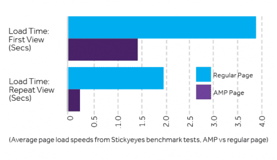
AMP pages boast a load speed up to four times faster than an equivalent non-accelerated mobile page, and use 10 times less data over 3G & 4G networks. Most of the content is cached by Google and unnecessary elements can be loaded last, or not loaded at all.

In August 2016, Google announced that it was rolling out AMP pages to the regular organic SERPs, and began to deliver messages within Search Console encouraging webmasters, particularly those of large e-commerce websites, to produce AMP versions of their regular HTML pages in order to “be shown in Google”.
Whilst, as of June 2017, AMP is not considered to be a ranking signal and is still a concept that is in its infancy, Google is strongly encouraging brands to invest in AMP pages, with suggestions that this will become a ranking signal in the future.
Creating AMP pages is a relatively simple technical fix, and represents a straightforward way of creating a much faster and user-friendly internet experience. It will help your audiences to access your content much more quickly and reduce the number of visitors lost due to poor page speed.

Thanks to
Tom Coad for sharing their advice and opinions in this post. Tom is SEO Performance Manager at digital agency Stickyeyes, responsible for a number of key client accounts and contributor to the agency’s guide to mastering your mobile strategy of
Stickyeyes. You can connect with him on
LinkedIn.


 Thanks to


