Email strategies must recognise users are now constantly moving between devices
Consumers now expect a consistent experience across every device – whether they happen to be using a PC, mobile or tablet. So what can businesses do to improve the customer journey that is gradually blurring between devices?
Since Apple launched the iPhone in 2007, smartphones have saturated our society with as much as two thirds of UK’s population owning one according to Ofcom[1]. Even before we have stumbled out of bed in the morning, we are likely to have checked our mobile to catch up on the news, read emails, get the weather forecast and browse social media channels.
In fact, the average smartphone user carries out over 200 tasks a day on their mobile, compared to just 140 on a desktop or laptop.[2] Even web browsing, traditionally a desktop or laptop task, is now a smartphone-centric pastime with 95% of consumers in Adestra’s Consumer Usage and Digital Adoption study doing just that.
Ten years ago, marketers would draw sharp distinctions between email marketing to consumers on mobiles, tablets and PCs. Each was viewed as a separate platform. There was also a degree of reticence about marketing to users on mobile – the consensus at the time was that customers would be offended by being contacted in this manner.
Fast forward to 2016, and a typical email journey will involve a subscriber using their device; converting from a form, receiving an email, clicking a button in the email to go through to your website, (in a best case scenario) purchasing something, receiving another email, clicking through to track the delivery and so on, in a loop between the email and the website.

1. Provide a better user experience across channels
When your customers click through from a mobile email do they get to a mobile optimised landing page to continue their journey? The expectation from the customer is just there, but are you meeting it?
In November 2014, Google announced that it was going to start tagging websites that featured mobile friendly content. A year later it stated they will use of mobile-friendliness as a ranking signal.[3]
Interestingly, some of the criteria that Google list for a mobile friendly website just as easily apply to email. They include:
- Producing large readable text that doesn’t require zooming
- Creating content that automatically resizes to fit a mobile screen
- Putting large links on a message with plenty of space between them so they can easily be tapped
Correct rendering, in particular, is an important factor. According to a recent survey, 71 percent of people will delete an email immediately if it doesn’t display correctly on their mobile device.[4]
2. Provide a better user experience across devices
Ask these questions about your customers’ journeys:
- Would they understand what our brand identity is regardless of the first channel they come in contact with?
- Would they understand what we do and what we expect their next action to be?
- Are there common branding and design elements running as a thread through all the channels?
- Are we meeting their expectations in terms of experience in all our channels?
- Is the transition from one channel to the other seamless in terms of user experience?
- Do you communicate differently at each level or stage in their customer journey to match their expectations and needs?
We know that satisfying all email clients and their respective quirks is difficult and perhaps not efficient in delivering the message if it doesn't fit a customer's interaction with that device. So instead of focusing on finding the one design that renders beautifully in all email clients, invest that time in making the message the star and simply adjust its delivery to different experiences.
3. Deliver location specific content
One way companies can improve the content of their messaging is through geolocation. Put simply, geolocation uses mobile devices’ built in GPS to accurately point to the nearest location of a physical branch/store/restaurant based on a series of attributes. Armed with this intelligence, marketers can target users with location-specific content and offers in their emails.
For example, in navigation to events. By using geolocation services, you can embed live maps in email to help subscribers plan the best routes and provide directions to events. This eliminates the need for separate GPS devices or printed maps.[5]
4. Use image blocking workarounds
Numerous email clients block images in email by default with Android devices (80% market share globally[6]) the main culprits, so what do you do when your message gets lost because the text was embedded in the image? Two solutions:
- You can use background images and with some clever code, even get them to work in Outlook. This means you can overlay text on top of images without the need to embed it in the image, so you don’t need to worry about losing the message if images are switched off.
- As for using a web-safe font, while it may not look identical to your brand’s, it’s guaranteed to work across all email clients and mobile devices. An alternative option is ‘Google Fonts’. There are hundreds to choose from, they’re free to use, and they even work on all Apple email clients, falling back to a web-safe font where not supported.
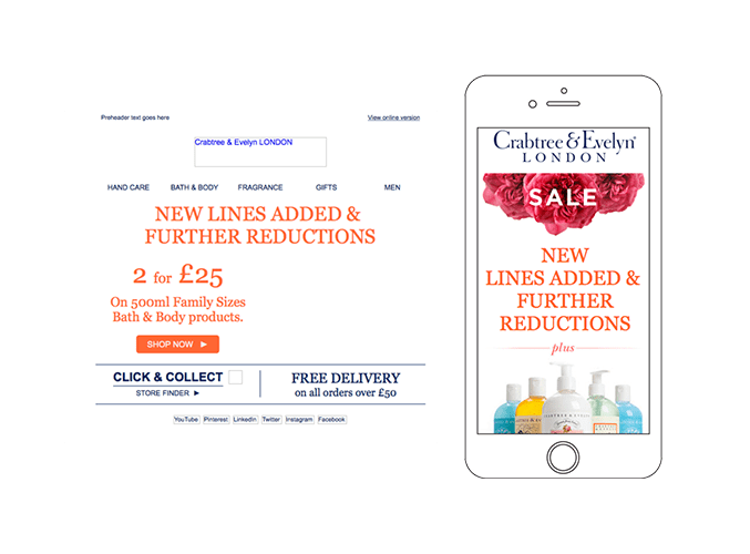
Crabtree & Evelyn had this exact challenge. With as many as 78 per cent of customers opening their emails on mobile devices, it was crucial that they made their emails easy to read and engage with on phones but their emails were composed almost entirely of images.
By adopting a modular template solution with clever use of background images instead, they were able to reduce its campaign build time and increase its average open rates by 11 per cent.

Why act now?
It may seem like Christmas is still a long way away, but there are only two months of the year left. According to IMRG, online spending rose to £24bn in the UK over the Christmas period in 2015.[7] In the US, Black Friday alone saw sales worth of $10.4 bn[8]. This year is expected to be an even more successful one for online retailers.
So right now is the time to invest in your customers’ experience. Reach out and grab their attention and provide them with a consistent journey with a clear message and images that represent your brand across channels, regardless of device.

Thanks to
Steve Denner for sharing their advice and opinions in this post. Steve Denner is Adestra's co-founder and COO. He is a strong believer in the need for enterprise SaaS providers to deliver the highest levels of service to their clients. He thinks that enterprise technology can and should have 'self service' ease-of-use - backed up by proactive and swift support and account management.You can follow him on
Twitter or connect on
LinkedIn.


 Thanks to


