What email marketing opportunities do you miss in your transactional emails?
There’s no question that email marketing is one of the key opportunities for almost any marketing team. When thinking about it, newsletters and other promotional emails are usually the first to come to mind.
Few marketing teams give serious attention to transactional emails. Very often, these are even out of their jurisdiction.
Set up by development or customer-facing teams, these emails serve their key purpose in a better or a worse way. The marketing opportunities behind these messages are often overlooked though.
Throughout this article, we’ll give you plenty of reasons why it shouldn’t happen. You’ll learn how to maximize the potential of your transactional emails and which common mistakes you should avoid. Apply these learnings to your emails and you’re likely to see promising results in no time.
What are transactional emails?
First of all, let’s get some definitions of the list.
Transactional emails are automated messages that are triggered by certain actions of your customers. They can be sent when an account is created (or deleted) when an order is placed (or abandoned) when a certain page is loaded or a link is clicked. Most commonly, these are:
- Welcome emails - sent to greet a new customer right after they created an account or signed up for a newsletter.
- Confirmation emails - sent to, well, confirm that a certain process has been completed. These can be sent when e.g. an order is confirmed, a password is reset or an invoice is issued, Usually, they don’t require any further action from a user.
- Notification emails - delivered to let a user know about a certain action(s) happening on the platform / in an app. These can happen when a password reset process is initiated, payment or a user verification is underway, an unrecognized login is detected, etc.
- Reminder emails - finally, these are sent to give a gentle reminder to a user about, usually, a certain action they should undertake. Some of the examples are abandoned cart emails, overdue payments, incomplete setups, etc.

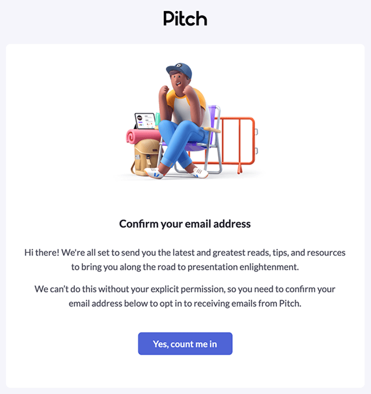
Pitch asks you to confirm your email in a fun, good-looking email. Way to start a relationship.
Why should transactional emails be important for effective email marketing?
You might be wondering by now - how the heck am I supposed to market my product in a password reset email? And you would be right - you shouldn’t. But there’s still a lot of value you can get out of such a message anyway.
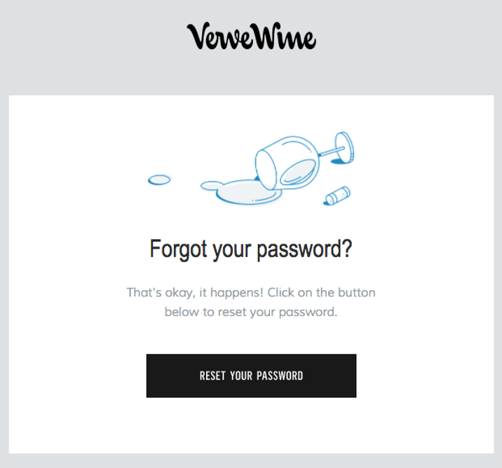
What if, instead of sending a dull email like this:

A recipient would find this in their inbox this:

In theory, the result of their action will be just the same - a person will reset their password and will, hopefully, continue being your customer. But adding a bit more touch to such an email can go a long way.
Here are some of the main reasons why transactional emails should be an important part of your marketing efforts.
Which other emails can you say the same thing about? Since transactional emails are triggered by users’ actions, people genuinely want to see them. Many will launch their inbox specifically for this purpose.
A study from Experian showed that welcome emails, for example, enjoy 4-5 times higher open and click-through rates than promotional messages. It’s safe to assume that similar numbers can be observed for any order confirmation or various notifications you surely send to your clients. That’s a huge opportunity to grab their attention and give them something to think about.
- They already bring value to your customers
It’s sometimes a struggle to bring value to a customer in a purely promotional email. And you know well that they’re unlikely to open the following email if it doesn’t offer them anything in return.
Transactional emails by default carry a lot of value. They give the customer peace of mind that a payment was processed. They inform them about the next steps they need to take. They include files or secret codes that a user needs elsewhere. All of this ensures that they’ll be eager to open these emails and interact with them, possibly generating some additional revenue for you.

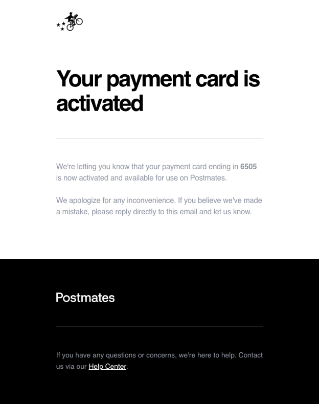
The design of this email from Postmates is very simple but at the same time eye-catching, great for building brand awareness.
Download our Business Resource – Email marketing strategy guide
This comprehensive guide shows you how to take your email marketing strategy to the next level.
Access the Email marketing strategy guide
- They’re great for building brand awareness
You want to establish a connection with a customer. If they recognize and trust your brand, they’re more likely to buy from you or recommend you to their peers. They’re also less likely to shift to a competitor for whatever silly reason.
You’re going to send a lot of transactional emails to each of your customers. Your welcome email will be one of the first touchpoints with the brand they will have. If you’re to build great relationships with your customers, this will be one of your most important channels.
- They’re an excellent way of engaging your leads
If your goal is to gather customer’s feedback or learn of the problem they’re trying to solve [with your product], transactional emails prove invaluable too. They enjoy high interaction rates and are perfectly timed to arrive right when a process is finished or an issue emerges.
If reaching you is as effortless as just hitting on the ‘Reply’ button or tapping on a button, you’ll hear from many and you’ll gather a lot of data you can use for user segmentation or simply improving the product.
Oh, and this hasn’t convinced you to invest in transactional emails yet, the infographic demonstrating the ROI of transactional emails will.
Common mistakes made in transactional emails and how to avoid them in email marketing
By now, you probably realize the size of the opportunity in emails that your company already sends and you’re eager to take action. Read on as I analyze the common mistakes of many transactional emails and give advice on how to make yours better.

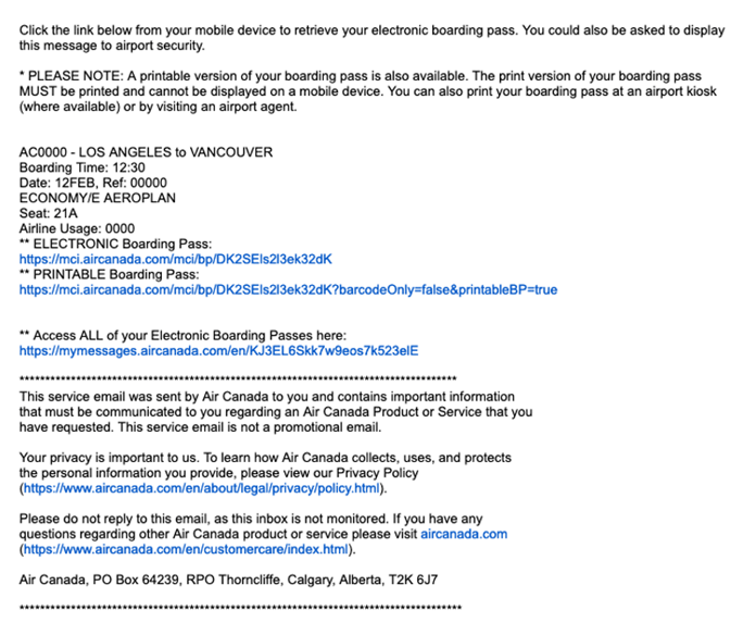
The flight itineraries we sometimes receive are some of the worst examples of transactional email. Lots of links, poor (or lack) of formatting, no attempts at any personalization.
Sending automated, impersonal emails
Many companies send transactional emails that are just pure instructions on what happened or is about to happen.
“We’ve received your request. We’ll be in touch within 10 business days”
“Password reset. Regards”
“Subscription confirmed. Click below to unsubscribe”
These emails are forgotten as soon as they’re closed. And if the whole message fits in a preview, they may be archived without even opening. By sending such emails, you’re missing out on a lot of opportunities - to engage a reader, to point them in the desired direction, to stay in their memory.
How to improve:
- Personalize a message with the data you already have. Replace “Dear Customer” with their name you likely have on the records. Refer to their activity and provide the information relevant to them and no one else. Read more on how to personalize emails.
- Make ‘From’ field more personal. 68% of Americans said that the display name visible in their inbox impacts their decision on whether they should open an email or not. Show your customers that there’s a person behind each email, even if they’re automated by nature. Replace “Sales” or, worse, “No reply” with “Tom from XYZ”.
- Make the content more casual. Unless you’re running a bank or are a debt collector, you don’t want to hide behind a super-formal tone. Make your language more casual and show a reader that you’re a human just like them. Caveat: Not every industry and every customer base will appreciate being casual with them. It’s for you to decide how far you can go.

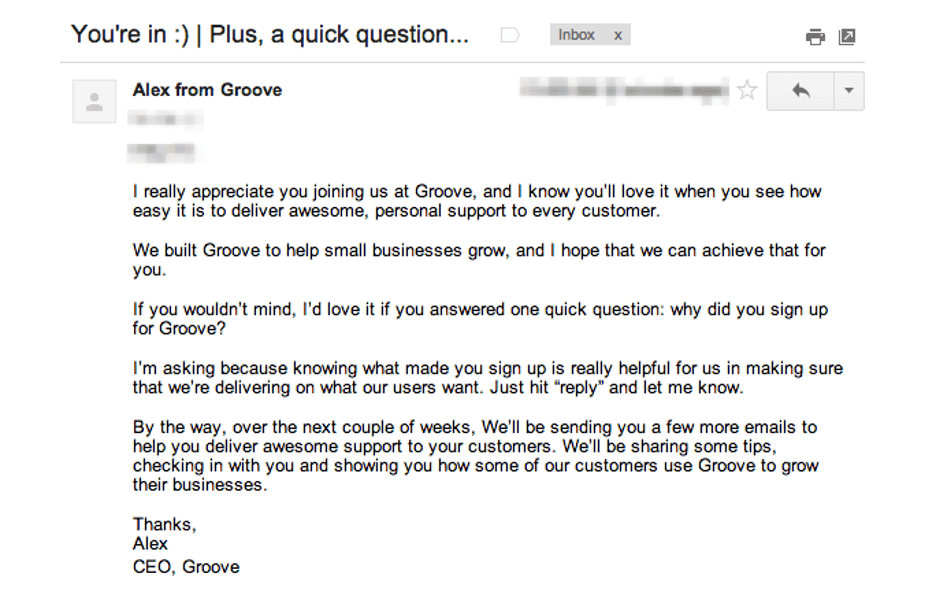
Example of a great welcome email from Groove. The story behind it is also very interesting.
Sending emails that never arrive
The infrastructure you use for sending emails is as important as the quality of emails. What good is in a perfectly written email if it lands in a spam folder, right?
It’s way more crucial in the transactional department than it is for marketing emails. I assume most of your customers can live without your last newsletter if it never arrives (though some will be sad, I’m sure).
The issue appears when order confirmation lands in the spam or a password reset email is discarded by the customer’s ISP. This automatically creates more work for your support team and disturbs the peace of mind of your customers. No one wins in this situation.

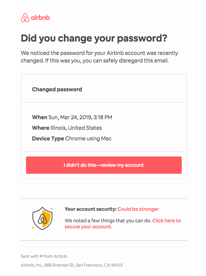
Simple notification from Airbnb that lets you inspect the relevant details within a few seconds and quickly take action if necessary.
How to improve:
- Choose the right ESP. Some sending providers specialize in marketing emails while others are great in transactional emails. A few platforms are good in either and you should carefully analyze what each platform is capable of before you select the perfect ESP for you.
- Use separate IP or even domain for transactional emails. Marketing emails always have much lower numbers than transactional emails, that’s understandable. At the same time, transactional emails just need to be delivered, always. Since email reputation and deliverability are heavily dependent on the past performance of IP/domain, it’s worth separating both streams. This way, the poor results of marketing campaigns won’t have any impact on the transactional emails we put so much faith in.
- Track deliveries. Needless to say, to detect any issues and act on them quickly, you need to actively track how your emails perform. Make sure you have the proper trackers in place and look at transactional emails separately, rather than focusing on the overall performance of your emails.
- Test your emails before they’re sent. Use some of these email testing tools to improve your emails before they’re even sent. Whether it’s broken HTML, poor rendering of visuals, or simple grammar issues, you want to eliminate them before your emails are added to the queue.
Sending complex, poorly formatted emails
One thing you have to give to these boring “Account created, bye” emails is that they get straight to the point. And that’s what most recipients of transactional emails appreciate a lot.
Too often we receive emails that are just a pain to use. They feature long lines of text and legal disclaimers. The ugly links take two lines at least (and more on mobile), making the copy irrelevant. The confusing copy makes it hard to figure out what exactly they need from us.
And finally, the lack of formatting* or, opposite, an abundance of visuals makes things even worse.
All of these directly impact the conversion of your transactional emails and are often very easy to improve.
* Disclaimer: I think the complete lack of formatting can give ground to some really powerful emails, some examples you can see in this text. But very often you’ll achieve much better results with a bit of work on the design end.

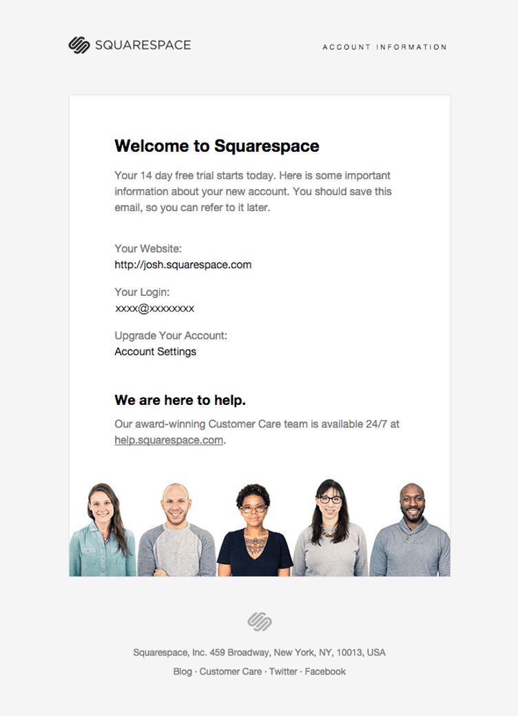
Squarespace adds a bit of a personal touch to a welcome email, assuring you that a group of smiling people is looking after you.
How to improve:
- Write concise, straight to the point emails. Transactional emails need to be simple, there’s no rocket science involved here too. Cut your emails to the bare minimum, try to skip anything that doesn’t bring value to a reader.
- Sell but don’t sell too aggressively. As I talked about earlier, transactional emails can be a good opportunity to promote your product, here and there. By all means, use the chance to grab the reader’s attention. But don’t overdo it as well. An order confirmation with 3-4 suggested products is perfectly fine. Order confirmation in the first two lines and then an entire catalog of your latest collection makes for a pretty bad experience.

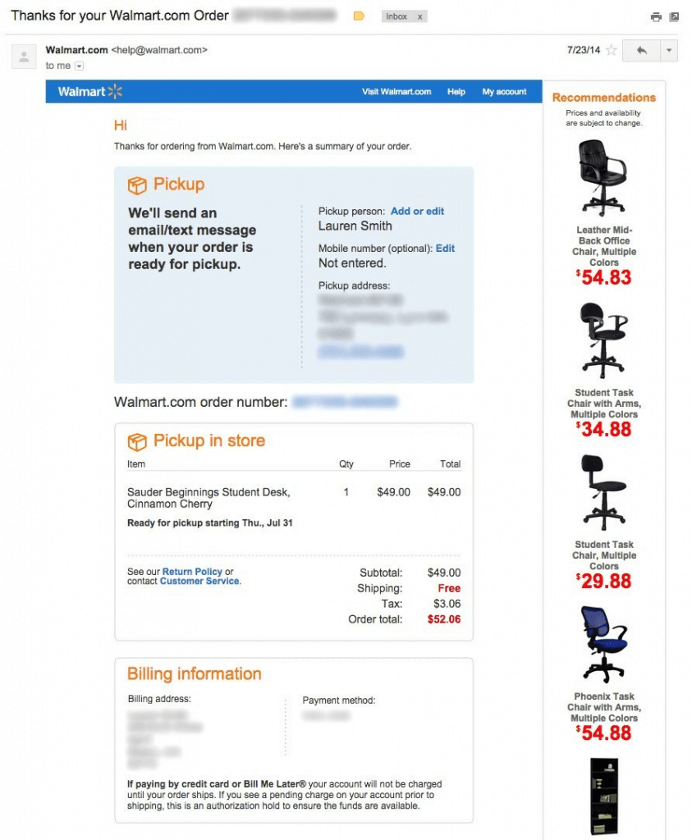
Walmart knows you just bought a desk from them. They use the order confirmation to remind you of some good-looking chairs you may need as well.
- Write a clear subject line. There’s no need for the creativity typical for marketing emails. The subject of a transactional email should precisely state what’s inside. If your customers expect a message from you, don’t try to surprise them when it’s not necessary.
- Include your branding. As I talked about earlier, this is where your brand can shine. Build awareness in every single email by including an identical branding. Get users used to seeing your logo, your vision, and brand colors. Tell them your story and share your values so they can get more emotionally involved. Include a picture of your team to show them who’s on the other side.
- Limit an email to a single CTA. Make it clear which action users should take upon finishing your email. If they’re meant to update their payment details or confirm something, add a firm button telling them to do just that. If the action they need to take isn’t that simple, visualize what needs to be done (or even use an animated GIF).

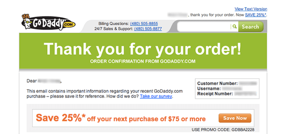
GoDaddy uses a confirmation email to immediately encourage its clients to make another purchase.
Not accepting replies
Very often companies, especially the large ones, email you from an address you can’t reply to. I mean, I get it. People who set up these emails are not supposed to respond to them and a support team is already overwhelmed.
But if you don’t have to, don’t do it. It sends the wrong message altogether. No-reply email is the same as “don’t contact us” included in the last line of a message.
Email is by definition a two-way communication. With a no-reply address involved, it becomes a one-way conversation that reduces engagement to nearly zero (big high-five to that one guy who found the support email address on the web and still replied to that email!). No replies to your emails also don’t help with your email deliverability.
Caveat: A no-reply address makes sense if sensitive data is involved. Assuming you include users’ passwords, credit card details, or Social Security Numbers in emails (which, btw, you shouldn’t), you don’t want users messaging back and forth with your support team.

How to improve:
- Accept responses, simple as that. Make sure they’re routed straight to the support team as they’re usually the best folks to answer your customers’ deepest concerns.
- Hijack some emails if you want to go the extra mile. Maybe you’re a CEO, a Head of Marketing or Customer Success, or another high-profile person that doesn’t normally talk to customers? If you can handle some extra volume, surprise users by giving them a chance to talk to you directly. They’ll be more willing to share their feedback and who knows, might inspire you to build or fix something you weren’t aware of before.

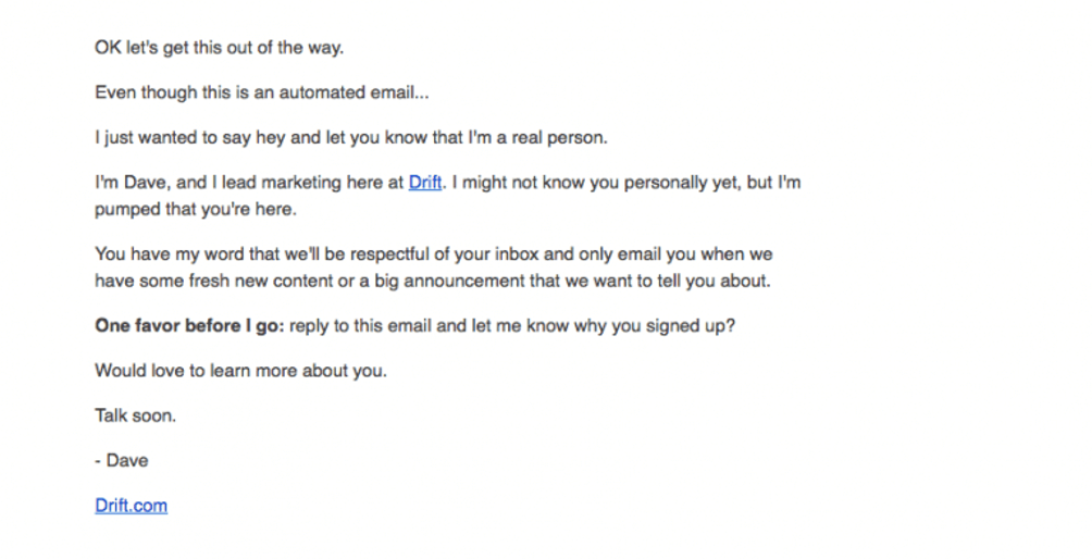
Another example of a very simple email that can go a long way. It’s a great way of gathering feedback and making your readers feel appreciated.
- Pick the right email address. Want to give your customers some extra touch? Medium asks its customers to reach out to [email protected] in case of any issues. You’ve got to admit it sounds better than support@ or sales@ and requires nearly no effort on your end.
- Ensure a decent response time. All these efforts will go in vain if customers wait for weeks to hear back from you. If you’re letting them respond, make sure the incoming inboxes are actively monitored. And if you’re swamped with incoming emails, at least set the right expectations with an autoresponder. Hint: an autoresponder is also a transactional email and needs some marketing attention 😉
Over to you
I tried to share a bunch of excellent email designs throughout this article. Some are very simple, some others could be displayed in the Louvre right next to Mona Lisa. But what connects them all is that they incorporate a lot of good marketing practices into seemingly simple transactional emails. And since they’re so frequently quoted, they must be doing it pretty well, right?
Fingers crossed for you and until the next time!
About the Author:
Full Name: Andriy Zapisotskyi
Author’s description: Andriy is a Growth Manager at Mailtrap, a product that helps people inspect and debug emails before sending them to real users. He has over 5 years of experience in the field of marketing & product. Andriy loves to network with people. Running is his hobby and he enjoys discovering new places. You can connect with Andriy via Linkedin or Facebook and share your feedback on the article directly there.


