A quick look at the ways personalization should be implemented into your website
Jeff Bezos’s vision for personalizing customers online experience back in 1998 has become a reality for many e-commerce sites and is fast becoming a game changer for online retailers. We have not seen personalization be adopted by many of the non-retail web which is interesting. Many businesses still believe that their homepage only needs a ‘one version fits all’ approach, regardless of the fact that it is the main doorway to their business. Businesses spend vast amounts of money trying to market to their customers on a 1-2-1 level but overlook or misinterpret this approach on their website. This shows there is a massive opportunity being missed
“If you do build a great experience, customers tell each other about that. Word-of-mouth is very powerful.”
- Jeff Bezos
So why personalize?
To understand why personalization is so important, take a look at how people interact and engage with websites, and how their online experience affects their buying behaviours. Check it out not only from a content, tone and promotional point of view but also from placement of that content, which is equally important.
We know that an effective website is one that builds trust with its user and influences him or her to take a preferred course of action. From layouts and typeface, to colours and CTAs, each element plays an important role in engaging users and creating profitable conversions. Users crave recognition. It’s human nature and where there is human nature there is the possibility to influence and help.
Remember that users tend to scan websites in a Z- shape or an F-shape. Users like to read from left to right and from top to bottom but on average will only read 20% of your site. It’s critical to make sure what they are seeing is relevant to them.
Mentioning a user by name and using pronouns like ‘your’ helps establish a relationship. Using slang or colloquial language in error messages humanizes a site. Personalized content based on the user’s previous behaviours cuts to the chase and gets them straight to the content they are interested in.
Maintaining consistency in the placement of your personalization helps any user to confidently navigate a website and keeps them on the road to your objective of making a purchase.
Implementing other tactics which invoke feeling of scarcity and urgency have shown to increase sales. Scarcity or limited time offers can be used in marketing to invoke anxiety and fear of missing out (FOMO) and leverage the fear of a shortage to sell more.
Understand your e-commerce sales funnel
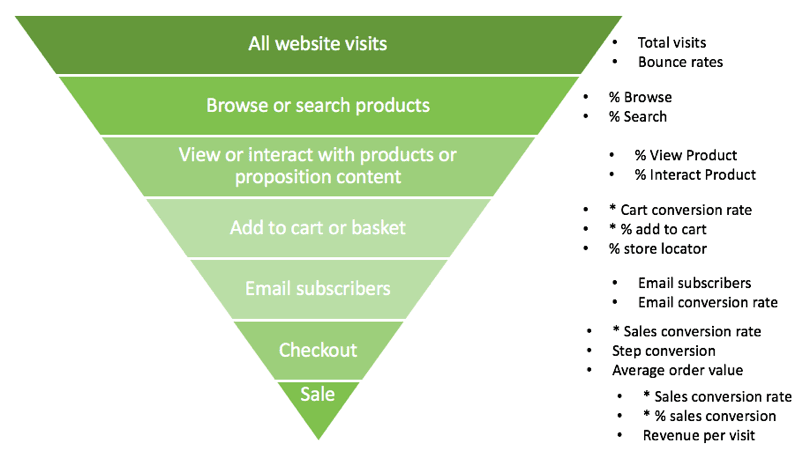
A funnel represents the journey that potential customers travel as they move toward becoming paying customers.
For home page personalization, common goals include to decrease the bounce rate, increase dwell time and increase email subscriber conversion. Mid-funnel KPIs typically refer to product and category pages. It’s simple: the more visitors you can get searching and browsing on your site, the higher your conversion rates will be. With the increased popularity of blogs on e-commerce sites, for which many visits are single page visits only, increasing product page views from these visits has become more important.
For the bottom of the funnel, you will want your personalization to track conversion-to-sale rates, but also values such as average order value and revenue per visit.

Detailed macro (*) and micro-conversion KPIs for an e-commerce funnel
Page types and placements
At a practical level, when planning your rollout and optimization of personalization, you need to decide which pages to prioritize for implementing personalization. You will have many of these page templates or layouts on your site already, but they should be prioritized for improving their effectiveness by adding personalization.
typically, these page template types are the ones that need to be optimized:
- Home page
- Product category page
- Product page
- On-site search results pages
- Offers page
- Mega menus/Primary navigation menus
- Basket
- Order confirmation page
- Lead generation landing pages
- Pop-ups or header/footer bars containing opt-in offer across all page types
Again, there are many other types, which vary depending on your business sector.
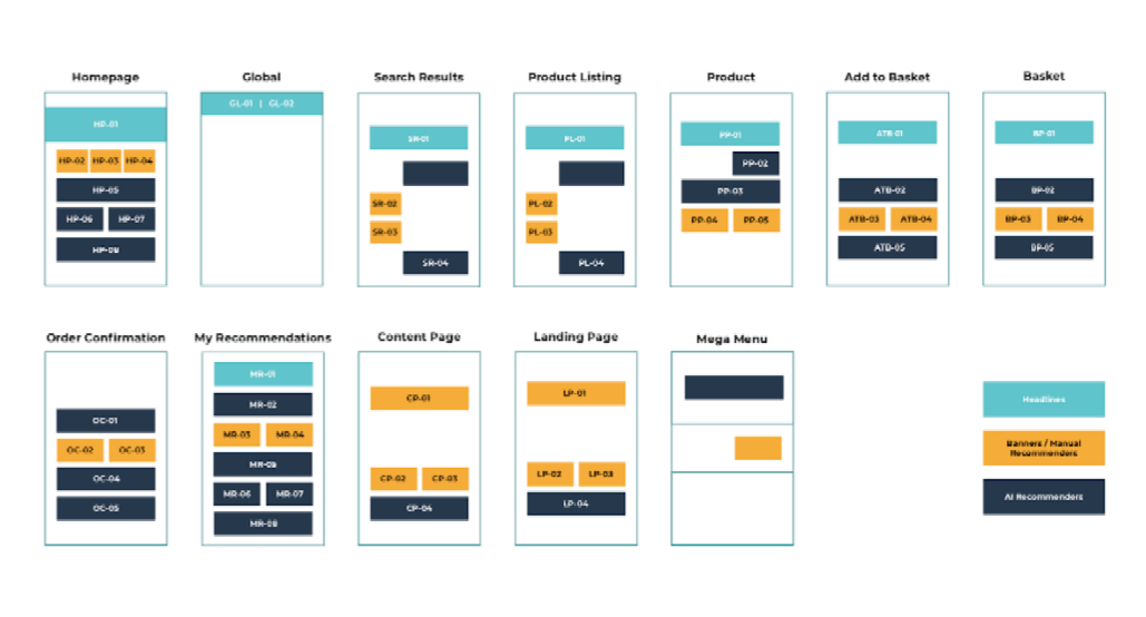
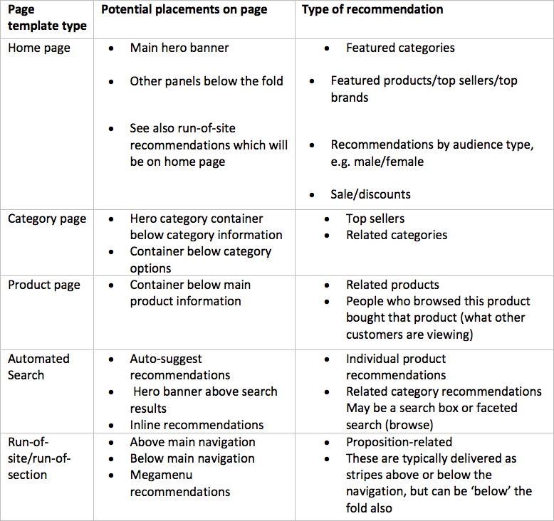
The types of placement available for personalization will be familiar from your site. The most obvious are home, category, product, and checkout pages, but many others are possible. The visual below shows the full range to give you an indication. Search results pages and recommendations within the search box are also important given the proportion of site visits which have search sessions. See the visual below for the essential placements.

Examples of key personalization placements for different types of page template
Here we’ve provided you with a checklist to review your personalization requirements based on options available that you should consider. We also recommend considering run-of-site and run-of-section options where personalization is served across part of the website.

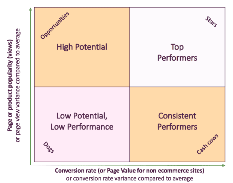
To prioritize your different personalization options, we recommend you consider all the page types on your site as a portfolio, as shown below. Start deploying personalization on your top-performing page types and then roll out the program to the lower-performing pages with less footfall and lower conversion rates.

Reporting and measuring success
As well as reporting on funnel KPIs, it’s key to use specific reports on how well different product offers and discounts work to distinguish between different personalization systems. These should show the number of visitors engaging with the personalization elements and their outcomes, such as clickthrough rates, conversion rates, and revenue generated as a result of being presented with these elements.
It’s important to have a personalization tool which allows you to compare your site performance over time, as well as one which is transparent about how the tool is performing. For example, key statistics such as page impressions, total order value, and overall conversion rate.
Additionally, there should be in-depth reports on each aspect of the tool’s functionality, and their outcomes. The ultimate aim of any performance report should be to provide the user with data on past performance, linked to an obvious action to improve performance going forward.
View the full guide "E-commerce personalization: The complete Buyer's guide to selecting the best platform" to review examples of personalization used in e-commerce and gain access to a personalization recommendations checklist.
Joanne Burman is the Digital Marketing Manager at
PureClarity and has over the last 12 years worked in the e-commerce and digital marketing field across several B2C sectors including retail, healthcare and leisure, helping companies devise clear strategies to grow their online business.From exploring new technologies to try and create a more tailored online shopping experience through to building customer and brand loyalty she has delivered growth targets in all her roles to date.Jo, as well as loving her morning coffee, has a strong belief that data has become the new business currency and the more insight companies have into their customers behaviour the more they can tailor their marketing and e-commerce strategies to enable growth.


