You should strive to add concierge-level service to your e-commerce website’s user experience
We all want to be cared for.
On a business trip to Winnipeg, Canada, Michael Scott’s character in the popular sitcom ‘The Office’ is over-the-moon excited to learn that his hotel has a concierge (a concierge is a hotel employee whose job it is to assist guests with their every need). If you’ve seen the episode, you know that later that evening the concierge’s services far exceed his logistical support needs.
It’s human nature to want to be cared for, especially in this often impersonal world. So you should strive to add concierge-level service to your e-commerce website’s user experience. To make your service ubiquitous and consistent, you should extend this higher level of service to your other customer contact channels.
Download our Resource – E-commerce personalization buyer’s guide
Implementing an effective retail personalization strategy can be one of the most cost-beneficial decisions you can make towards increasing your online revenue, improving your online conversion and building a loyal and happy customer base.
Access the
You can help your visitors in many ways, including:
- Offering a product finder
- Providing online chat
- Answering top visitor questions proactively
- Adding sales hooks to your social channels
I’ll walk through these in detail in a minute. But first I’ll explain why it’s essential to support your shoppers.
Why you should assist your shoppers
I’d like to think that we humans are eager to help for altruistic reasons. However, I know that some people need financial justification for their actions, so I’ll share a couple of them here.
My recent analysis for an online seller of surveillance products found that the Revenue Per Visitor (RPV) was 2.2 times higher when visitors used a product finder tool (I explain what a product finder is below). For this same website, visitors who used online chat had an RPV 3.9 times higher than visitors who didn’t use chat. While your RPV mileage may vary, these data show that offering your visitors assistance produces significant revenue leverage.
Now that we know why you should help, I’ll share how and when you can drive revenue improvements through a concierge selling approach.
How and When to help
Offer a Product Finder
What’s a product finder? It’s a Web-based tool that guides you to the product or service that best meets your needs in a time-efficient manner. It does it by:
- Promising to solve your shopping problem
- Asking you a few questions to clarify your needs
- Offering you a product or solution that best meets your needs
Since they’re tailored to visitors in the consideration stage, you should place Finder entry points early in your website experience, like on your category and landing pages.
Most importantly, the questions you ask should be clearly worded. Be sure to use language your customers would use and avoid any business-speak.
The best part about creating a Product Finder is that you can tailor your individual product - or bundled solution - recommendations to those that maximize your revenues or profit margins. If you’ve integrated an AI-based recommendations engine into your site, you can do this by customizing the application’s rules logic.
Who does this well: Stitch Fix
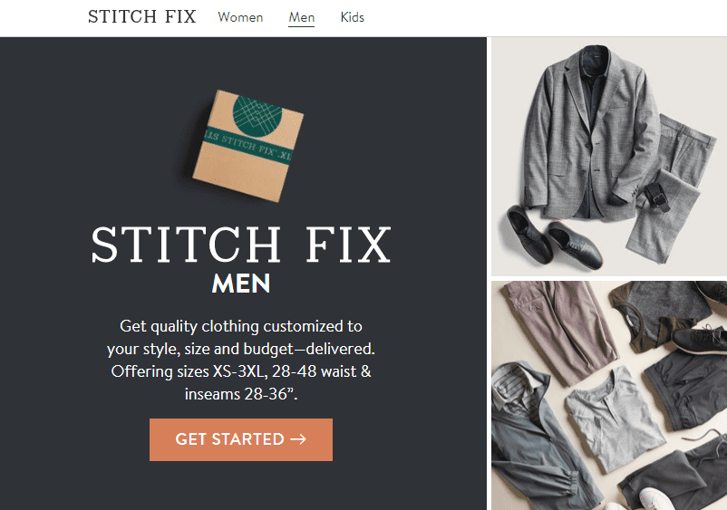
Innovative online clothing vendor Stitch Fix does a great job of offering a personalized selling solution for the sometimes frustrating and time-consuming experience of shopping for clothes. They don’t have any physical stores, so they’d better get their online experience right.
On their homepage they start with their brand promise: clothes customized to your style, size and budget, and delivered.

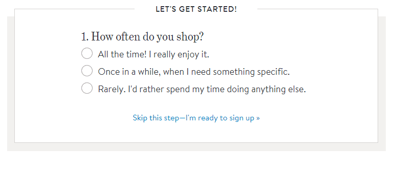
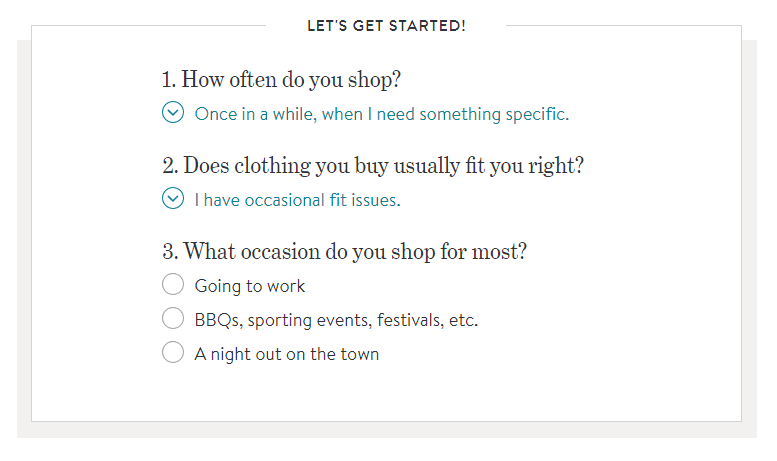
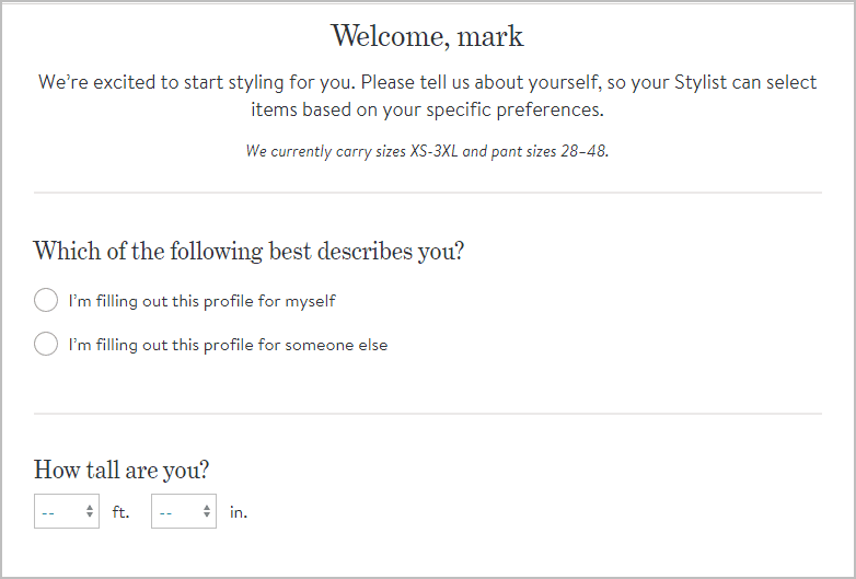
Then they ask the visitor a few quick questions (note: I have not shown all instances in the below screenshots).


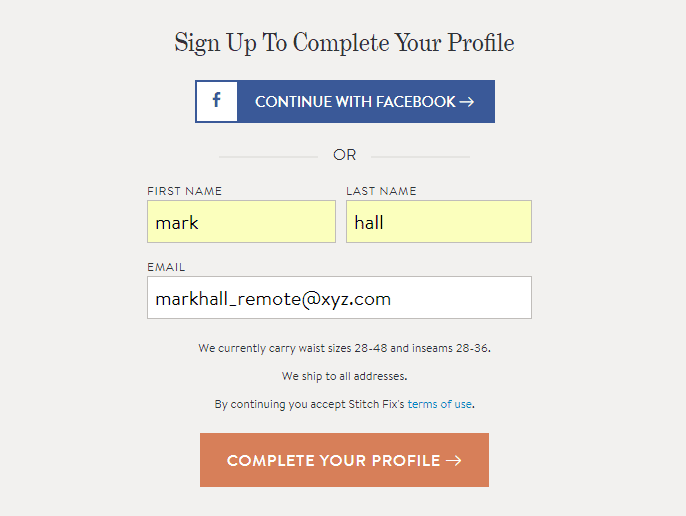
They then ask the visitor to complete’ their profile. Every word matters - I suspect that saying ‘complete your profile’ versus ‘create an account’ increases the completion rate of this form.

Finally, they segue directly into the rest of their profile questions. They ask about eight more questions at this point - quite a few - but reasonable since their visitor has committed to using Stitch Fix by this time.

Note how in this experience they:
- Ask simple questions with only two or three answer choices.
- Use common, comfortable and brand-compliant language.
- Gradually increase the visitor’s commitment through an easy and engaging experience.
- ‘Assume the sale’ (they aren’t asking visitors whether they’re ready to buy, but assuming they are).
We can all learn a lot from how this disruptive brand sells and I look forward to seeing how they grow over time.
Offer live chat
The next concierge selling tactic involves simply being available to help. When your visitors are on your site and have questions, they want help right here and right now. They don’t want to send an email and even fewer want to make a phone call. So you need to meet them at their point of need - with online chat.
I’ve recommended adding chat a lot over the last few years, mainly for the ‘4X’ why reason I mentioned earlier. If you sell stuff online and are serious about making money, you simply must offer live chat, and staff it with agents trained in sales and service best practices.
Another good practice with chat: ‘push’ chat invites to your visitors under certain conditions - for example, when they’re checking out, or haven’t interacted with your category or product page for over 30 seconds. Offering assistance in this way shows that you’re there and you care.
Who does this well: BlueOcean
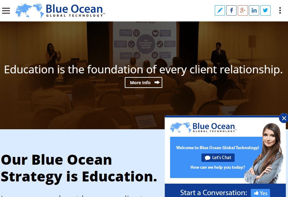
BlueOcean.com, a provider of technology solutions to the financial industry, offers an effective chat solution. They start with the chat invite, which appears about ten seconds into the experience.


Note that:
- The chat invite includes a friendly face (making it more welcoming).
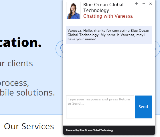
- Their opening question, ‘May I have your name?’, is action oriented.
- The chat window can easily be moved or minimized, putting the visitor in control.
- The chat invite, if minimized, stays pinned to the bottom of the screen.
- The blue color reinforces the Blue Ocean brand.

Also, about once every minute the chat app makes a chime sound to remind the visitor that it’s still available. Not annoying or interruptive, but more like a gentle reminder.
Answer top questions proactively
Product finders and chat are great reactive selling approaches. But a proactive approach is always preferable since it prevents questions from arising in the first place.
Think of a website that ‘read your mind’ as you used it - understood what you wanted, smoothly guided you to the right product, explained why that product was best, and supported you along the way. That’s the customer-centered approach you should seek.
So, how do you get inside the mind of your visitors? By doing a little visitor research. Plug in a tool like HotJar and review the analytics it provides after a few weeks. Talk to a few customer support agents to discover your prospect’s top questions, concerns and complaints. Finally, summarize what you learned, then prioritize and fix the top user experience issues ASAP.
Who does it well: Quickbooks (by Intuit)
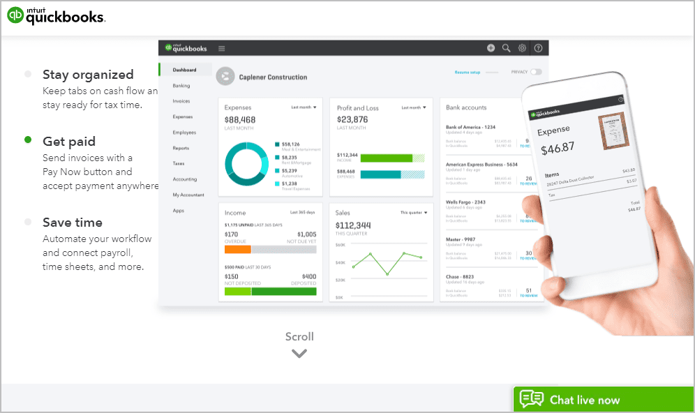
At a quick glance, the Quickbooks website shows the top features and benefits of its tool: organization, easy payments, time savings, nice interface and on-the-go access via the mobile app. What’s more, the picture-centric presentation appeals to our visual senses, which improves brand memory.

A grayscale ‘scroll’ symbol gently guides the visitor further down the page.
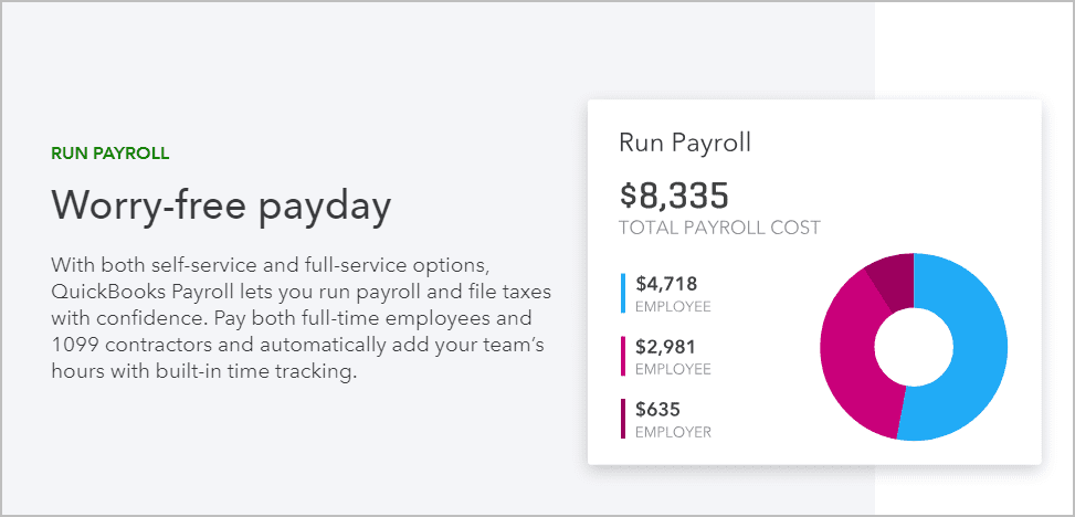
Here’s a mid-page screenshot of the ‘payday’ panel. Very cleanly presented indeed - and who doesn’t want ‘worry-free paydays’ and an easy-to-read graphic?

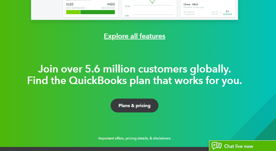
Further down the page, they show their main call to action: a ‘Plans and Pricing’ button, plus the ‘over 5.6 million customers’ social validation. All the content to that point has cleverly guided the visitor, just like a good salesperson, to the desired action.

All the while Live Chat sits there in the bottom right corner, persistent and supportive. The brighter green colour matches their brand palette. Yep, I think QuickBooks and Intuit have nailed the goal of proactively addressing expected questions, and without the need for extra navigation.
Add sales hooks on social channels
Over the past several years, social engagement with prospects and brand advocates has obviously exploded. Information-hungry followers expect to engage with brands anywhere and anytime.
If your brand depends on social traffic to attract and nurture customers, you should leverage the tactics I’ve just described, but ‘social-ise’ them.
For example:
- On your Instagram and SnapChat accounts, offer ‘finder’ or ‘support’ bots, automated tools that drive your members to the next stage in your funnel (of course, you first need to get them engaged with interesting content and discussions).
- Within your branded apps, include links that facilitate ‘shopping now and buying later’. For example, after capturing your visitor’s email on a form, send them a couple of follow-up emails asking 2-3 questions at a time (perfectly suited to short interactions on mobile phones).
- Add links from your lead-generation websites to your e-commerce site, so that after you’ve built trust you can go for the sale.
The American Express 2017 Customer Service Barometer survey showed that Americans are more likely to post about good experiences (53%) than poor experiences (35%) on social media. So continuously monitor your social channels to ensure these interactions are predominantly positive.
Example: Starbucks customer feedback page
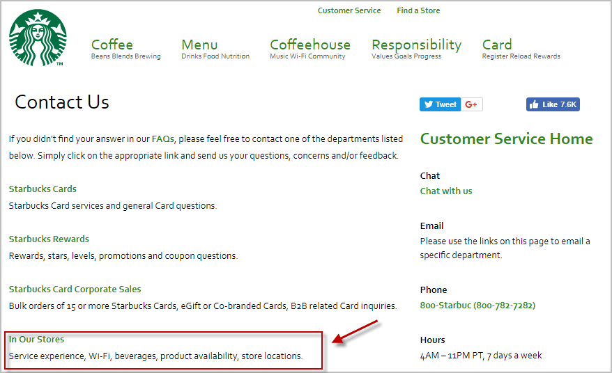
Starbucks, in the ‘Customer Service’ section of their website, offers several contact options, including one to send feedback about the experience, beverages, products, even WiFi.


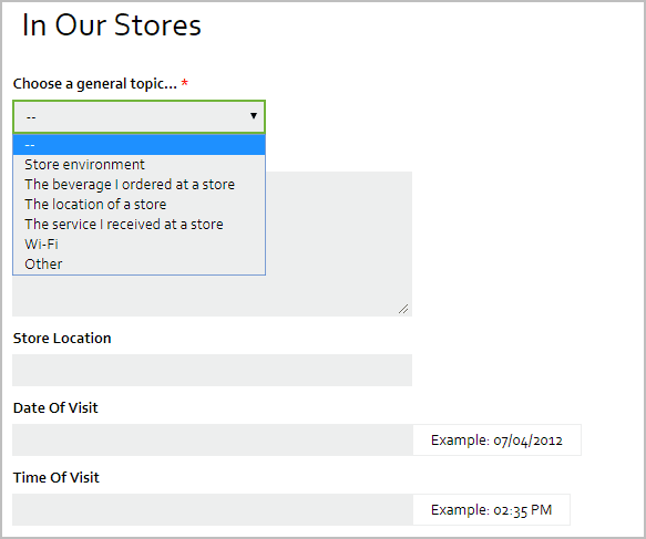
The form includes a topic selector, which helps to pre-organize the feedback. The form also collects specific visit details. This feedback mechanism could be made even more accessible and effective by including a ‘We value your feedback!’ link (or button) in the site header area.
Start doing proactive and reactive selling
Creating a more customer-focused - and, best of all, higher converting - e-commerce website experience isn’t rocket science. It starts with being proactive: spending a little time observing and speaking with your prospects to discover their questions and concerns at each point in the shopping process.
But since you can’t anticipate every question or concern that will arise, you’ll need to offer some reactive support, too. Adding well-designed product finders and online chat backed by well-trained agents will cover any support ‘holes’ you may have.
After investing a modest amount in staff, tools and website development you’ll most likely see your revenues and customer satisfaction metrics on the rise.


