Product pages do more than just represent the product, they help build a relationship with the customer, giving them every reason to open their wallets and make a purchase
For many webmasters, creating a winning e-commerce product page may not seem as sophisticated as to write an entire article about. After all, all product pages have the same purpose and many other crucial aspects come to play in converting the customer.
However, in today’s e-commerce landscape, simply uploading a product, adding some details and then laying back waiting for sales to happen is overly superficial. The dawn of smarter algorithms, more inquisitive online shoppers, and rising competition between brands has given webmasters a lot to think about. Product pages now do more than just representing the product, they help build a relationship with the customer, giving customers every reason to open their wallets and purchase the product.
Therefore, the task is not simple, because now you are in for creating a product page that is not just pixel perfect, but also fun to browse. Product pages are not just good for information, but make a great platform for nurturing your potential customer. Without a properly optimized product page, you cannot expect to convert, let alone engage a customer within your target segment.

In this article, we take the opportunity of sharing special insights on designing successful product pages and some field-tested methods that e-commerce vendors must implement to create customer-winning e-commerce product pages for their online stores.
Unlike many other guides that cram design theories down the merchant’s throat, we have taken a more researched path to offer field-tested methodologies that yield high conversion results and stimulating user experience.
What it means to have a well-designed product page
In the world of e-commerce, creating a high converting-product page is a bit of an art form that demands several key aspects put in order. A well-designed product page instills the customers' interest and prompts the desired response that culminates into a purchase. Moreover, it compliments your digital footprint, engenders trust within the audience, and effectively conveys your brand message through the product. As it acts as a gateway towards completing the checkout process, it also matures the lead ensuring it does not abandon midway.
Having impressive product pages are imperative to your online business goals but need a great deal of effort to bring them up to mark. Fortunately, they require a minimum investment and can be easily redesigned and maintained with the right resource or digital partner.
According to a recent survey, the average conversion rate of online visitors was found out to be between 2% to 2.5% in their usual homepage to product page journey.
Surprisingly, the conversion rate of visitors who land directly on a product page is approximately 7%. This means a well-optimized product page can convert 300% more against the normal buyer journey on an online store.
“Access
This Quick Win will help you to review your approach to writing product page content on both B2B and B2C websites.
Access the
Write a compelling product copy
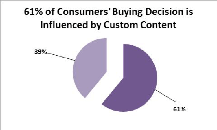
Well-written product copy has the potential of drawing 7.8 times more site traffic and produces a much higher brand recall and engagement rate.
A winning product page is the combination of different web elements joined in harmony. While the aesthetics certainly give an edge, a well-placed, informative and persuasive product copy plays a huge part in engaging the customer and influencing purchase decisions. Here are some tested tips that can help you make a visible difference through your product copy.
- Use ‘Above the Fold’ methodology to capture customer’s interest the moment they land.
- Add catchy headlines, catchphrases, and slogans for your copy.
- Choose an appropriate style of writing such as technical, scholarly or freestyled.
- Make sure your SEO objectives are thoroughly met in the copy.
- Write your copy based on your target user so it is instantly recognizable.
- Highlight its key features by organizing them in bullets.
- Focus more on your product’s functional aspect than marketing elements.
- Inspire your customers through techniques such as storytelling.
- Add questions and exclamatory remarks to create an implicit bond between your brand and the customer.
It is best that your product copy is relevant, concise and digestible. You can add bullets to highlight the key points, use clean typography to make the text readable, and
add product tabs to organize your content so it becomes more apparent. Your copy should also reflect the company’s tone of voice and remain inherently clear when fused with marketing language. You don’t want customers to see you exhibiting self-importance.
Improve your page loading speed
A delay as small as 100-millisecond can lead to a 7% drop in conversion rates
Speed is hard to trade, especially when your store sales depend on it. In e-commerce, product pages are meant to be fast and snappy, and therefore demand uncompromised loading speeds to start with.
A laggy page will not only kill the confidence in your customers but also breed impatience and bad temperament in them. In the end, it takes a heavy toll your product page’s retention and bounce rate which undermines your site analytics.
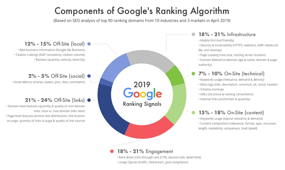
Page loading speed is also a key metric in Google’s ranking algorithms which means neglecting it will directly impact your position on Google SERPs. When a page loads slowly, search engines crawl fewer pages since their crawl budget is specifically allocated. This keeps Google from indexing your pages.
Here are some tips you can use to effectively improve your product page loading speed,
- Enable compression by reducing the size of your CSS, HTML, and JavaScript files.
- Optimize your code by minifying CSS, HTML, and JavaScript. Remove unnecessary commas, spaces, comments, and formatting.
- Reduce the number of redirects to avoid additional time for HTTP request-response cycle.
- Find performance bottlenecks such as slow routing, database queries, and lack of memory to six server response time.
- Clean your browser cache every year to improve site speed.
- Work with content distribution networks (CDNs) so your customers have faster and more reliable access to your product pages.
- Optimize your product images so they are the right size and format. Use CSS sprites so large images can load all at once.
To get a good idea of where you stand, you can use tools such as Google’s PageSpeed Insights which provides a comprehensive report on your current page loading speed. It also provides recommendations for increasing your site speed according to your current status.
Search engine optimize your product page contents
36% of SEO experts think the most important SEO element are title tags.
Lack of proper insight in digital marketing often leads to poor judgment when designing your product pages. Later on, it can prevent webmasters from measuring and keeping track of their progress along the way which directly impacts their business goals.
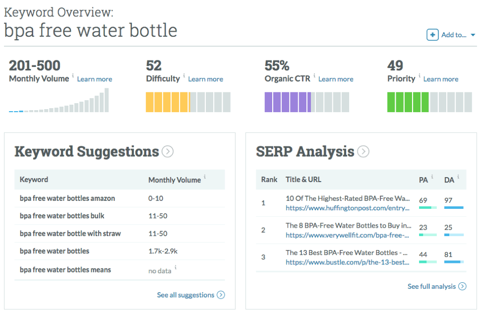
There are numerous SEO and keyword research tools you can use to discover search volume, cost per click, and keyword competition. Tools such as Ahrefs, Moz, Majestic, or SEMrush provide a complete insight into your SEO KPIs you can effectively rank your pages. Here are some tips that will immediately help you in getting your product page content optimized.
- Use appropriate meta description and focus on title tags optimization
- For clarity use descriptive headers
- Strengthen your internal linking by linking internal pages
- Add Alt attributes for Images
- Make your product copy unique to avoid plagiarism
- Make use of rich snippets for structured data markup
Add impressive HD product images
Adding attractive product images next to your textual content has images can increase your average views by 94% than your counterparts.
In e-commerce, product images are not just important, they are everything. Unlike brick and mortar stores where customers own the privilege of thoroughly examining the product by hand, online stores have to compensate that with something equally appealing and captivating, one that prompts a sensational experience when the customer views it. This is why you must have a great standard of quality for your product images because customers need to visually scrutinize these elements to be convinced into buying it.
While product images make an excellent tool to invoke acknowledgment from the viewer, they come to a lot of responsibility. To make sure your product images are on point, here are a few tips you can use to optimize them
- They help give customers a visual overview of the product’s textual description
- They provide a more profound understanding of the product’s features
- They enhance the aesthetics of the product by showing it in better angles and with better light
- They captivate the viewer through product zoom options, lightbox view, and product label and stickers, etc.
- They effectively deliver the product’s value proposition, highlighting its core features
- They serve a good source for SEO optimizable content to improve product page rankings
- They help in building buyers trust by informing the viewer about the product dimensions
Using white spacing to your advantage
According to research conducted by Human Factors International, whitespace increases comprehension by almost 20%.
White Spacing is a cosmetic element that makes an essential part of your product page design. White spacing allows webmasters to separate different elements from one another, giving a disciplined layout of their product pages.
It helps generate a clean, simple, and minimalistic look and feel that defines your content elements and aesthetics. More importantly, it cuts away the clutter of dense text and frivolous functionality, making your content accessible and digestible for the customer. Here is why white-spacing is crucial for creating a winning e-commerce product page.
- Increased the legibility of your content by organizing your paragraphs, blocks of text and images.
- Yields more interaction by preventing distractions and drawing attention towards the targeted area of your product page.
- Gives more visibility to CTAs by making them look more prominent. This directly improves your conversion rate.
- Makes your product pages look more impressionable, elegant and superior by elevating your layout, color schemes, and design template.
- It helps create balance by eliminating disorganization and unreliability and highlighting the designer’s ingenuity and finesse.
- Separates unrelated elements that streamline overall visual layout. This helps webmasters communicate their brand messages more effectively.
When customers arrive at your product page, white spacing effectively helps them direct towards the target elements and generate a better user experience. However, overdoing white spacing can also counterproductive for your page design so it is wise to use it appropriately.
Make your website mobile responsive
94% of people judge e-commerce websites on responsive web design.
Being mobile responsive it utterly critical for e-commerce stores today. If your images cannot open in mobile devices, they are no good to your visitors. Over the years, faster internet facilities, more powerful smartphone devices and widespread internet access have fostered a growing percentage of mobile e-commerce throughout the world. Below are some advantages of using a mobile responsive design for your e-commerce store.
- Your product page content becomes accessible across all screen resolutions.
- Renders a unified view on any device making content scalable and easy to navigate.
- Provides an optimal experience for customers with minimum resizing and scrolling.
- Translates a positive perception about your store, increasing the chance of return business.
- Establishes a key ranking factor since mobile-first indexing is recognized by Google.
- Makes social sharing faster and easier, helping reach a bigger audience and higher conversion rate.
- Minimizes your store management since you only have one website to look after
- Significantly saves costs on online marketing and website maintenance.
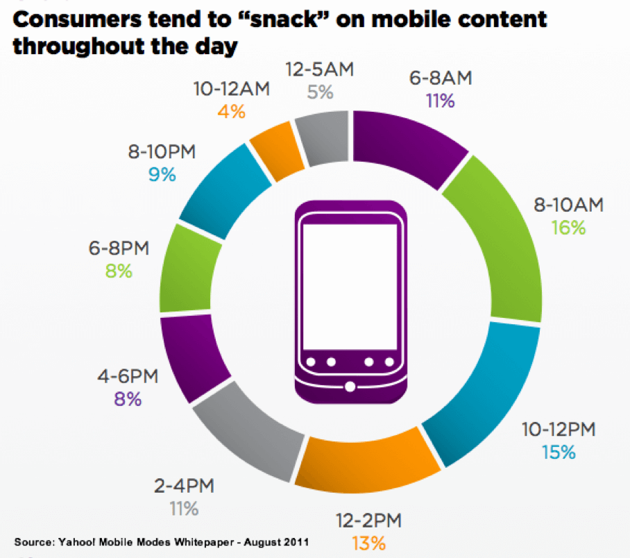
Now mobile commerce accounts for more than 50% of all online shopping and continues to increase rapidly so failing to acknowledge its significance can be highly detrimental to your sales.
Aside from our six key pointers, here are some bonus suggestions for product images that we found highly useful.
Deliver actual images
Showing actual dimensions of your product is the key to building a trusting relationship with your customers. often, online merchants take their own creative liberty and airbrush the product and its size dramatically in pursuit to overwhelm the customer. Sadly, when the product arrives and surprisingly appears otherwise, the customer not only loses trust but also takes the opportunity to tarnish your brand image nice and proper. There is also a refund you will likely have to deal with afterward.
Multiple images
Showing multiple images provides the visitor with a comprehensive understanding of the product and details its various features more vibrantly. It reveals the different angles of the product and induces the sensation of the in-store experience for the customer. You can create a media gallery and organize it in albums to offer a variety of images on your product page. Doing so you will serve a profound store experience and significantly increase your product page’s conversion potential.
Final takeaway
Ecommerce is the latest mode of business and adapting to its interventions is the only way to grow your business and deliver a better experience to your customers. While sales might be a sound metric of your e-commerce success, having good product pages is what’s worth celebrating for. Using these six pointers to experiment and test elements on your product pages, you will not only be able to identify conversion drivers for your landing pages, but also engender a stellar user experience for your customers.
Mirza Irfan is a web design and ecommerce expert who writes for
FME extensions, a web design and development agency based in Austin Texas, USA. He has a passion for helping people find innovative solutions in online marketing and has written numerous blogs on design science, AI technology, digital marketing, and business strategy. A writer by day and a reader by night, you can find him on
LinkedIn.


