9 Key Content Types For Your Ecommerce Site
With so many ecommerce websites in each category, how can a retailer cut-through if they're not a 'high street brand'?
And while each of them is unique in their own way, they all have something in common too. They aim to deliver what their visitors expect to find, from products to great user experience AND useful content.
Content is the backbone of today’s marketing strategies.
Be it a short snippet in an AdWords ad or a lengthy blog post, it helps you to attract new visitors and build an audience.
But there is another type of content - the generic information about your store, which should be available right from the home page that convinces users to buy from you.
Here are the 9 content types every ecommerce site must have.
1. Shipping Information
You know that, to many shoppers, the cost of shipping is one of the key factors in the buying decision. So is the time it will take to get the item delivered. And nothing is more irritating than finding out at a checkout that your store doesn’t ship to a customer’s destination or it costs even more, than your purchase.
And therefore, display clear information about shipping options you offer, prices, delivery destinations and carriers you use.
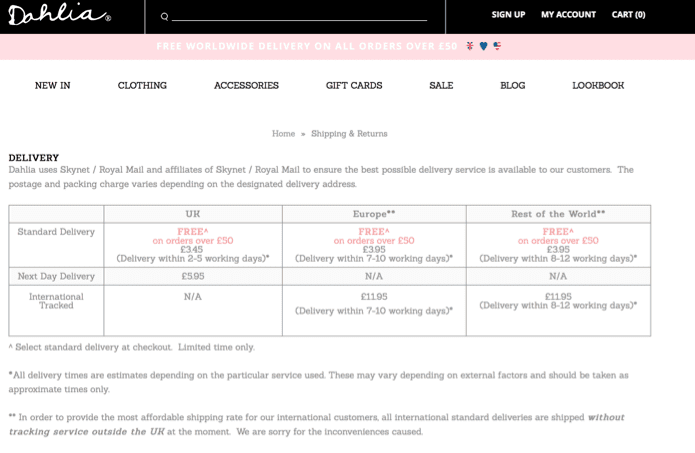
Dahlia displays their shipping info in a nicely laid out table:

2. Offers
Offers are often the main thing that drives visitors to buy. But, if your store regularly features offers, promotions or deals, create a dedicated page for customers to quickly discover how they could buy and save on your site.
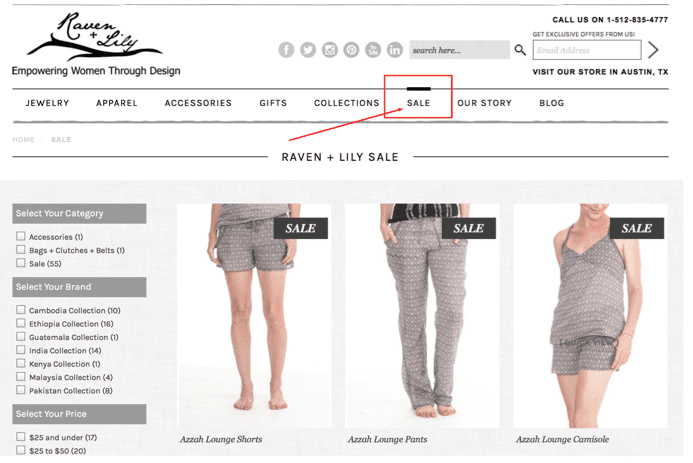
Raven + Lilly features a dedicated Sale section giving visitors a quick access to their recent promotions.

3. Payment Options
28% of customers will abandon the purchase because you don’t accept their preferred payment method, at least according to Mobile Marketing Magazine.
Of course one way to prevent this is by accepting all major payment methods. But that’s not always feasible.
If that’s the case, use content to convert customers whose payment method you don’t accept. Display clear information about how they can pay for items. And if you don’t accept a popular method (i.e. PayPal), explain your reasons why. Being transparent about it might help convince some customers who prefer this method to use an alternate one on your store.

4. FAQ
A study by Forrester discovered that as many as 72% of customers prefer to use self-help option rather than reach out to a company.
And thus, having an up-to-date knowledge base is crucial for providing satisfactory customer service.
Your knowledge base section of the site should include information about your products; advice on best usage practices, answers to most common customer questions, troubleshooting advice, T&Cs and other information that would help customers overcome their most common problems.
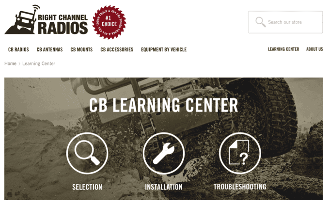
Right Channel Radios features a full Learning Center section helping customers find out more about their products, troubleshoot usage problems and answers most common questions.

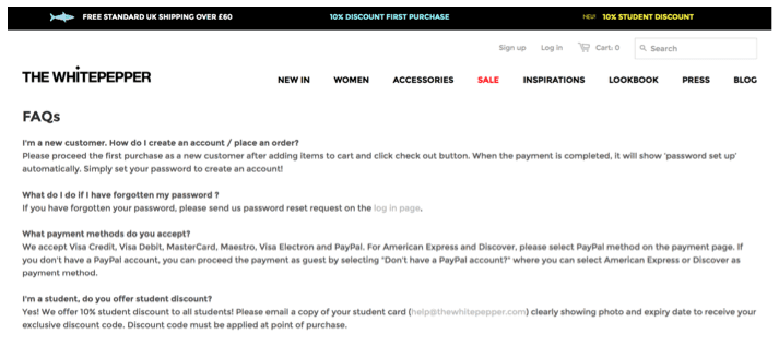
The White Pepper features a Q&A style FAQ page:

5. Support Information and Contact Details
Clearly visible contact and support information put visitors at ease that no matter what happens, they will be able to get help.
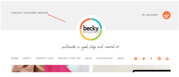
Becky Higgins’ site features a very prominent link to customer service page, right in the header.

6. Returns Policy
A clearly visible return policy not only informs clients about steps they need to take if they need to send an item back.
It also reassures them that you will be there for them if they need help or simply aren’t happy with a product.
And quite often, if customers aren’t sure about purchasing from you, be it because they don’t trust you or have doubts if the product is for them, a clear returns policy may help them make that decision.
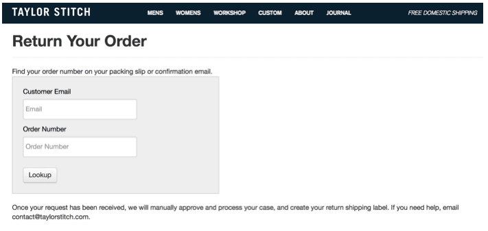
Taylor Stitch requires a log in with order number before displaying their return policies.

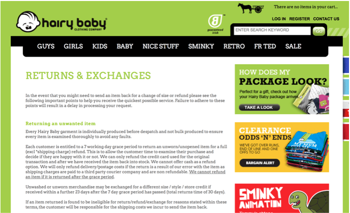
Now compare it with Hairy Baby’s long and detailed Returns page.

Which one would help you make a buying decision?
Part 2. Content You Should Be Using to Attract Customers
None of your traffic happens by itself. But just as you could use a number of marketing strategies to attract visitors, you could also use content on your site to the same effect. And here are the content types that could help you with that.
7. Blog
There’s plenty of stats to prove the value of blogging. For example:
- Companies that blog generate up to 67% more leads per month (source).
- 77% of B2C marketers use content marketing (source).
- 54% of B2C marketers rate blogs as the most effective tactic for driving targeted traffic to the site (source).
It therefore, goes without saying, a blog is a perfect tool to attract new visitors to your site. But the question is, how?
Let me illustrate the value of blog using the upcoming holiday shopping season as an example.
Soon thousands of customers will begin their search for that perfect Christmas gift. In the process, they’ll turn to Google or other search engines for suggestions. Blogging offers an opportunity to intercept those customers at a time when they’re the most likely to buy. And you can do that by posting shopping and gift guides to help them pick that perfect offering.
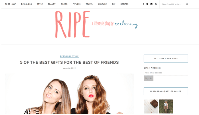
Zeeberry runs The Ripe, a lifestyle blog as part of their site:

8. Reviews
Did you know that 61% of customers will read reviews before deciding to buy? (source)
Or that 77% of travellers will not book a hotel without first reading its reviews? (source)
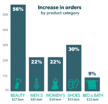
And so, not displaying reviews on the site greatly diminishes your chances at converting a visitor. Just take a look at this graph. It shows the estimated effect of increasing the number of reviews from one to 15 will have on the number of orders across different industries (according to Bazaar Voice):

And so, allow customers to leave review and rate products. And don’t worry about negative reviews. In fact, having them might also help your conversions. According to Econsultancy, having negative reviews could increase conversions by up to 67% (source).
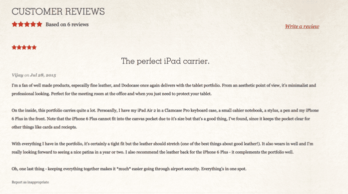
Dodocase features Reviews section for each of their products.

9. Social Proof
Lastly, show your customers that others have been buying or engaging with your store too.
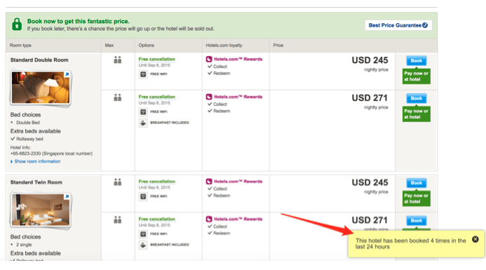
One way to do it is by displaying the aforementioned reviews. Other, by showing other customers’ behavior.

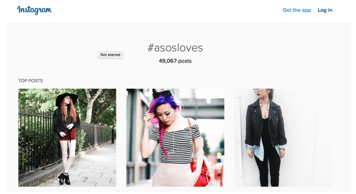
You could also feature photos of customers using your products.
ASOS for instance, asks their customers to tag photos of them wearing the company’s clothes on Instagram with #ASOSLoves hashtag.

And if the company likes a photo, they’ll repost it to their Instagram stream.
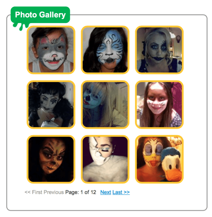
Snazaroo, a store selling face painting accessories asks their customers to send photos of their painted faces. The company then features them on the site.

Conclusion
One of the best ways to increase conversions is by presenting your visitors with the content they’re looking for at their current stage of the buying cycle. From information to help visitors to pick you to blog posts to attract new visitors, your store should boast with relevant and timely content.


