Landing pages are a key tool in your CRO arsenal
So, you’ve already invested a considerable amount of time, money and resources on developing a fully-functional and navigable site.
What next?
You plan to set a budget for PPC ads, social media and email marketing in order to drive traffic to your site. Great! But what happens when a visitor clicks on your PPC ads or links on your social media profile? If they land on the company’s homepage, you’ve already failed! Remember, you don’t just need to drive leads to your site; you also need to convert them. This is where landing pages come to your rescue. They help you convert your web traffic into qualified leads.
In case you’re still looking for reasons why you must invest in landing pages, check out these stats:
- Companies see a 55% increase in leads when increasing their number of landing pages from 10 to 15. (Source: Hubspot.com)
- Companies with 40+ landing pages get 12 times more leads than those with 5 or less. (Source: Inboundmarketingagents.com)
- The general conversion rates are 1%. However, landing pages help top 25% companies score an average conversion rate of 5.31% or higher. (Source: Searchengineland.com)
- 80% of all traffic goes to the top 10% of landing pages. (Source: TrcuConversion.com)
Now you understand why you need to create creative landing pages that attract click-throughs and conversions. But creating the next generation conversion-focused landing page experiences that you need to excel is easier said than done. And the big question here is how would turn your landing pages from “so-so” to “wow” and stand out from the crowd? The answer is simple! You'll need to embrace the trends of tomorrow to stay ahead in of the game.
In order to help you deliver maximum value with your creative landing pages and minimize the impact of ever-changing and demanding market, here’s a list of 5 innovative, upcoming landing page trends.
Trend #1: Contextual Landing Page Video Will Rule The Roost
An article reveals that videos used on a landing pages can increase conversions by up to 86%. Contextual videos on landing pages are effective in attracting click-through and persuading visitors to take the desired action. Remember, over 90% of people prefer videos over plain, static text. And given the ever-increasing popularity of videos, soon contextual videos on landing pages would be the norm, rather than the exception.
Check out how Canary brilliantly uses contextual videos to its advantage.
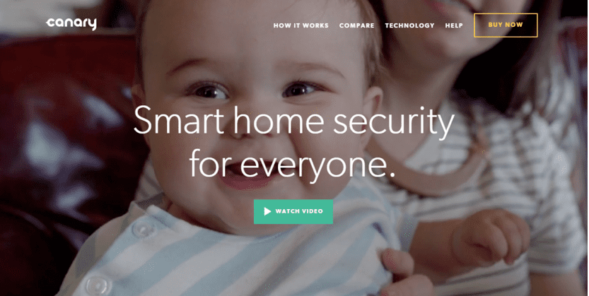
So, this 2016 try exploring the potential of contextual videos in landing pages. But in order to attract sales right from the outset, you’ll need to ensure that contextual videos on your landing page resonates with your target audience in the best way possible. So that whenever they look at the video, it’s their experience, their voice, their taste they see.
Trend #2: Interactive Content will Take Center Space on Landing Pages
With the overabundance of static web pages, users have become desensitized towards traditional sales centric landing pages. More and more consumers now want and essentially demand more personalized and memorable landing page experience. And this realization is pushing a lot of designers and marketers to change the way they conceptualize and create landing page designs with interactive elements that invite user’s active participation, beyond just visuals and videos. We’re likely to see popularity landing pages with interactive elements rise considerably in 2016.
Here’s an example of such landing page from CommVault. The popular storage solution provider uses an interactive calculator on its landing page to tempt its visitors into clicking.
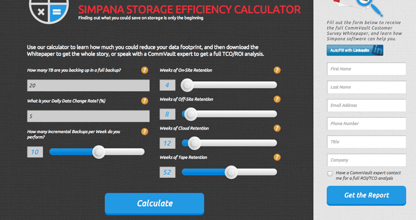
If you’re planning to invite user interaction and participation, it’s vital that your interactive elements capture your target audience’s interest right from the get-go. Make sure everything on your landing page—from interactive element to the overall voice of the design—all come together in a way that makes visitors want to know more about your brand, want to stay.
Trend #3: Long Landing Page Will Become the New Oprah
Last year, long landing pages were a big hit. Such landing pages allow businesses to strategically place several CTAs to ensure multiple conversion points. Remember, CTAs are the key to conversion. In such landing pages, each section facilitates conversion. Every element on the page, right from images to the copy and headline seamlessly blend together to guide users to click on the CTA whenever he or she is ready.
The popularity was spurred on by the likes of Basecamp embracing the trend of long landing page trend. Each section of the landing page has its own CTA. It features three large CTA buttons that help the company convert users at any given point on the landing page. Here’s just one section of the Basecamp landing page.
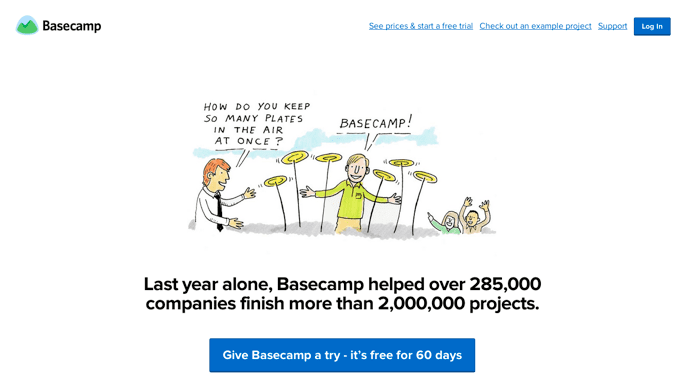
We’re sure long landing pages will continue to make waves this 2016. The reason is simple and clear: Landing pages with more CTAs stand a higher chance of conversions. But remember to strategically place the CTAs.
Trend #4: Simple and Minimalist Landing Page Design will Rock
Landing pages with simple and minimalist designs work the best. Landing pages with fussy, elaborate and even ostentatious designs are the worst to pull off conversions. This is why we’re sure to see more landing pages this year simplify.
A simple and minimalist landing page features all the information that the website wants to convey to the visitor. The design and colors used should appeal to the emotions of the visitors. Unnecessary graphics, colors and texts make the landing page look cluttered and messy so put off visitors. On the other hand, minimalist design cuts through all the clutter and makes it easy convey your message effectively and efficiently.
Square Space’s landing page is a great example of minimalist landing page that never fails to impress and inspire visitors with its elegant design.
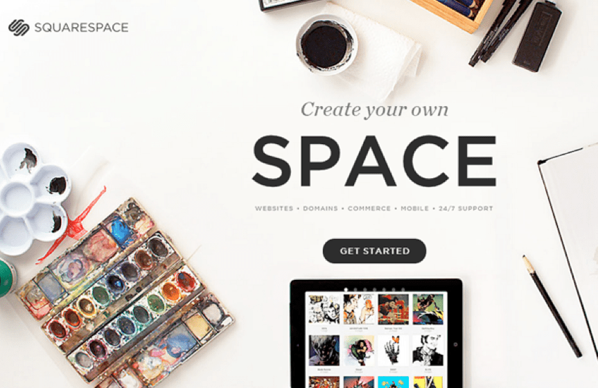
If you’re looking for a landing page that helps you amplify conversions, ensure your brand’s personality features strongly in your landing pages.
Trend #5: Illustrations will Become Popular Than Images
Here’s another 2015 landing page trend on the list and it looks to be going strong this 2016 too. Landing pages with illustrations are set to take center space this year. Illustrations help you add personality to your brand and gets your users interested in taking the desired conversion action on your landing page. No wonder, a fair share of marketers and designers prefer illustrations over images in their landing page designs.
Take the example of Shape. See how beautifully its landing page uses illustrations to catch the attention and interest of its visitors’ right from the get-go.

If you too are planning to use illustrations in your landing pages, do well to emphasize your brand, and share your brand story through great illustrations. You may use even use your company’s custom logo design or animated illustrations to stand apart from the rest of the crowd.
Over to You!
Clearly, building a landing page that converts isn’t rocket science. But you need to look out for up and coming trends to stay ahead of the curve. So, if you’re at the helm of creating a landing page to convert strangers to your site into paying customers, don’t start your efforts without getting up-close and personal with these innovative trends.

Thanks to
Alice Jackson for sharing their advice and opinions in this post. Alice Jackson is a Blogger and Marketing Consultant at a crowdsourcing company,
Designhill. She is a social media enthusiast, online market analyst, amateur designer and an avid author. She has written on several topics including social media marketing, content marketing, designing trends, startup strategies, and e-commerce. When not writing, she loves spending her time reading romantic novels.


 Thanks to


