Words aren’t enough, you need to step out of the box when it comes to engaging the audience
Do amazing marketing campaigns always come from huddling around a whiteboard as a team or working in isolation, or even worse staring at a screen for hours upon end - Agree or not? Definitely Not! I mean if this is the scenario, then how would every major social network, including Facebook, Snapchat, Instagram, and Twitter, make themselves better day in day out. You have to work on the go to come up with a fantastic idea.
Download our Free Resource – Top 10 common content marketing mistakes
Our free content marketing mistakes guide reveals the most common mistakes, but more importantly, what to do about them.
Access the
If we talk about marketing in the earlier days, SEO was all about getting higher rankings by using all text, with no focus on visuals. This old school strategy no longer works. Words are no longer enough, you need to step out of the box when it comes to engaging the audience. This is where great visuals can really come in handy and make you stand out from the crowd.
It may quite interest you to know that around 65% of people are visual learners.
The following post help you will refresh your love-hate relationship with images from photographic to infographic, and even your love-hate relationship with GIFS. After all, we know this content type causes an innate psychological resonance with our audience, right? Let’s delve into the details.
The significance of Visual Content
- Numbers never lie: According to studies conducted by Visual Teaching Alliance:
- Eyes can process 36,000 visual messages per hour.
- The sense of a visual scene can be felt in less than 1/10 of a second.
- 90% of information transmitted to the brain is visual.
- Brain process visuals 60,000X faster than any text.
- Triggers Reaction: There is no denying the fact that visuals are processed better, and they produce much faster as well as a stronger reaction than any other type of content. Scientifically speaking, visual stimuli, and emotional response - such as surprise, shock, happy, inspired, confused - are linked together in the brain, which leads to making memories.
- Increases Engagement: A picture is worth a thousand words. Nothing works for humans like telling them a story. Remember how our grandmas used to create one? Quite similarly, businesses must come up with a story that is relevant to your brand, engaging and sticks to your marketing objectives.
Visual content types include:
- Images/comics/memes
- Videos
- Infographics
- GIFs
- Presentations
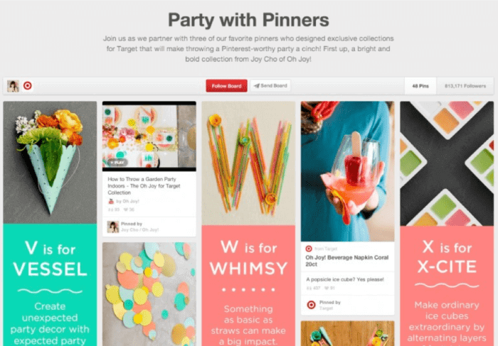
For instance: Target’s Pinterest strategy is a good example of using visual content in the right way. Target is a brand that serves as the best example by using sites like Pinterest to stand out. It has numerous Pinterest boards and uses different strategies for each board.

Pinterest is a platform where it can be easy for brands to come off as very generic and typical. Most of the time, brands happen to post images of their products, which might work, but that method isn’t always as engaging as a graphic that combines both images and text. Target’s 'Party with Pinners' board does an especially good job of sharing images that are fresh, fun, and engaging, as well as that share a message.
The Smarter Pinterest marketing guide for Business members helps content marketers make optimum use of Pinterest's potential by taking you through the steps of creating an online presence or reviewing your existing approach with lots of inspiring examples of how businesses and brands are engaging their audience through their boards and campaigns.
Implementing your visual content marketing strategy
Not every kind of visual included in your content is the same, so they won't work in the same way. Visuals are only successful when they are used in the right place. Adding a stock photo to your tweets, for example, doesn’t work these days, you need to be more interesting than that. Here are a number of techniques that can help visuals in your content be effective.
1. Including a featured image
Always include an image at the beginning of every blog post - preferably a relevant image that links to the topic of that blog. You should also try including the same image in the snippet section of your website’s main page. These visuals draw attention to your content and increase engagement, so you should ensure they are accompanied by words that let people know what the article is about.
So from now on, whenever you include an image on the top/left/right corner, do not forget to add fewer characters. By doing this, people will be able to make snap decisions about the content of your blog, deciding whether they want to read it or not.
2. Use a variety of visuals
There is still a broad misconception among many marketers that images are the only visual element that can be incorporated alongside text. However, it is now easier than ever to utilize other forms of visual content, giving you more options no matter what your budget. This means you can jump on trends that are big right now, including:
- 3D charts and graphs
- Stock images
- Custom-made images
- Infographics
- Cartoons
- Memes
- Embedded tweets/Instagram or Facebook photos/videos
Mixing up the visuals you use can make all of your content more interesting, give you more assets to share across other platforms and increase overall engagement. On top of this, different types of visual content can make your site look updated without taking on a huge overhaul.
3. Make the most of social media
Social media has never had such a huge impact on the way a business interacts with its audience as it does today. Not only is it a great way to increase awareness of and improve engagement with your brand, but social media is also one of the platforms that gets the best results from visual content.
Slide Share, Instagram, Pinterest, YouTube are just a few of the social media platforms that make the most of consumers' increased engagement with visual content. From custom-made graphics to live videos or user-generated content, these platforms allow you to create and share a broad range of content so you can engage multiple target audiences.
Stunning Examples of Visual Content Marketing
Starbucks on Instagram

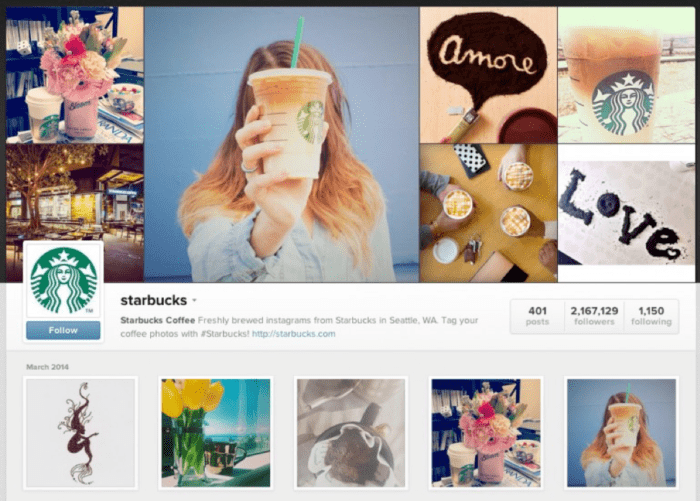
If you didn't fancy a coffee before, Starbucks' social media presence will probably get you in the mood for one. Not only does Starbucks make great coffee, but it also positions itself as a lifestyle company - quite successfully too. Its Instagram profile is a great example of how the brand brings its personality to life.
The coffee company regularly mixes up the types of content shared on this social media platform, but each type of visual represents the brand, its values and the interests of its followers. It is all about good images, many of which are taken by its followers, that showcase the lifestyle it targets while still showcasing its products, but not in an overly promotional way.
AirBnB map

While everyone is well-versed in Google maps, AirBnB's map is a little bit different. The map represents the real-time occupancy of properties listed on AirBnB, showing users where is popular right now.
Presented in other ways, this information is likely to be far from engaging. However, the visual aspect of the map - alongside the interactivity - brings the information to life. It enables audiences to spot areas that fellow travelers are loving, as well as see what properties they might be interested in. Not only does the map show that AirBnB has a huge reach, it shows its audience that they can access it.
On top of this, the map is also an excellent idea for link-bait content, as it is likely to attract backlinks from news and travel agencies.
Domino’s Pizza Emoji

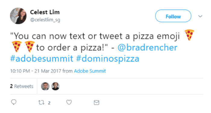
Dominos launched a unique campaign to change the way people order pizzas. To appeal to their Twitter audience, Domino’s made it possible to order pizzas via tweets, but it didn’t stop there. Interested parties simply needed to tweet the pizza emoji to get a delivery, making use of a visual element that everyone is able to access with ease via their smartphone.
Ultimately, the fun and interactive visual campaign earned a lot of attention proving that words aren’t always necessary for communication and visuals can be enough to get your message across.
Final thoughts
If you want to tap into the visceral psyche of your audience, provide exciting ways that they’re curious to explore and leave them awestruck. Visual content can do just this, but you need to remember that only a well-designed visual content marketing strategy will do the trick.
Olivia Diaz is working as Technology Observer at eTatvaSoft an Enterprise level Web and Mobile Application Development Company. Being a tech geek, she keeps a close watch over the industry focusing on the latest technology news and gadgets. Follow her on Twitter.


