How to nudge your customers towards conversion
Take it as an established truth: your customers are lazy. They want you to come to them, offer your product and ask minimum effort in return. They will pay you more if you allow them to be lazy.
This means your first concern is to check whether your website will be admired by anyone except you. Ask your friend to “buy” something there. Did they manage it in 4-5 clicks? Have you made your registration form too complicated? Are delivery prices and conditions clear? To scale this to a more, I recommend you run a series of user tests with services like User Testing or What Users do in this Smart Insights list of online customer research tools. You can also review this checklist for eCommerce beginners with which you can verify your online store. For those who want to get a bit more advanced, here are 8 of the top psychologically and statistically proven tricks your website should possess to attract everyone.

1. Don’t you want to know about us?
"About us" is dead, long live "About us"! The 'About' page gets a significant number of page views on any website, though often its content isn't given enough attention. Your customer will certainly come there, because nobody likes buying from complete strangers. She will come, find it dull and leave in 5 seconds. But what if we completely rebrand the “About us” section by one simple move — calling it "Start here"? The energy changed immediately. One no longer expects to find there boring contact telephone numbers and "My name is John, I studied economy at Princeton University" stuff. You give them a call to act and more — immediate direction, you basically control their motion. If you want more pros check out this article on how it works.
This doesn’t mean you have to delete everything about yourself — it’s important to leave a contact number, where they can call in case of questions or difficulties, and facts about your journey of "struggle and success". But the accent is customer-oriented. Think: what do they get out of it? (P.S. And photos! Photos everywhere!)
2. Hocus Pocus and behold the magic of storytelling
This leads us to the importance of storytelling. People love personal stories (That’s where the popularity of all those reality shows comes from). And here comes the question of content. Science says that if you add a background and the right words, people will trust you. This principle is tested by charities: people are more likely to donate to a living person with a face, name and specific problem, than to some intangible general program for saving hundreds of them. How can it be applied to online sales? There was an experiment about selling goods, each with a unique emotional story, called "Significant objects". What made them significant? Their descriptions were written personally and meaningfully by a pool of special authors. And this description, this unexpected background, immediately added a meaning to the item being sold.
You can see the product becomes significant and valuable right away with the magic of storytelling. Forget about "Cotton T-shirt, M, S, XS, $20 each". Use your imagination or, if you are not that imaginative hire professionals to write something unusual. That is the way to stand out.
3. Personalization: love me, adore me, praise me
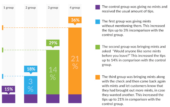
Add some follow-ups there if you want their loyalty! I love being praised (oh, we all do, don’t you deny it). I love when a waiter brings a small piece of chocolate with a bill, I will always leave them bigger tips and come back again. And there’s a whole survey on how mints influence waiters’ tips. Waiters gave the customers mints with no mention — 3% increase of tips. They mentioned mints — 14% increase. Waiters mentioned them once and then came back and mentioned them again — 21% increase. So, add some mints there and don’t be shy to let them know about those mints.
Subscribed to our newsletters? Here's our appreciation — exclusive stuff not mentioned on the main page. Bought something? We add a postcard with your name to your package. Your attention is what counts. They will come back if they feel their custom is considered valuable. The main idea is to create a feeling that your mutual cooperation does not end with a first purchase, but you are ready to please each of your customers, even if they don’t pay for it.

4. I care what you say: feedback from your customers
Why bother reading someone else’s comments? “Don’t care what they say” — said your mom and Christina Aguilera. In reality, we always want to know if our choice is approved by others. This reaches back to the power of social proof (check out this experiment with an elevator) — people do what other people do, they love feeling like a part of a cool gang.
Surveys show that 70% of Internet users read customer reviews before making a final decision. The same surveys demonstrate that 75% of reviews are positive. Consequently, customer reviews are an absolute must-have for your website.
To make customer reviews work for your e-store, spend some time collecting positive feedback from your clients. Also, make a dedicated section with testimonials on your website, and optimize it for search engines to help people find it on Google.
There’s another tip that is crucial for your e-store and often neglected: explicitly ask your customers to review your products. The Internet is made of hyperbolas, so don't be afraid of asking people to add some sugar. Believe me, satisfied buyers will never say no. Also, adding photos of your customers with your products will help you maximize the positive impact of customer reviews and boost the credibility of your service.
5. Know your worth and the psychology of pricing
There are hundreds of studies on this topic (here’s the fullest collection pricing strategies I know). I will only show you my favorite 3:
- No matter what they say, people love limits. Even more — they can’t stand the lack of regulations that makes them freeze and choose doing nothing over making decisions. That is why a big choice is worse than a small. That is why the identical items should cost different amounts. That is why sometimes it’s better to have less than too much. And one more thing. Regulations and prices should be clear, no whats, whys and whens left. If a customer has any doubts about delivery prices or additional payments, you have lost him/her.
- Time- and choice- limited discounts. Is it “The discount will be active until Thursday” or “Last three days of the discount! You had better register right away”? Procrastination tortures us all, so if we have the possibility of doing it now or later, we always choose later (which sometimes means “never”). All those “remind me later” for software updates are in this category. But imagine they say “if you don’t update it today, tomorrow your finance report for the whole year will be deleted”. No later possible, huh?
- I don’t mean to sound banal, but classics are classics, and $0.99 price is just the never-ending, scientifically proved beating-them-all king of classics. Still, keep those prices as simple as possible — $1,499.99 looks way more expensive than $1499, fewer digits are always a better choice.

6. In security we trust
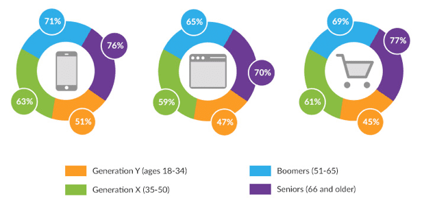
As long as you work calmly without accidents the security issue shouldn’t bother you, but when was the last time you actually read the news reports about those criminals? Yesterday they hacked Jennifer Lawrence’s iCloud, today they pirated Tarantino’s “The Hateful Eight” and tomorrow they will steal your customer’s money. And naturally the customer worries about it. As polls say: one third of online buyers hesitate to buy because of credit card information thefts, so they are more likely to trust big companies like Amazon and PayPal, and the older they are, the more security concerns they have. There’s an interesting thing about big companies, people do trust them more, but about half of the customers think these giants still don’t do enough to protect private information.
Do you see my point? While you’re simplifying all possible sections this one has to be a real five-level top-secret fortress. Your first duty is to take care of all security issues — of your online store itself and of the payment system in general. This can become an even bigger problem for small bloggers who may have decided to add a small store to their blog and didn’t aim to incorporate commerce sites in the first place. People trust them the least.
And after you have improved everything possible you’d better doubly explain to your buyers that they are protected. Add it briefly to the order form and also explain all security guarantees in an independent section of your online store.

7. Heart-to-heart conversation — Customer Service.
People get into trouble from time to time. It’s just the way we roll. And if their problems result from working with you, why come to you ever again? I’ll tell you why. Because you’re going to be a live person to them and are there, in person, to solve their issues. Providing qualified customer service is a connection you can’t lose. Whether it’s a telephone consultation or a chat talk, remember 3 must-haves of any good support:
- Speak your customer’s language — I’m sure you’re a big expert in your field, and it’s tempting to use all those narrow terms you learnt over the past year. But buyers don’t want this, they want a flesh and blood person who will tell them why their delivery is delayed without delving into the economic situation in your country.
- Make it personal (by using the customer’s name, adopt friendly positive impressions etc). Do it in a more informal “buddy-to-buddy” way. “I can’t” and “it’s not” are forbidden, you are to stay positive. And person such as “we” doesn’t exist at all. It’s you they are talking to online.
Endeavour to be time-saving. Sometimes it’s just yes or no. Be concise whenever you can. After all they came for actual help which requires your concrete answer and not long hours of debate. So fight against wasting your and your customer’s time!
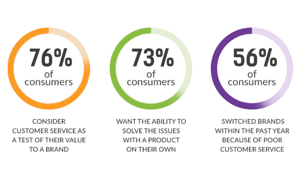
- According to the 2015 survey about what people think of customer service 76% of pollees consider it as a real sign the company appreciates them. This only proves that in the most cases you don’t even have to interact with your buyers, all they need is the confidence of the availability of such an option.
7. What a “picturesque” store!
Would you prefer to see The Grand Canyon once or to hear your friends’ telling about it a thousand times? When I was a child the first thing I always asked about every new book was "Are there any pictures in it?" There was no need to read what it was about — I saw a beautiful princess on a cover and knew, right away, it was for me. I grew up and so did technology. Now the first thing I always ask when Googling something is "Are there any pictures for this query?". Well, pictures are good, they help you to acquire information faster. And the very anatomy of our brain speaks to our advantage, too: according to studies, we can get the sense of a visual scene in less than 1/10 of a second and (better sit down!) visuals are processed 60,000X faster in the brain than text.
That is why people like that upper line Google suggests for every query — the line with pictures. Now, please, meet SEO, you’ve probably met this guy before, but somehow he is going to host this party as well. Or you can refresh your acquaintance with SEO. Pictures from your website, if optimized properly, should make it to the first 10 random ones Google suggests when someone searches for your niche. Pure SEO as it is. So, imagine, John wants to buy a hanger. He still doesn’t know where or how. All he wants is to read some Wikipedia article about this interesting product. John Googles and the first thing he sees are pictures of what he’s looking for. Why bother himself reading, if he can just look? So he opens the first nice picture and sees the link to your store, selling exactly what he wanted — the best hangers on the West Coast.
And now we’ve come to the point, image SEO is easy and you should definitely do it:
- The very filename of the picture you upload to your website matters a lot, no “screenshot345” should be considered. It should be meaningful and contain your keywords — “the-best-hangers-on-the-west-coast”.
- Pick out the most practical image and file size. The actual image can’t be 2400×1300. Fortunately the file size can be reduced with the help of any graphics editor you have handy.
- Write captions — the text which usually appears grey under the picture and briefly explains what it’s all about.
- Add “alt tags”. The alt text describes what’s on the image and the function of the image on the page. So, this is the way search engine bots see your picture.
Conclusion
Trends change in a blink of an eye. I typed this sentence — designers came up with a new trendy texture. You read the next one — web designer chose red-green colour combination as the best one of 2016 (just kidding, don’t you ever combine those two unless you’re a fan of Freddy Krueger’s sweater). And “evergreen classics” do not exist on the Internet. So, keep moving forward - only your original approach matters.

Emily Hunt is a content marketer and startup advisor at
Startup Hub. Focused on helping people to start websites of their dreams. Active citizen of the Internet with all the consequences and passionate about latest Internet trends, new media formats and rescuing cats out of trees. Follow her on
Twitter.


