Modern e-commerce platforms offer a smoother user experience and cover the entire customer journey.
Enterprise e-commerce software has remained synonymous with age-old, unwieldy applications. It is easy to consider them a hindrance to both creativity and productivity. Thankfully, because of innovation in this space (especially headless commerce), things are changing for the better.
Enterprise e-commerce platforms have been moving in the right direction since 2018. While there are exceptions, modern e-commerce enterprise platforms are a lot more user-friendly and take care of all the essential features an e-commerce site should have.
The truth is, enterprises now realize and apply basic best e-commerce practices. They are now relatively intuitive and offer a smoother customer experience after testing their platform and analyzing user feedback.
The turning point for enterprise e-commerce platforms
Earlier, large organizations would focus on adding relevant information into the platform and getting it up and running. In the race to market, UX was the biggest loser.
But enterprises are increasingly turning the spotlight on superior enterprise e-commerce UX. This focus is prevalent irrespective of applications in the digital ecosystem.
The key lies in treating the enterprise user and the e-commerce user as the same person relying on different technologies for work and leisure, respectively. Designers should not distinguish between the two.
Remember, employees become more productive and enjoy their work more when they have the right tools that support their work and eliminate unnecessary burdens.
Types of enterprise e-commerce platforms
There are three categories of enterprise e-commerce platforms namely open-source, SaaS (Software as a Service) and headless commerce. Let’s learn about these in more detail:
1. Open-source
Popular among IT heavy and development-driven enterprises that crave complete control over their e-commerce platform, open-source e-commerce platforms allow you to modify every aspect of the code.
2. SaaS
Hosted in the cloud, SaaS platforms allow enterprises to manage the software on their own. Rather than developing or creating a custom solution, the platform essentially gets “rented” by the enterprise, making it considerably cheaper.
3. Headless commerce
The CMS and shopping cart are decoupled in headless commerce. Enterprises normally use CMS or DXP in such cases. Then they plug the decoupled e-commerce shopping cart solution.
SaaS technologies like BigCommerce may also be used instead of decoupled carts owing to the overall low ownership costs and high API flexibility.
Apart from the above technologies, enterprise e-commerce platforms provide hosting environments for clients in two ways that are Cloud and On-premise. Every enterprise requires a hosting environment for running their e-commerce store.
Why enterprise e-commerce is leading in terms of UX?
Amazon and Sephora are leading the pack when it comes to expanding what e-commerce UX is all about. Their UX covers the whole customer journey and impact aspects like product selection, customer feedback, and pricing that are not covered by UI. A strong UX helps such enterprises establish sustainable and profitable relationships with customers.
Also, the intersection of marketing and UX covers everything from customer profile management to content strategy, increasing value through personalization. By combining UX best practices and data analytics, these enterprises evaluate the whole customer journey and adapt their offerings accordingly.
Here are some prominent UX design trends that pioneering platforms offer, to empower enterprise e-commerce players.
1. Product highlights
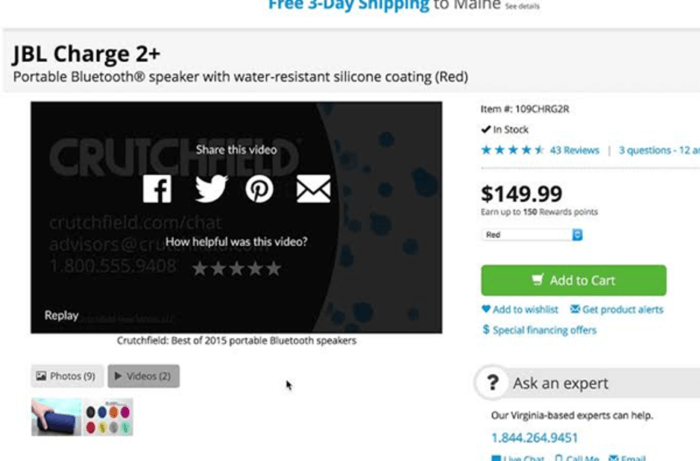
According to HubSpot, 76% of enterprises have increased sales with videos, and videos swayed 81% of end-users in favor of purchasing a product. The format has become a dominant force in 2019, and enterprises should not shy away from using it (see an example below).

Rather than display a product through conventional walls of text, add short videos about your enterprise’s service or product for a more efficient approach. Include 3D graphics so end users can view the product from all angles. Interactions fuel the likelihood of purchase too.
2. A simplified checkout process
Checkout can make or break the UX of your enterprise e-commerce platform. The lack of payment methods, length of the checkout process, and confusing form fields can transform a good on-site end-user experience into a bad one quickly.
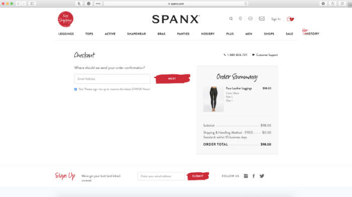
That’s why more enterprises are improving the checkout UX by simplifying and shortening the whole process. One easy way to do this is guest checkouts. You can also eliminate several checkout fields and steps, or opt for single-page checkouts.
Some e-commerce platforms have resolved the guest checkout versus returning customer debate by sending all end users directly to the express checkout option. Customers can now do everything on one page and view all fields and options together.
See the checkout page for Spanx below. The simplified e-commerce UX process reduces checkout to just a single page, increasing the company’s average order value by 28%:

3. Adaptive design
Ensure your UI adapts to various screen sizes with adaptive design. This is different from responsive design since the content maintains a fixed layout size, unlike responsive design.
Adaptive design combines elements that function well together, such as autoplay functionalities, image carousels, parallax scrolling, and video backgrounds.
It also supports micro-interactions that improve enterprise e-commerce UX by decreasing errors, reducing user anxiety, offering natural interplay, and guiding the user through the site intuitively.
If that’s not all, adaptive design allows enterprises to test various elements on the website by using properly set up analytics. Find out what features your customers are using, and remove the ones that are not required.
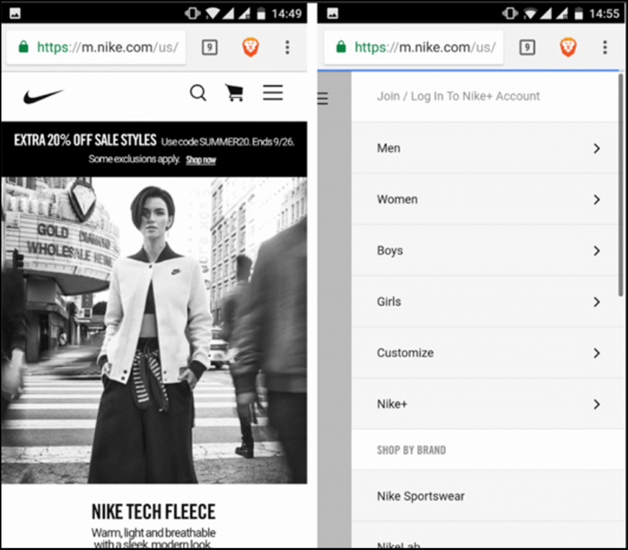
Sports brand Nike does an amazing job of presenting customers with the basics. However, the other important options are a click away. The desktop version, for example, shows a looped video on the website’s home page. But the mobile version showcases a static frame to save hardware resources and bandwidth.

They also place most of the site elements within a hamburger menu, providing access to every option from a single place.
Also, while individual items display a men or women menu, the mobile version allows users to access customized search options by clicking “Refine”.
4. Improved accessibility
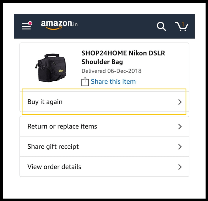
Every customer will visit his or her account page to look at their order history and status. Simplify the process by highlighting recent and open orders on the account dashboard. This presents a wonderful opportunity to prompt repeat purchases via the “Buy Again” button.
Amazon’s user account page is a wonderful example of this trend in action.

5. Quick user signups
Also, enterprises are trying to keep things simple and fast. User signups are now crisp and intuitive so that website visitors get the best experience.
Onboarding is also very easy and enterprise e-commerce platforms don’t ask too many questions right off the bat. They usually ask for email ID and name during registration and seek other personal details after onboarding.
6. Single column structure
The addition of single-column structure improves enterprise e-commerce platform navigation. Users tend to move down from the top to the bottom of the page along a single line.
Multiple columns don’t always make it clear to the user where to begin and the direction to read in.
Moreover, a registration process with various columns can hamper the experience for the user.
That’s why enterprises are gravitating more and more towards a single column built for their e-commerce platforms.
7. Infinite scrolling
Apart from that, many e-commerce platforms are implementing infinite scrolling capabilities to provide a smooth user experience.
The content loads continuously while the visitor scrolls down the page, thereby increasing user engagement. This technique works especially well for flat content structure.
However, it is not a feasible option for goal-oriented tasks. That’s why enterprises include advanced navigation techniques and filters so that customers don’t find it tedious to locate products displayed in a linear format.
Concluding remarks
Enterprise e-commerce UX is all about anticipating and impacting the actions, reactions, needs, and demands of customers to achieve the desired outcome.
UX involves goals, strategies, and interactions on a more basic level, and through it, enterprises are moving full speed ahead to win the e-commerce race.
Joydeep Bhattacharya is a digital marketing evangelist with over 12 years of experience. He maintains a personal SEO blog,
SEOsandwitch.com and regularly publishes his works on SEMrush, Ahrefs, Hubspot, Wired and other popular publications. You can connect with him on
LinkedIn.


