Optimize your site to increase your email lists and generate more leads
Amazing, isn’t it? In spite of being pronounced dead more than once, email continues to drive the biggest growth for online stores and businesses alike.
Heck, it actually seems to be performing better and better every year.
The latest data published here on Smart Insights at the start of January proves that currently, email delivers approx. 30 times higher ROI than other channels. Plus, a staggering 95% of people rate it “important” or even “very important” to their organization.
Download Premium Resource – Email Marketing Audit
Benchmark to identify areas to improve in your email marketing.
Access the Email marketing audit
The catch? To generate similar results, you need to build a strong and vibrant list first.
And the problem isn’t how to capture those more emails.
It’s how to do it with so many visitors landing and exiting the site through different pages. And what goes with it, exhibiting a variety of intents for their visit.
In this post, I’ll show you how to overcome this. You’ll learn how to collect email addresses on different sections of your site:
- The homepage,
- About page,
- Blog
- Sitewide calls to action.
Intrigued? Let’s begin.

1. The Homepage
A blog aims to attract and convert potential customers who are early in the customer’s journey. Product pages focus on communicating the value of what you sell.
The homepage, however, has to do it all and more.
For one, it introduces visitors to your brand, positions you as an authority too, and finally, entices them to engage with you.
How to convert visitors on the home page?
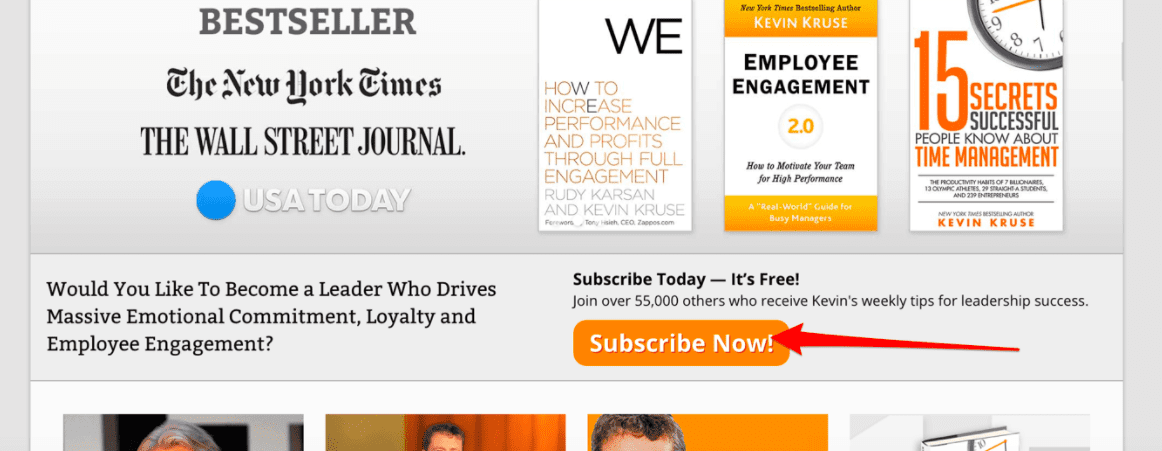
Use a dedicated call to action, embedded on the page itself.
For example:
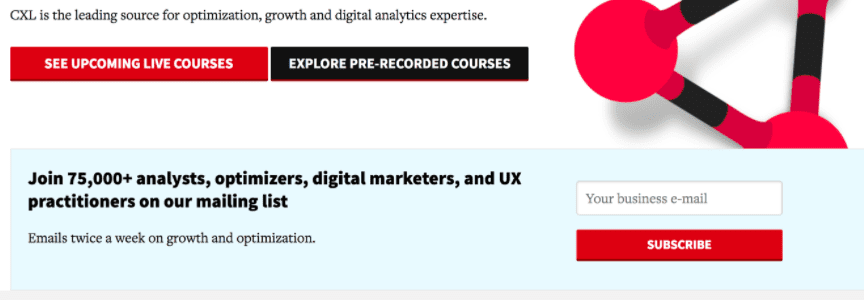
A dedicated call-to-action that takes the user to a dedicated sign-up page.

An entire form embedded within the homepage


Why embedded Call-to-actions works so well on the homepage?
For one, because it doesn’t interrupt the first-time visitor’s experience. The call to action doesn’t jump out at them or cut into their flow through the page.
Instead, it lets them go through the page naturally, at their page, and discover your offer as an integral section of the experience.
2. The About Page
It’s hard to imagine that the inconspicuous about page could actually be of any significance, isn’t it?
And yet, once landed on a company’s website, as many as 52% of visitors want to see its about page.
Now, I admit, just over half of visitors might not seem that impressive. However, I think we can safely assume that most of those people aren’t your current customers or casual browsers. In fact, they mostly comprise of people considering doing business with your company.
That’s exactly the reason why they turned to that page - to learn more about you and your brand.
And what goes with it, they present a great opportunity to convert to your email list.
How to generate leads on the About page
Lead generation on the about page requires subtlety. Remember, your main goal for this page is to develop a personal connection with visitors, confirm your authority and convince them that you can help.
And needless to say, any aggressive lead generation strategy might overshadow those objectives.
Therefore, your best option is to use either a sidebar banner or a small popup showing in a less strategic location on the screen, - at the bottom or on a side.
Let’s go through them in more detail.
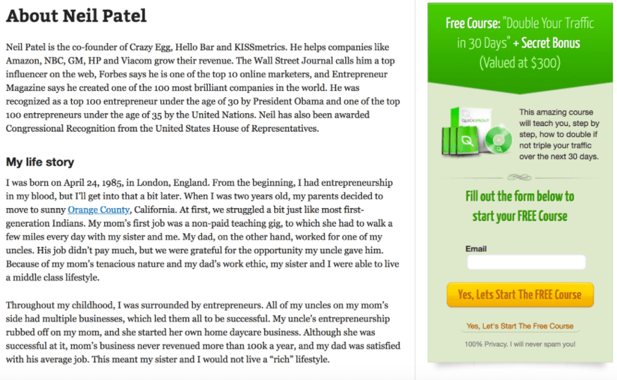
1. Sidebar banner
As the name suggests, this call to action resides in the sidebar column of the page, and typically contains a visual or contrasting color to attract a person’s attention.
Here’s one example of an About Page displaying sidebar banner. In this case, using a free course to entice more signups.

Unfortunately, there is also a downside to using sidebar banners – banner blindness. Many users naturally ignore page elements that resemble advertising in any way, including banners and calls to action in the sidebar.
Luckily, the other call to action helps overcome this challenge perfectly.
2. Email Popup
I admit that popups have caused a bit of a stir among marketers. Some openly discount them while others praise their effectiveness.
Nonetheless, the fact remains that email popups are the highest converting call to action, ever.
For example, our customers typically collect 270% more emails with popups, and their average conversion rate exceeds 5%.
Exit popups, another email popup type, we’ll discuss later often convert at 7% or more.
In contrast, sidebar banners generate roughly 0.5% 1.5% conversion rate. Sliders and bars attract about 1% of signups.
Impressive, right?
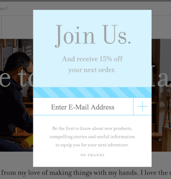
Here are some examples of popups on the About page:

Why popups work so well?
For one, because they give you full control over when and for whom they display.
Most popup platforms allow you to specify timing and choose specific visitor-types to display the most relevant offer to them.
For example, you could show a more generic offer to first-time visitors, since you don’t know anything about their preferences yet.
At the same time, people who have seen your website before could see highly-relevant offer – a discount code or a specific lead magnet, greatly increasing their chances for conversion.
3. Blog
The blog is the foundation of the entire inbound methodology.
Every post you publish aims to attract relevant visitors that you could, in turn, convert into subscribers, and later, customers.
Couple that with the fact that between all your articles, blog receives the greatest number of visits, and you know why you should focus list building efforts on it.
To capture email signups from the blog, use the following calls to action:
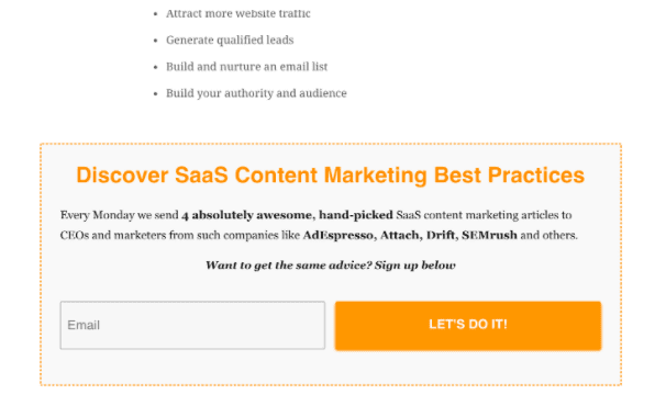
1. Under the Post Banners
Have you noticed that most blog posts end with an offer, prompting you to sign up with your email to retrieve it?
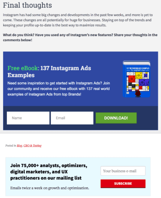
Offers like these, for example:

Why under-the-post calls to action work?
Because they place your offer as a natural extension of the value your content has already provided.
A person who has just finished reading an insightful and helpful content from you might be naturally inclined to want more information. A banner, strategically placed at the end of the information provides them with an opportunity to get it.
2. Exit Popups
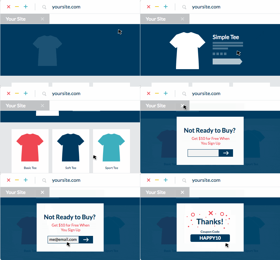
We’ve talked about email popups already. And this call to action is their variation that uses an exit-intent technology to identify when a person aims to leave the site and trigger a popup at that moment.
Here’s how this process works in practice:

The purpose of this popup type is to deter or prevent a person from leaving the site without engaging with your brand.
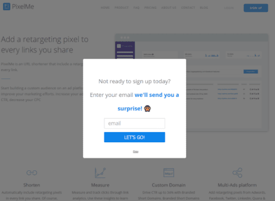
Exit popups typically feature relevant copy, targeting the person’s intent to leave. For example:

Source: PixelMe
Why do exit popups work?
The main reason is relevancy. By targeting a specific behavior, you can present exiting visitors with an enticing offer that engages them with your brand.
3. Inline content upgrade
Finally, you can also place calls to action inside your blog posts. In this case, these call-to-actions offer a specific lead magnet called a content upgrade.
Here’s how they look:

Why inline links to content upgrades work?
Inline links’ main power lies in the information they offer. The idea behind content upgrades is that they provide additional and exclusive material for the content a person is already reading.
Assuming it provides them with value, there’s huge chance that they’ll also want the additional information.
4. Sitewide
We’ve discussed converting visitors on every major section of a website. But what about converting all visitors, regardless of the page they’re on? Luckily there are calls to action that help with collecting emails site wide. And the most effective of them include popups, slide-ins, and bars.
1. Email Popups
We’ve talked about email popups already. And just like they help to convert visitors on the About page, you could also use them sitewide.
However, I always recommend that you use more than one popup to target different visitors with offers that are relevant to them.
2. Bars
Bars are permanent calls to action that reside either at the top or bottom of the screen, separately from the website. This means that they remain visible regardless of a page a person’s viewing.
For example, when viewing this site, you see this bar:

3. Slide-ins
Finally, slide-ins are similar to popups. The major difference between them is how they appear. And as the name suggests, they simply slide out from the side of the screen, presenting the marketing message in full. For example:

Why these calls to action work so well on the site?
To understand their effectiveness, we need to look at their common characteristic – each of those call-to-actions resides outside of the site and show up depending on a person’s behavior or interaction with the content.
As a result, they can deliver the most targeted message when visitors are the most susceptible to it.
Wrapping Up
Email continues to drive the biggest growth for online stores and businesses alike. However, to fully avail of its potential, you first need to ensure you’ve optimized every section of the site to collect the most email addresses.
Hopefully, after reading this guide, you have a good idea what calls to action to use and where.
Download our new Business Member Resource –Email Marketing and Marketing Automation Buyers Guide
This guide is for senior marketing managers and email marketing managers who are using, selecting or reviewing email marketing service providers and marketing automation platforms.
Access the Email marketing and marketing automation buyer’s guide
Thanks to Greg d'Aboville for sharing their advice and opinion in this post. Greg is Head of Growth at
WisePops. WisePops enable marketers to design website popups and bars that increase conversions.


