An introduction to responsive website design for marketers
The Olympics were fantastic this year, the atmosphere was electric and the performances were first class (not to mention Danny Boyle's staggering opening ceremony).
The only problem that I had was that I kept on missing the first and last 5 metres of each race. You see, my television is very old, and can’t cope with content that has been created for the panoramic screen. If only my television was as responsive as an increasing number of websites...
So What is the Responsive Web?
Responsive Website Design (RWD) is a concept widely attributed to Ethan Marcotte, who takes inspiration from the experimental movement Responsive Architecture (see pioneering Nicholas Negroponte for further reading).
The aim of RWD is to create one website design that adapts to each environment that it is being viewed in. Whether being viewed from a traditional PC browser, or perhaps a new android tablet, and not forgetting the ubiquitous smart phone (which, as we know, will be more commonplace than webcats).
So how is this achieved?
Responsive Website Design is made up of three key ingredients:
1. The Fluid Grid
The grid is one element that has been consistently used throughout all design disciplines, from typography through to furniture design; and the web is no different (please do not employ the skills of a website designer who has no knowledge of this!).
Typically in website design, the grid is created in pixels, with 960 pixels being the preferred choice by most designers. As, amongst other reasons, it is a framework that streamlines the design process, and keeps in mind the classic design rule of thirds.
The fluid grid has fundamentally turned the website layout on its axis.
Instead of using pixel based layouts, the fluid grid uses percentages. This means that all of the elements within the website design are relative to the size of screen. Clever.
See this working fluid grid example.
2. Media Queries
The objective of media queries for RWD is to look at the capability of the device that is being used to view the website.
Media queries can be used to check:
- the resolution of the screen
- the height and width of the device
- whether the device is portrait or landscape
Once the media queries have been determined, then the device will load the appropriate style sheet that has been called.
See a more in-depth example of media queries in responsive website design.
3. Flexible Media
The aim for flexible media (specifically images) is to enable them to load differently on different devices.
An initial solution has been to simply set the image size to 100% on all devices, and leave it at that. However it isn’t necessarily that straight forward.
For example, an image on a mobile phone needs to be a small enough file size, so that it doesn’t eat up all of your expensive bandwidth; whilst it might also need to refine its message due to having a smaller screen size than a PC.
Adaptive Images, by Matt Wilcox, appears to be a more sophisticated solution. His approach is to ‘create, cache, and deliver device appropriate re-scaled versions of your web page’s embedded HTML images’. Thus saving you bandwidth issues.
Does this mean that every new website should be responsive?
The BIG question. Not necessarily. As with most developments on the web, there are many angles and arguments to be mindful of.
Here are my top 5 issues to consider:
1. It takes longer to design a RWD than a pixel based website
There is more to consider than a pixel based website. Testing and refining the user experience on each device simple takes time.
2. It will cost more than a pixel based website
As well as the additional time it takes to create a RWD, it is still at a relatively early stage of its lifespan, so not all website designers will be practicing these techniques (old-fashioned supply and demand applies here).
3. RWD can lose some of the finesse compared to a pixel based website.
This can partly be because a RWD needs to work on the smallest screen size, which means that the design needs to be simpler. However, working within design constraints is part of the design process, so I would personally see this as an opportunity rather than a hindrance.
4. Better for SEO
From an SEO perspective, having a single URL for both desktop and mobile content, is great for the user journey, and even better for search engine bots to index your content.
Read Google’s official statement with regards to Responsive Website Design.
5. Finally, is zooming on your smart phone really an issue?
Is there anything wrong with having to pinch and zoom in on your tablet or smart phone? Is that the extent of our first world dramas? An unresponsive website (if that’s now the correct term) looks great on smart phones, so what’s the big deal?
In my next post, I will be discussing the alternatives to Responsive Website Design - namely the pros and cons of a separate mobile optimised site, compared with mobile apps.
Examples of responsive design
In the meantime, I will leave you with a mixture of both good and average examples of RWD, so please take a look through and let me know what you think.
Not-for-profit example - WWF


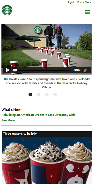
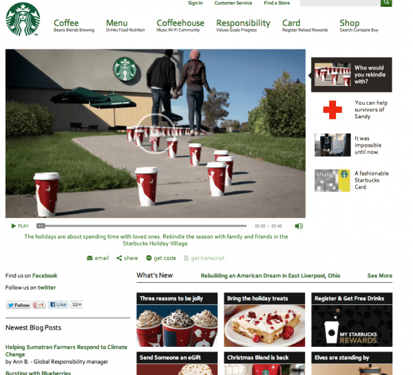
Retail responsive design example - Starbucks


Publisher example - Time magazine


Thanks to Smart Insights Expert member
William Seabrook for sharing his advice and opinions in this post. William is Managing Director of
Seabrook Associates, Brand and Digital Marketing specialists based in Manchester, and has been helping businesses in the UK for the past 7 years. His aim is to create both remarkable and technically reliable websites that integrate seamlessly into the heart of well-conceived digital marketing strategies. You can follow him on
Twitter or connect on
LinkedIn.


 Thanks to Smart Insights Expert member


