A checklist of issues to consider in a responsive website redesign project
If there’s one thing that every Web and Digital marketing manager has had on their agenda in recent times it’s responsive design! Responsive Web Design has become the defacto standard of web sites in a very short space of time. But is it a silver bullet? Is it a magic cure for many digital illnesses our sites (and visitors!) have been suffering from? It certainly gives many challenges, and in this post I'll share 9 key issues that site managers need to talk through with their designers.
When I first started looking at the concept of responsive websites back in 2010 - I fell in love. This seemed like a proper working implementation of the “fluid websites” that were largely a dream back in the days when we were moving from table based layouts to CSS based ones.
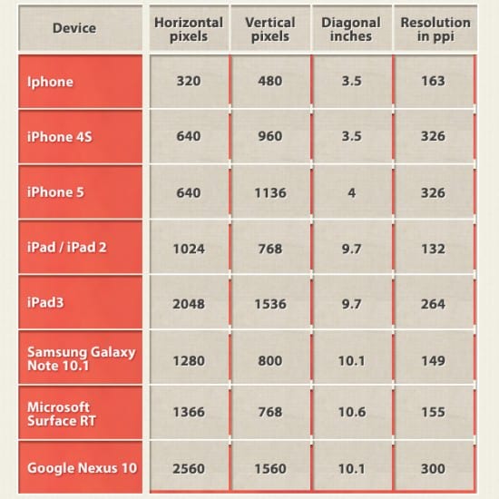
Over the past 2-3 years, as more and more sites have implemented responsive web designs, my love for them has taken a bit of a bashing. The reality of the situation has become more clear. There are many issues with creating, implementing, and maintaining a website that has been built to adapt automatically to the viewport of the device being used by your visitor. This compilation of display resolutions for responsive design shows just some of the mobile platforms that must be targeted.

It’s challenging, complicated, and the “best practice” is constantly evolving. Here’s a list of 9 things to watch out for when going responsive... Hold tight!
9 Tips on responsive web design
Probably the biggest single issue facing websites with the most basic of responsive implementations is page size. With separate mobile and desktop sites, we pushed different HTML out to visitors. Back in the days of WAP sites, we made sure the size of the page being downloaded by a visitor was absolutely tiny. Every byte mattered. Responsive at its simplest pushes a desktop site onto your visitor, but sweeps some of the content under the rug just before the visitor arrives. It’s there, just not seen.
A newly launched responsive site I saw recently, had apparently been built 'mobile first', still managed to have a total size of just over 3MB when viewed on a mobile. Downloading this on a moving train, for example, will not be fast... You could argue that a better choice than “mobile first” would have been 'performance first'.
Web pages are built up from a collection of documents and images. These are downloaded to your browser and processed in order to render the web page. The way in which the browser initially arranges all the parts of your page is called the DOM tree.
Making a change to the DOM tree whilst the page is loading, or after, makes the web browser work quite hard. The more disruption to the DOM tree, the most sluggish your page is (or the faster browser/computer you need).
Many responsive sites put a fair amount of additional and unnecessary stress on the browser and increase the amount of work needed to display and interact with the page. Poor programming and structuring of the HTML and CSS for a page is often the reason by you think a (mobile) web page is sluggish or unresponsive. The browser in your smartphone is working its socks off to understand what to hide, move, or add to the rendered page.
Your pages need to be efficiently programmed.
- Tip 3. Focus on context not screen size
What we want to do on a website is not dictated by the screen size of the device we just happen to have to hand.
In order to deliver a fantastic user experience, we first need to understand the context of the user.
It might be more relevant for the UX to realise that a visitor is accessing your website from home sat in the sofa rather than via a mobile. Considering the context allows you to provide the right content and guidance so your visitor can complete their goals.
Knowing that they are looking at your site using a smartphone helps you make display decisions that further enhance their chances of completing their task. It’s not as simple as grouping all “mobile” users together, just as it’s not as simple as grouping all 'desktop' users together.
- Tip 4. Break-point fixation
Responsive designs are based on what are known as “breakpoints”. At a specific viewport width, the design changes from one layout to another. It’s common that during a design project that 3 “static” designs are produced for 3 specific viewport sizes. Normally (at the time of writing) this would be desktop, tablet (iPad) and smartphone (iPhone).
These three widths, 1024px, 768px and 320px may, at the moment, cover a majority of your visitors but the variations in between those breakpoints are almost endless. This endless variation is exasperated further depending on the browser used. Chrome and Safari scale the viewport according to the device pixel density, but not all browsers do.
For example, a Google Nexus 7 (using Chrome) has a viewport width of 601px. On the same device the width becomes 800px when using Firefox or Dolphin.
The key here is to prototype as soon as possible and test on as many devices as you can. Your breakpoints should be set to where your design needs them, not according to a specific device’s screen size. Flat designs for fixed widths are of limited use to you now.
- Tip 5. Responsive isn't just mobile
The range and array of devices accessing your site isn’t limited to desktop, tablet and mobile. Anything with web access might end up visiting your site. This could be a games console, a Smart TV or an eReader. All of these will, probably, trigger one of your “breakpoints”. Perhaps with these devices (and their associated contexts) a 'mobile' website isn’t really what they want and need?
Don’t forget either that some people using “desktop” machines have monitors as large as 27 inches (with a viewport of over 2,500 pixels!). Smart TVs come in sizes up to a staggering 90 inches (with a viewport of almost 2000 pixels).
Your responsive 'desktop' design will probably start to fall apart long before it gets stretched to those sizes . I recommend that single line of text should be between 40-75 characters, never less and never more (irrespective of the responsive breakpoint in action).
With fluid columns, you could end up texts rows of over 30cm on super-large monitors and that would make reading content feel like watching a tennis match!
- Tip 6. Content management, production and publication
Depending on what kind of content your site contains and what kind of responsive solution (combined with your CMS) you have implemented, you will probably be faced with the need for deploying new publishing routines and/or adjusting your existing content creation processes.
Web Editors using the WYSIWYG editor in your CMS may (without trying too hard) end up publishing content that clashes with the various styling included in your responsive design, resulting in messy or broken pages. Certain types of content (such as tables of data) might be challenging, or even impossible, to get to display correctly across all breakpoints..
The worst case scenario is that your current CMS is very inflexible with regard to what HTML it outputs, meaning that the task of shoehorning it into a responsive design could be a bit headache for your developers, and your budget.
- Tip 7. Images will be a problem
One of the great unsolved issues with responsive so far is how to deal with images. Images are an issue as traditionally (and ideally) you’d serve one set of images for the webpage you’re presenting to visitors.
With responsive, you don’t want to send large, high-res images to people on mobiles (wasting their bandwidth and slowing the page down). Similarly you don’t want to send low-res images to people using larger, high-definition displays.
Some solutions to the problem involve preparing multiple versions of images and programming the page so the correct one is downloaded. The question is, do you do this automatically at the server side (same source picture scaled), or does the Web Editor deal with it manually when publishing (original pictures cropped appropriately for each size and dimension)?
What happens when another breakpoint is introduced at a later date? If you’ve got a 1000 pages with images, do you really want to crop and upload 1000 new images?
As there’s no silver-bullet solution for images, (there’s not even a bronze-bullet once CMS and DAM platforms come into the picture) expect to encounter (long term) challenges with regard to images and RWD.
- Tip 8. It shouldn't cost more... but it does
Doing everything by the book, from the beginning, should mean that a responsive site comes out with a very similar price tag to a 'regular' site. In reality, it’s going to cost you more. Be prepared for that.
The design stage is more complex and effectively involves a full design for each breakpoint. Programming is going to be more of a challenge, especially given how few CMS have (up to now) been built with responsive in mind.
You will have an existing site that needs to be migrated. Image problems that will need to be tackled. Testing and usability testing to perform that puts all the variations of your site through its paces.
If you’re migrating from a dedicated mobile site to responsive, then yes you’ll see savings elsewhere, but don’t expect going responsive to be a budget project.
At the end of the day, despite all the positive things that a well made responsive web site can offer, the honest truth is that your site might not actually need to be responsive. Perhaps it would be more helpful to trim the fat from your existing site, reduce the page weight and speed up the page load time.
iPhones have been around since 2007, 'smartphones' of various types even longer. Mobile internet access has become ubiquitous in many markets. Some of you will have websites where visitors have been happily pinch-zooming your full desktop site for a number of years. They are used to this. Having the exact same website accessible from all devices fosters familiarity.
Just perhaps, right now, your budget might be better deployed on optimising other aspects of your web presence rather than a full responsive makeover? It is, at least, worth considering...
James Royal-Lawson is a Digital Strategist and Web Manager based in Stockholm. James has over 12 years' experience with web management, helping Swedish and international organisations piece together the digital jigsaw. Since 2006 James has been a Freelance Consultant. He is also co-host of the regular UX Podcast.


