A review of usability best practice for UK Universities
I worked in Higher Education for 14 years, so I found Wedcredible's Education Report 2013 extremely interesting, since their survey benchmarked the websites of 10 UK universities to assess their online user experience.
With changes over the past few years, with higher UK fees and more demand on universities and FE Colleges to provide a positive experience for home and overseas prospective and current students, from the first and every ongoing touchpoint - it's increasingly important to engage and provide a good experience throughout the customer lifecycle (from enquirer - applicant - student and beyond to alumni).
Students or at least their parents are paying customers with 'set expectations' and the HE market is very competitive multi-nationally and domestically, as the government changed regulations and opened up HE provision to more providers such as FE colleges. Coupled with overseas institutions providing lower fees or 'added value' benefits.
The research reviewed 4 key user journeys which need to be optimised around 1. finding a course. 2. making a commitment (tuition fees, application) 3. research on the go and social engagement and finally 4. starting university.
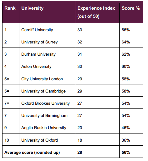
In May 2013, Wedcredible evaluated ten universities and scored each points against an Experience Index rating revealing some large differences:

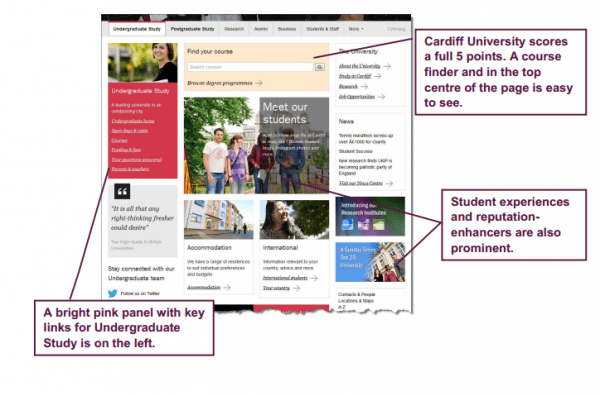
One example of their findings is the results of the home page. Overall, Cardiff University ranked first for the UX and top for their homepage. This can sometimes be the first point of contact for prospective students to obtain a prospectus or book onto an event so the UX is key. Providing this positive UX for Cardiff University included an easy to find course finder, prominent social proof through student experiences, clear navigation for the Undergraduate audience and clear links to CTA (events, prospectus):

Read the Webcredible report for further info.


