Which resolutions of web browsers should you target when testing new website designs or on conversion rate optimization projects?
It pays to be aware of the screen resolutions for the devices your prospects and customers are using since the quality of experience you deliver through your website can vary hugely depending on how well your design works at different resolutions. Even with a responsive web design (RWD) where screen layout adjusts depending on resolution, there are 'break points' which may mean that some resolutions don't work so well.
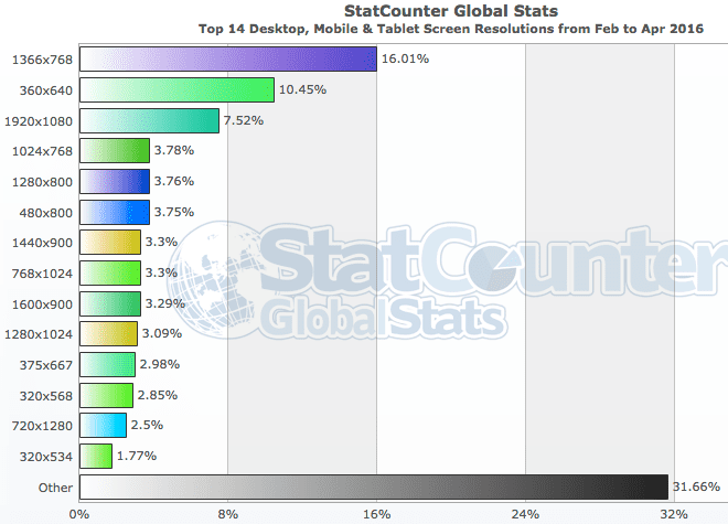
The latest worldwide screen resolutions show the challenge of the wide range of Desktop vs Mobile vs Tablet screen resolutions to test against. Of course, the tablet and smartphone resolutions have to be tested in both portrait and landscape format:

Of course, to find out the most popular resolutions to test, your first port of call should be analytics for your own site. But if you're targeting a new audience or market, compilations from other analytics can be useful. They are also a prompt of the range of platforms to target against.
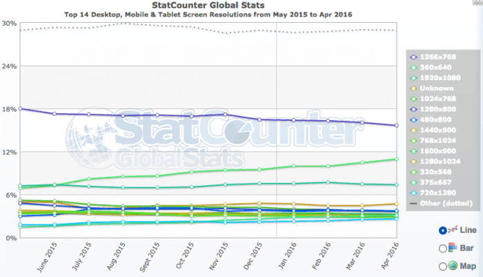
It's also worth reviewing the trends in resolutions to help make the case for investment. For example, the most notable trend here is that 360 by 640 is increasingly dramatically.


