Twitter Advice for those just starting off with the platform
You'll know that Twitter is a platform worth taking seriously as these statistics show:
Given these stats, it's no surprise that Twitter is being used by different types of businesses to promote their brand, connect with their target audiences and boost social conversions.
In fact, in a blog posted on Adweek.com, writer Shea Bennett reports that almost 67% Twitteratis buy from brands they follow on Twitter. So, what does it mean for startups and small business owners? This means that Twitter is not going away anytime soon and is going to establish a cobblestone bridge between businesses and potential buyers.
Businesses with all kind of sizes and shapes are showing promising presence on Twitter. So, how will you set you brand apart from crowd on Twitter? Remember, rules of the game: you’ll need to summon the attention and interest of your target audience and turn them into paying customers. One thing that influences and tempts your target audience to follow your Twitter page is your page design. New visitors who are not aware of your brand will weave an impression of your product through a design kaleidoscope. More often than not, the overall look and feel of your page determines user engagement.
There are countless ways of expressing yourself through design, and brands like Adobe and Red Bull have gained massive following in the recent years. Here we present to you some vital points on how you can also build more Twitter followers using creative page design.
1. Understand the Basics
First things first, want to your Twitter page design to take elements of your brand and showcase it to the world in a way that’s even more awesome, then don’t forget to understand the basics. With so many users, who knows? You might just find a diamond in the rough. With a little careful approach, a bit of creativity and a dash of encouraging conversation, you might be able to deliver maximum impact. Here is a little list of the most vital components of your Twitter business page and how to best use them.
- @username - Your Twitter handle is your business’s unique identification on the platform. Twitter stipulated that your username must be 15 characters or less. So choose a memorable and unique username. Keep your username simple to make it easy for users to remember your username.
- Profile photo – One thing that affects the visual appeal of your page design are photos. Select images that convey your brand’s personality. Be very careful when choosing this image, it will show up as icon in every Tweet you post. You may choose to use your logo design as profile photo. Use JPG, PNG or GIF images that are 400x400 pixels.
- Bio – Ensure that your bio shares your business story with audiences. Make sure that you’re able to tell your story in 160 characters or less. Be as interesting as you can. Describe your business, products or services and be as interesting as you can. Do well to show how your business will make a difference in the lives of your followers. Don’t forget to include contact info.
- URL – Add URL of your website. Ensure that your URL is correct and consistency of your profile page and your website.
2. Utilize All the Design Space
In a blog published at Smart Insights gave an alert that in April 2014 Twitter changed its profile design providing businesses an opportunity to paint their own picture in whatever way they wish. Since its introduction, this design space has attained an important status and experts even consider this valuable Twitter real estate with immense marketing potential. Enthusiastic marketers are utilizing the space to create visually creative graphics to hold visitor's attention, implementing a strong value proposition while promoting all their latest offers. Here’s how you should you use this design space to your advantage.
- Highlight Your USPs: Use relevant profile photo and an attention-grabbing header. Use profile photos and images with a clear connection to your site and your brand. Remember to use images that appeal to the emotions of your audience. Put your best face and image forward, it will make a lasting impression!
- Show Brand Personality: Use the space to highlight your business’s USP on this space. Any endorsements, slogans or key 'relationship' items must find a place within this space. Your website address and your contact details must also be part of the list. And all these elements should be in a clutter-free space.
- Win Battle for Attention: Use the Twitter real estate to make your brand speak directly to your target market and resonate with them in the best way. Pin your best tweets with content & images that sync well with your overall design page. This will promote your followers to retweet your content, thus establishing a decent flow of social marketing.
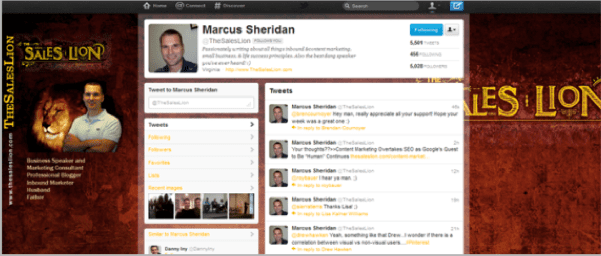
The Sales Lion's is a classic example of a company that uses design space to highlight its USP, showcase its brand personality and capture its target audience’s interest right from the get-go.
3. Compatibility with Mobile
Statista reveals that over 80% users access Twitter via their mobile device. With the significant surge in the number of Twitter users, it has become important than ever to provide better Twitter experience for mobile and smartphone devices. So, make sure that your page design is powerful enough to endure the dramatic shift from one device to another—and by endure; we mean the power to go through the entire thing unblemished.
To ensure that people follow you and keep coming back to your Twitter page, ensure that every element of your Twitter profile — right from your images to your bio and your Tweets are clearly visible, no matter which device is being used.
4. Be Brand Consistent
In a blog published at Smart Insights, author Annmarie Hanlon reveals that Twitter business page helps you establish a visual brand for your company, just like your logo design, business card, and website. And any disparity between your Twitter business page and other branding elements of your company can make your consumers and prospects question your credibility. That’s why it’s vital to ensure consistency across your Twitter profile. Remember, being brand consistent will help you show your clients that you pay apt attention to even the tiniest of details and sweat the smallest stuff related to your business. In addition, do well to ensure an unobtrusive call-to-action. That heedfulness, along with the quality of your Twitter page design, can prove to be a major deciding factor in whether Twitteratis follow your business or not.
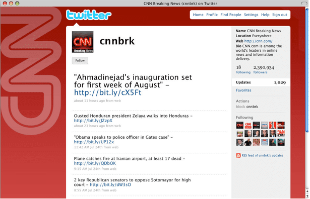
CNN and the NBA are classic example of companies that maintain consistency across their Twitter pages.
5. Be Organized
Remember, organization is the key. The right Twitter page design must be laid out in a way that vital elements of your brand and business pop up. For example, important Tweets, contact details and links must not be buried under the bottom of the page. In the grand scheme of things, your logo must be visible. Your contact details must be easy to locate. In addition, do well to ensure that your page doesn’t have too many images or too much texts. It will ensure that all elements of your page are arranged in an orderly fashion. Twitter users, especially the ones accessing it from mobile, often shy away from pages that feature too many images or are text-heavy. Also, the positioning of images is also crucial to the success of your Twitter page. Be careful when placing images. We’re sure you wouldn’t want any portion of an image overlapping with crucial details on the page.
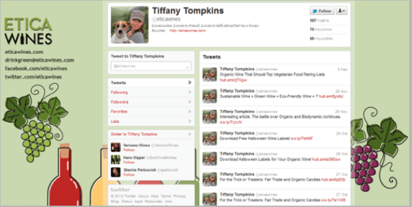
Etica Wines Twitter page design is well-organized and features branding elements, links, guides and resource and contact details to make it easy for visitors to learn more about the company.
6. Quick Load Time
In many countries, cellular data networks are slower than in the West. So, it is only prudent to pre-load important information so that your users don’t necessarily need to wait for the network. In addition, 80% people access Twitter on Mobile devices. So, ensure smaller file size of your background image to make it load faster. Though Twitter allows GIF, JPG, or PNG files smaller than 800k, we suggest you to go for file size not exceeding 300K to ensure faster loading time.
8. Be Professional in What You Do
As soon as you create Twitter profile, it becomes a natural extension of your brand. And as such, is exposed to much scrutiny from your competitors, audiences and your market. This is where a well-made page design comes in handy. A well thought of Twitter page design speaks volumes on the level and quality of your professionalism. Remember, that is what Twitteratis like. In addition, anything that goes against the aesthetics of design such as pixelated images and amateur graphics can turn followers away. With a bit of professionalism, you can attract new followers and retain existing followers by feasting them with quality stuff. ‘
MLT Creative’s Twitter page never fails to impress and inspire with its clean, professional-looking, and intriguing design.

Bonus Tip: Don't Make These Common Mistakes
Remember that having a vast empire of followers on Twitter will need you to be on your toes far often than usual. Understand your design limitations and keep most common mistakes at bay. In terms of design, here are few common mistakes committed by businesses.
- Logos not fitting into the default square size. A cropped-off logo looks unprofessional and gives an impression that your business does not care about details.
- Not syncing three basic images – The Profile Picture, The Header and the Background Image.
- Tweeting content drastically different from the theme of your business and Twitter page.
- Not matching your image background hex color with a chosen background color.
So if your Twitter page design fails to incorporate all these tips into an engaging whole and isn’t powerful enough to boost your brand, now’s your chance. Go for the change. Remember, it is never too late to get your Twitter page back on track and boost your twitter traffic, followers and engagement.

Thanks to
Campbell Jof for sharing their advice and opinions in this post. Campbell is a blogger and designer, who works as a creative head for
Designhill.com. He writes on topics concerning design, ecommerce, startups, digital marketing, interactive content. You can follow him on
Twitter.


 Thanks to


