A checklist and examples of good practice for 9 new features
It’s now around a month since Facebook business timelines were introduced. We explained the main marketing features here.
We’ve been checking out some of the best uses of the new features for marketing, plus we’re seeing some of the new features aren’t being implemented. It’s rare to see a Facebook page that combines all the features in the most effective way. That’s natural, there’s quite a lot for page owners to “get their heads around”, plus the usual time, budget, technical limitations.
In this post I hope to give some guidance to help you review your site and to combine looking at some examples to learn from, plus showing what some are missing. So from top to bottom, I’ll mark what are potentially the most important.
Well, most new pages have a cover photo, mostly a visual that fits the brand, so a tick for this one. There are some interesting promotional ideas. Here’s one example where Firebox are using the photo more tactically for a promotion encouraging liking through an app.

The arrow pointing to the app to sign-up is reminiscent of the old gated Like pages. It may be pushing the terms-of-service, but who’s going to check… This is what Facebook say your cover photo can’t contain:
- Price or purchase information, such as “40% off” or “Download it at our website”
- Contact information, such as web address, email, mailing address or other information intended for your Page’s About section
- References to user interface elements, such as Like or Share, or any other Facebook site features
- Calls to action, such as “Get it now” or “Tell your friends”
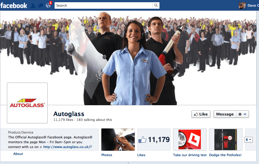
So perhaps a safer option is the people picture since that's what Facebook is all about:

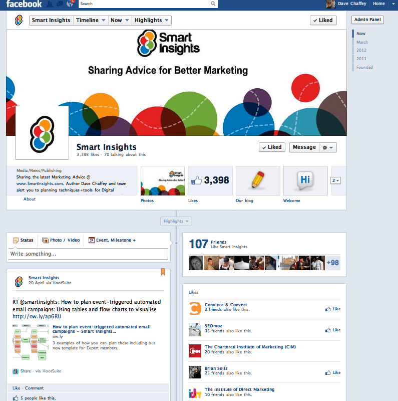
2. Integrate your Website through a Link in About (some value)
Browsing different Facebook pages, this is surprisingly rare. To me it’s worthwhile as a call-to-action, above the fold, to browse a store or find out more, so I don’t see it does any harm?
FWIW you don’t need the “http://” which helps it look neater. This is how we do this:

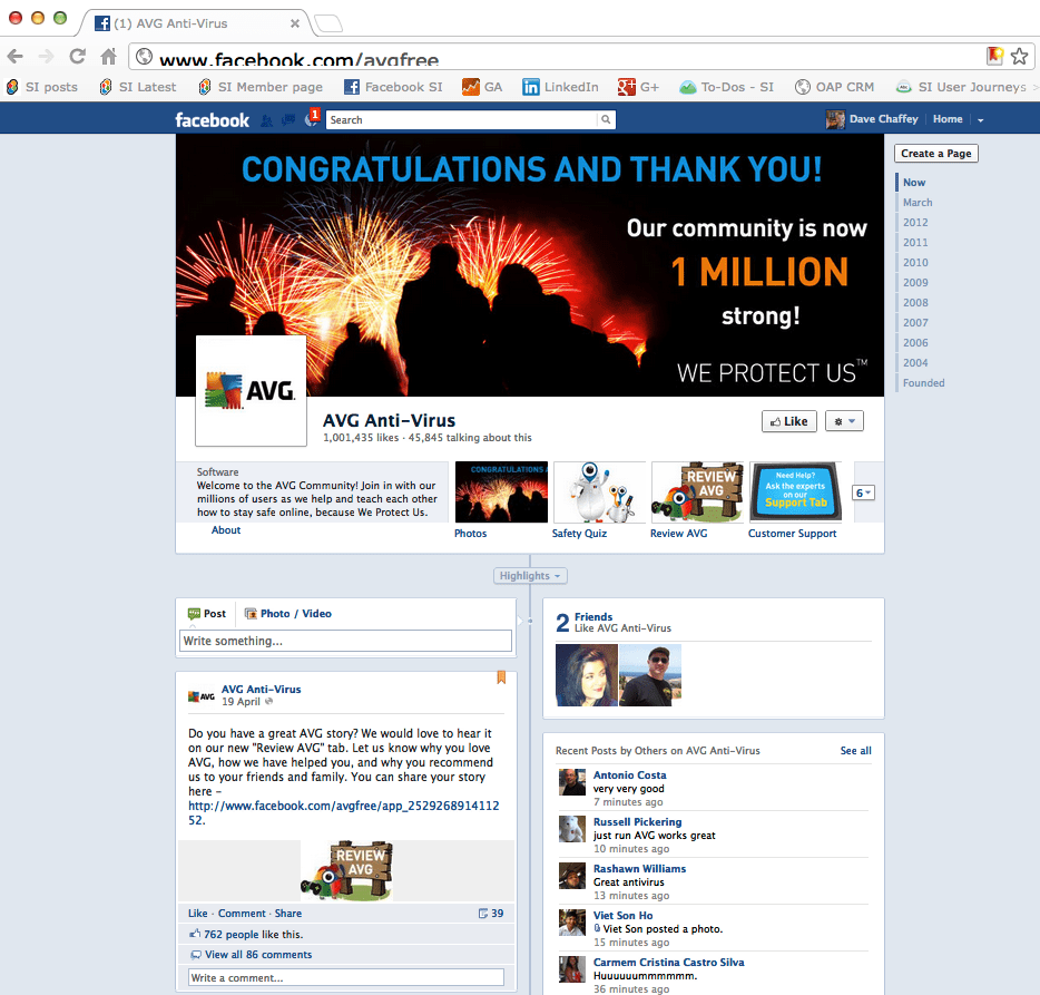
3. Pin to the top left (Important)
Most, but not all are doing this - either for current promotions, or to encourage opt-in - through a gated Facebook App in the panel.
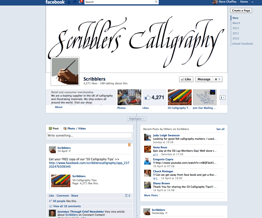
Here’s a nice example a Smart Insights expert member was telling me about. It's marked by the flag, top left:

An interesting choice this. If you’re likely to get negative comments it’s best to go for Featured Likes which are other Facebook pages you recommend - handy if you have multiple pages and good to show partners or sites you like.
Comments by Others are good for encouraging comments or showing positive comments.
5. Create a magazine (Nice if you have the right assets)
One of the nice things about the timeline is that Facebook is that it’s like a magazine and despite Google’s recent efforts, far better than Google+ since it’s two column and supports spanning across them, these are our next two tips. As a print magazine publisher, Asos.com are great at this.
6. Use full-width features
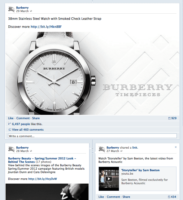
To make a post full width for more prominence, you click * on the post.

7. Use photo albums
We know from Pinterest and infographics how people love visuals. ASOS do a great job of keeping columns consistent and using photo albums.

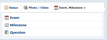
8. Don’t forget events and questions
These are hidden away top left and I’ve seen few recently, perhaps because of the design, perhaps because you need a largish audience to make them work. We had a post from Marie Page on the value of online Facebook events if you’d like to know more.

9. Create milestones (minor)
This is a corporate comms type of thing, but can be fun too. Milestones can start from 1000AD if you can think of a company connection then! Some companies have also used them more recently to engage or show recent announcements.

A lot of companies start when they started using Facebook it seems, so it’s worth digging into those archived photos if you have an interesting story to tell.
I hope you find these ideas useful, here are the official Facebook Timeline Help notes.


