Tips and examples for creating effective Facebook brand apps
Facebook applications can be a great way to increase a company’s fans’ tie to their social presence, while simultaneously delivering valuable user and customer data. For a large number of brands, apps can be essential to their healthy Facebook presence in order to add value to their growing fan base through online sales, personalisation mechanisms, incentives and competitions and more.
For the majority of brands though, producing their own apps is not essential, nor should they be. If you are perhaps thinking of a Facebook app for your brand I am not trying to convince you otherwise. If your current of future Apps work by definition because they have a function and output for the user that supports the brand, aids user discovery and interest and adds value to them as a consumer, then it's going to be a good investment of time. Ultimately for the organisation, data is collected, the app and brand messages are shared and a successful app can go a long way to establishing or strengthening social media traction.
In this short article I wish to show why, if a Facebook application or a range of applications are chosen as part of a social strategy – to be effective it should be as light, simple, quick, accessible and user-friendly to be effective as possible, whilst achieving its goals.
Complex and immersive brand experiences really, in the norm, do not belong on Facebook because the world's no.1 platform for business and personal usage - lends itself to and has already established a user experience based on speed, lots of content to scan at once, a user’s nature of browsing over content focus, and simple actions driven by simple calls to action.
Mobile First
Of course now, mobile needs to always be part of the mix to ensure that the main points mentioned above stay true. In a recent report 600 million of Facebook’s 1 billion users are classed as mobile.
With native apps and a mobile version, Facebook as a content source and content creation mechanism for the user is working well for mobile. But within apps is where bad user experiences have the potential to be hugely exaggerated due to more obstructive and slower data capture, navigation and reading of content if designers and developers to not make their Facebook apps fit for mobile. To ignore mobile for apps is an online crime that should be avoided first and foremost.
The view that “less is more” when it comes to the Facebook app experience is supported by Paul Adams, global head of brand design at Facebook who said recently, and whose quote was inspiration for this article:
“Almost every app built for a brand on Facebook has practically no usage...heavy, ‘immersive ‘experiences are not how people engage and interact with brands. Heavyweight experiences will fail because they don’t map to real life.”
This powerful statement would be enough to make anyone thinking of investing in a Facebook app for their brand, or evaluating any current apps, take a step back and consider the user experience combined with the brand benefit before proceeding with a plan of action for a Facebook app.
Whilst agreeing with Paul Adams and his quote, a key word here is “almost”. Not all apps built for a brand are heavy and immersive in their user experience. Many are light, simple, ‘fit for Facebook’ and add value.
The following branded facebook examples are worth checking out for this reason:
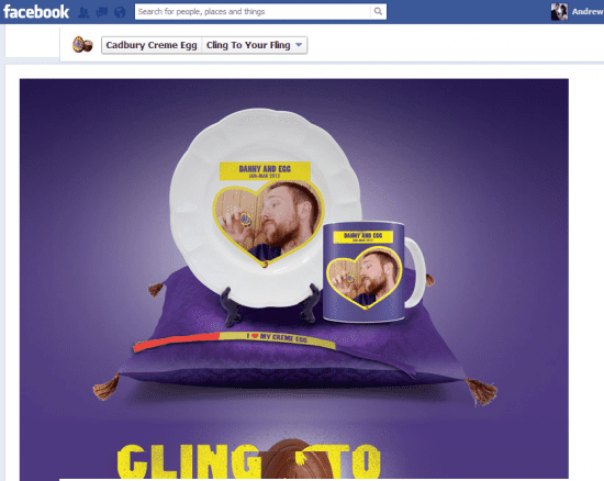
1. Cadbury’s Crème Egg: “Cling to Your Fling”
In this Facebook app Cadbury’s use a campaign supportive app to allow users through a simple photo upload to enter a competition to win a personal mug.
The app is simple, fun, shareable and ties in perfectly with the 2013 Easter campaign for Creme eggs. Nothing more than a photo upload and a share is all that is required.
Okay, some effort is involved in taking a photo with your creme egg first, but after that it’s plain sailing and this app has great viral potential and is well linked to a supporting online and offline brand campaign.
2. American Airlines: “Spin to Connect”
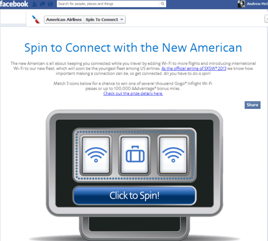
This Facebook app is a great example of a simple app that takes no more than a click to play a fruit machine style game to win an in demand product to enhance the American Airlines real life experience by offering free In Flight WiFi.
Simple functionality, ease of sharing and a value add top to the user makes this app work work really well.
3. Adidas Originals: “Create a Cover”
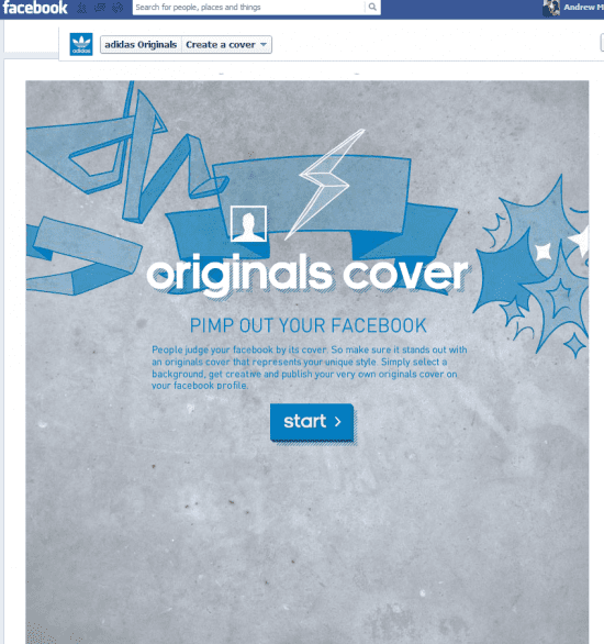 This app again uses simple point -click functionality to enable users to personalise their own Facebook timeline picture through their app.
This clever campaign is covered in 3 simple steps and its power lies in the visibility of the outcome through a range of branded timeline pictures being noticed by a fan’s friends. An experience that looks slick yet is simple and quick to engage with is what makes this app a great user experience that benefits both brand visibility and the user's online identity.
4. Boojum: “Free Burrito Day.”
Boojum is an Irish owned Burrito Bar with 2 main outlets across Ireland that I and Mammoth have worked with for the last 2 years and I’m showing this example to illustrate how the action of a simple like can harness so much power.
With 2 restaurants in Ireland; one in Belfast, one in Dublin, and Boojum wanted to promote and deliver a FREE BURRITO DAY to one city in the Summer of 2011 to reward fans and customers. The idea we came up with was simple. Whichever respective Facebook page delivered the greatest number of likes during the competition duration would result in a FREE BURRITO DAY for all in the city. The app was set up to record, visualise and encourage shares and likes and that’s simply all that was required.
The results were great and you can View the Case Study Here.
So these examples are a handful amongst thousands of great or good examples, where a brand is able to successfully engage and interact with their audiences in a way that gives the brand valuable data and of course more likes - but importantly the apps are quick, simple, shareable and accessible. Many brands have now woken up to the fact that users on Facebook, in the main, do not want or have time to participate heavily with your brand, but if you manage to attract the few that will take a look at what you can offer then be sure of one thing - the app needs to be clear, concise, add value and most importantly, be simple.

Thanks to Andrew McCrea for sharing their advice and opinions in this post. Andrew McCrea is Digital Director of
Mammoth, one of Ireland's leading brand agencies. You can follow him on
Twitter or connect on
LinkedIn. Andrew is also a blogger at
Attaining Axiom.


 Thanks to Andrew McCrea for sharing their advice and opinions in this post. Andrew McCrea is Digital Director of


