Creating effective landing pages for SEO
If you have followed the first six steps in this series on SEO (plus added your own twist and freestyling) you should now be seeing increased coverage (pages & keywords) in search results for your target keywords. Now the real fun begins since...
Being visible and getting clicks doesn’t guarantee you success. Success depends on many factors, of which landing page quality is one. It’s almost impossible to create a landing page that caters for the needs of all natural search visitors. Your aim should be to improve your landing pages over time, using proven optimisation methods, so that the natural search traffic you get positively contributes to your website’s KPIs.
Please note that you don’t have to make immediate conversions and revenue the primary goals for all natural search traffic – there may be some research terms (head and mid tail keywords) for which your aim is to get visitors to consume content and complete micro conversions, such as newsletter sign-up or social media follows. What’s essential is that you understand the goals and make sure you can measure them.
This article provides a beginner's guide to the role of landing page optimisation and how testing (A/B & MVT) can be used to enhance the performance of your landing pages for SEO. Please note that is a top-level “how to” guide, so I will not be comparing and contrasting the various testing solutions out there. For more resources and info on testing, you can use the Smart Insights AB and Multivariate Testing Quick Guide page.
What is a ‘good’ landing page?
A good landing page, to use the most generic of descriptions, should provide visitors with the information they need to take the actions you would like them to take and make it quick and easy to take actions. There is no hard and fast rule for design, functionality or content and landing pages vary significantly between different websites. That said, if you're new to creating effective landing pages, Dave Chaffey has a post on the Perfect Landing Page, giving examples and tips. Dave defines landing pages as:
"Specific page(s) on a web site created for visitors referred from marketing campaigns which are designed to achieve a marketing outcome.”
So we can say that any page on a site which attracts visitors as an entry point is a landing page, what we're discussing here are pages specifically created as an entry point for digital marketing techniques whether that's SEO, paid search, advertising, affiliate marketing or social media. While you can you use different landing pages for each of these marketing tactics, it's increasingly common to make pages work for a range of tactics because of the effort involved.
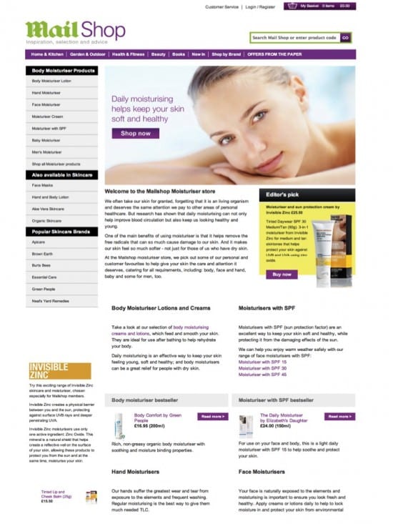
Example of a campaign landing page:
This landing page is used by the Mail Shop for marketing campaigns to promote its moisturiser products skincare range. It was created to provide editorial content and guidance to search visitors with deep links to relevant product.

This is a good example of a landing page specifically developed for SEO, so is different to some of the examples in Dave's article above which have less content since they are primarily created for paid search. I’d recommend reading Conversion Rate Experts’ article “How to make users scroll down your page” for insight into the potential of long landing pages.
Issues to consider when designing landing pages for SEO
Start by asking yourself what you want your landing page to achieve. Split this into the following:
- Primary goal
You must define this so that you can create a landing page that works towards achieving this goal – a page without a clear goal risks being untargeted.
- Secondary goals
These are important because less than 100% of your visitors will convert for your primary goal, for many reasons. If there is only one conversion path or call to action, you risk losing potential future customers because there is nothing of interest for them.
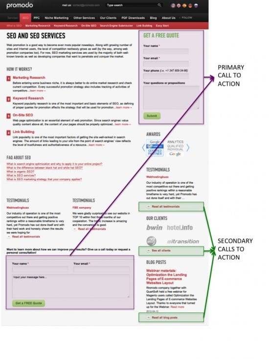
Let’s take a working example. If you look at Promodo.com , there is a landing page to promote their offer of a free SEO quote. This is the primary goal of the page. However, look more closely and you will find other calls to action, intended to keep visitors active with the website to increase the chance for future conversions.

When you have agreed on your goals, think about what content and functionality you will need to help deliver conversions to satisfy these goals. To satisfy this you should ask yourself who the likely visitor is and what needs they will have when they arrive. This is so important; if you don’t know who is coming, how can you build a landing page that makes their nerves tingle with excitement?
Questions to ask to check your landing pages are effective:
- What content will help visitors make decisions?
- What objections do you need to overcome to persuade visitors to convert?
- How does the page need to work to enable visitors to take positive actions?
- How can the content and functional components be organised to make the page easy to follow?
- Where are the possible dead-ends and how can you adapt these to continue the customer journey on your website?
- If people really aren’t interested and want to close their browsing session, do you want to use any Voice-of-Customer techniques to validate why (e.g. exit survey pop-up)?
Following this logical path will help you structure your landing page to make it relevant to visitors. Don’t lose track of the basic tenets of web usability and accessibility. A beautiful landing page is useless if people can’t use it properly – think about how easily people with visual impairments and other disabilities (e.g. people who can’t use a mouse) can interact with the page.
If you’re not sure of these guidelines, I’d recommend starting with the Wikipedia entry for web accessibility in which you’ll find useful links.
What should you be measuring to review and improve your SEO landing pages?
The answer to this should be obvious once you have defined your goals. Important outcome KPIs for e-commerce websites are:
- Goal completion (financial and non-financial)
- Checkout conversion (how does traffic to the landing page convert vs. other site traffic)
- Event completion (e.g. newsletter sign-ups, social follows)
- Content sharing (how many visitors ‘Like’ the page or +1 it on Google)
- Social sign-ups (e.g. clicking on your link to “Follow us on Facebook”).
Then you have ‘engagement’ metrics to consider, helping validate the degree to which visitors are interacting with your landing page.
- Bounce rate
- Time-on-site
- % new visitors vs. returning visitors (important as this shows how effective your landing page is at alerting new customers to your brand vs. encouraging previous visitors to come back).
Please note this list is by no means exhaustive and I would strongly recommend spending time to carefully consider how to use your web analytics tools to measure page performance. If you don’t know how to use tools like Google Analytics, you have a few options:
- Buy a book like Web Analytics: An Hour A Day by Avinash Kaushik and teach yourself
- Invest time in reading up on educational articles and blogs on the web – there are plenty on Smart Insights alone
- Speak to a specialist who has experience in doing this.
Techniques for optimising landing pages?
Web analytics
Web analytics data tells you what is happening. I’ve based this SEO series on using Google Analytics because it is a free solution (at least for the time being) and is a brilliant tool for digging down into website data, plus you can customise it for intelligent segmentation.
Data from Google Analytics can provide you all the data you need to tick off the list in “What should you be measuring on your landing pages” above, and a whole lot more.
To ensure you are capturing the data from day zero, check that your GA tracking code has been included in the landing page HTML (a quick “view source” will reveal this, then search for “analytics” and check for the JavaScript reference). Please note that some web platforms contain the GA tracking code in an external JavaScript file, so you may only find a reference to this file in your source HTML. If in doubt, ask the developers.
You may need to use custom functionality to support landing page analysis. For example, in GA you can use Events to track specific on page actions that do not generate URL clicks. A good example, is a video; if a customer clicks on play on your video, you won’t know this has happened using the standard GA reports. You need to add Event tracking to the video and then use the Events report to access the data.
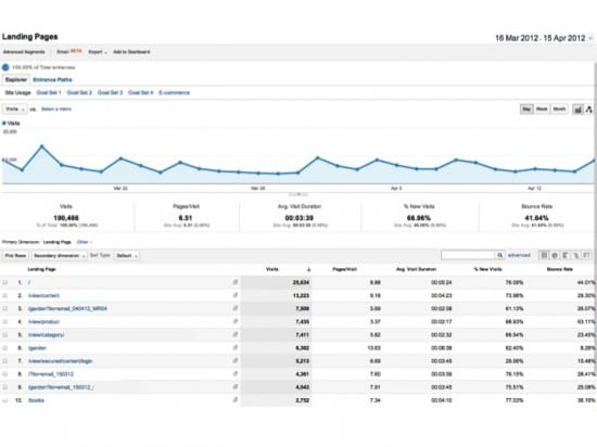
Example: Content > Site Content > Landing pages report in GA

Customer feedback
Customer feedback tells you why something is happening. Often ignored but really useful, provided you make it easy for people to send feedback.
You can start with a simple on-site survey (pop-under or pop-up) that uses structured questions to ask visitors what they think of the landing page. There are many solutions out there and I’ve been impressed by Survey Gizmo, 4Q and Kiss Insights.
The least intrusive option is to promote the survey on your confirmation page, the first page a visitor sees after completing an action such as placing an order or signing up for the newsletter. The request to participate can be included in the page content, or if you want to make sure it’s noticed, as a pop-up.
- Advantage - you don’t disrupt the user journey. It can be argued that pop-ups launched from the landing page or during the conversion process can impede conversion and increase dropouts.
- Disadvantage - you’re preaching to the converted. The only data you get is from people who liked what they saw enough to complete the goal. The feedback is, therefore, likely to be biased towards telling you that the world is peaches and cream.
My preference is to use a combination of techniques:
- Exit pop-up
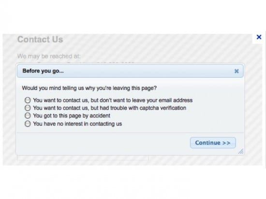
A small pop-up launches when the visitors terminates their browser session. Using persuasive visual techniques, it encourages people to tell you why they are leaving using a limited number of questions. The more questions, the less likely people are to complete the survey. You may wish to add logic that ensures each visitor only sees the pop-up once (this can be done using cookies or IP recognition but is not 100% accurate for several reasons e.g. people can clear their cookies).

Source: Boomtown.com
- Confirmation page pop-up
As outlined above, this will only be seen be people who successfully complete an action. The questions you use for this survey will differ to the exit pop-up as they should be used to find out what was good about the landing page (that’s the golden nugget to help you carry on the good work) and what else people would like to see.
Testing
Testing takes the learning from what and why and generates hypotheses for making improvements to your landing page. It’s important to protect the integrity of testing projects – when testing the impact of a change on a website, it’s important that you don’t make ad hoc changes to the affected webpages concurrently as this can distort the results. For example, if you are testing button styles on the checkout log-in page but at the same time refresh the entire page design separately to the test, results are compromised because you can’t prove whether the button changes or the design change affected the data.
To give an example of a basic test, a retailer with a strong free delivery promise on all UK orders ran a customer survey and learned that many visitors were unaware of this promise. A logical hypothesis was that by promoting the free delivery message more prominently across the website, this would increase checkouts and checkout conversion. A test plan was created to test the use of this message in multiple places throughout the website.
What is A/B testing?
A/B testing involves testing different variations of the same webpage against each other in a split test. Each version should be unique so that performance of each page version can be objectively compared.
Sensible A/B tests take a subset of the total website traffic because this minimises the risk on KPIs if the test result is negative. For example, run a test on only 20% of the traffic with the control getting 10% and the test version 10%. Please note that the volume of traffic to your website will determine what % of visitors need to be included in the test in order to get statistical significance. Check out this handy A/B testing significance calculator from Visual Website Optimizer.
How can you use A/B to benefit SEO landing pages?
The most important element of an SEO landing page is the primary call to action. Start your A/B test plan by creating different creative treatments for this – use different design techniques, vary the text, change the size, colour and position of the button.
Brace yourself. Sometimes test versions underperform and actually have a negative impact on conversion. That’s still a valid test – it means you know for certain that making the change you all dreamed about will actually kill your conversion, so you move on to the next testing option.
Once you have found ways to increase click through and conversion for the primary call to action, move on to other page elements such as secondary calls to action and techniques to encourage further scrolling if there is a lot of content below the fold.
There’s interesting insight into button placement and style on Effortmark’s Slideshare presentation “Buttons on forms and surveys”.
Taking testing to the next level – MVT (multivariate testing)
What is MVT testing?
MVT enables you to test more than one component of a webpage in a live environment. Each bit of copy, each image and each functional component becomes a testing element. You can have as many variations for each element as you like. MVT is used to determine which combination of content yields the best results for your landing page. Most MVT tests use optimal design, involving iterations and waves of testing.
How can you use MVT to benefit SEO landing pages?
Essentially, MVT enables you to simultaneously manage a higher number of tests without having to create multiple versions of the webpage. A good way to use MVT for SEO landing pages is to test the impact of variations in creative treatment (page design, colours, images etc) alongside variations in copy (length, tone, calls to action etc).
Whereas the A/B route would require creating a large number of different versions of the page, with MVT you would simply create the alternative versions of each element and then the testing tool would handle the page variations in real-time.
I’d recommend reading Get Elastic’s article “Introduction to A/B and MVT: Optimization Testing 101”.
Your comments
I appreciate that this is a broad topic and hard to cover all bases in one article. The intention is help you create a structured approach to landing page optimisation using proven techniques. There is a lot more information on these topics on the Smart Insights website and for further reading I would recommend:
Please drop by and share your thoughts and if you feel the urge, share this with your friends/colleagues to encourage further debate.
Did you miss the other posts in this SEO series? You can catch up here:
- Using Web analytics to benchmark performance and drive insight through data
- Competitor analysis for SEO
- Using the Google Toolkit to identify good performing keywords and execute keyword research
- Targeting the full tail of search
- Testing page titles & meta descriptions to boost SEO
- Weeding out poor performing keywords with the help of Google Analytics
Thanks
james


