Using copy to make a good first impression
Writing copy for your web page is much more than adding in just keywords for SEO and sometimes we forget the obvious – it’s about your customers!. Here are some tips on writing good copy for your pages by Mel Henson.
Your Home page
Quickly it needs to say ”This is what we do – and this is what’s in it for you” within a few moments before your visitors leave. Include a simple statement or value proposition that tells your visitors at a glance. Of course, this is best from the customer’s point of view, not the company’s. Additional copy should expand on this and incorporate keywords that apply to the whole site.
Of course, there are lots of other functions of the home page and navigation is important. the architecture of your site. It draws your customers in, stops them leaving, gets them to sign up to a newsletter, shows them your bestsellers, reassures them, gets them in the mood to buy, keeps their basket in view and more.
Keep your messages simple and customer-centred:
“Hand-made gifts for busy mums”
is much better than...
“Welcome to our website where you’ll find a wonderful range of hand-made gifts to suit every budget. We believe that mums are heroes, so our range is carefully selected to appeal to the fabulous mothers of the world”.

Landing page
Technically any page of your website can be a landing page, but here I mean a page that you have created for people to land on when they have clicked on Adwords or email marketing or typed in a specific URL that they may have seen in a promotion.
When this happens, acknowledge the route they took to get to you, with a similar visual look and copy such as “Thank you for clicking through from the email we sent you” or “Here’s the special offer on duffle coats that we promised you”.
This is the copy that pops up when you click on a category heading, usually found on one of the drop down menus on the main navigation.

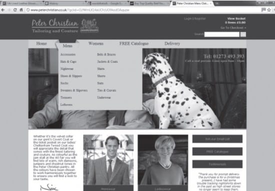
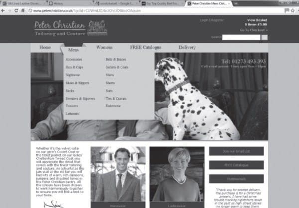
In this example for the clothes company Peter Christian, the main category is ‘Mens’ and the sub-categories – trousers, socks, nightshirts and so on – are on the drop down menu.
The main aims for this type of copy are to:
- Tell your customers what they can expect to find there.
- Curry favour with search engine spiders by feeding them relevant keywords.
- Reinforce your brand message.
In other words, the category copy is a signpost to help your customers find their way around. It’s also part of your organic search engine optimisation.
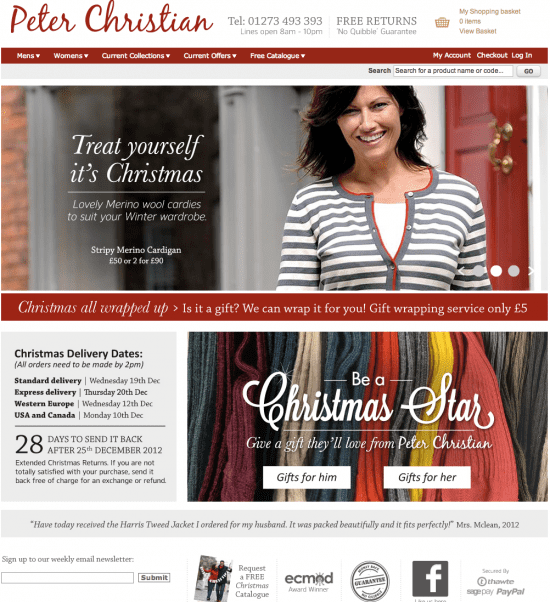
This current example shows the value of promotional copy.

Remember, you are simply telling your customers what they will find, not trying to sell the products. This is not the place to try to sell the product – your job here is to get them to click through to the next page.
An often overlooked use of category overviews is to help reinforce your brand. You can weave in messages about what you stand for and why it’s worth buying from your site.
I hope you find this useful, in my next post I will write about copy for product pages.
Mel Henson is [amazon-product text="author of Flicks and Clicks" type="text"]1907722041[/amazon-product].


