8 examples of CTAs that Should Inspire You to Assess Your Own and Make Some Changes
“If you build it they will click?” Not likely. Your visitors do not have some instinctive urge to click a button just because it is there. They have to want to click that button because there is some value in doing it. The questions to ask yourself are as follows:
- Have you created enough value or benefits?
- Is your CTA really “connected” to the conversion?
- Are you providing “no-risk” for clicking that button?
- Have you told the visitor exactly what to do?
- Have you established some form of urgency?
- Are your CTA’s taking advantage of the psychology of conversions?
While no single CTA will probably meet all of these criteria, the more that can be incorporated, the better. Here are 8 example CTAs that are getting conversions, with an explanation of why they do.
Manpacks Wants You to Get Creative
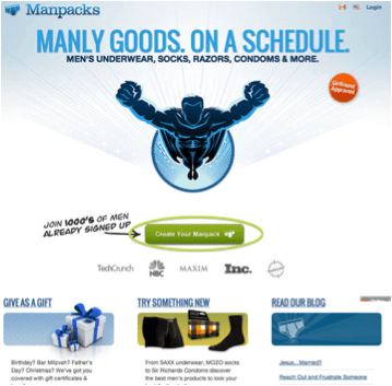
What Works:
- First, the image of a superhero is a great psychological feature – especially when you are selling something that might be rather boring (underwear, socks, razors and condoms), but these designers have found a way to make it more fun. (Note also the “girlfriend approved” button in orange – great humor.)
- Second, the CTA button is perfectly placed in the center above the fold and in a green color that cannot be missed. Also note the large amount of white space around the button to keep it from getting “lost.”
- Third, while no “value” such as a discount or a free trial is being offered, there is still value because of the words on the button. We all like to create things, and clicking this button will allow us to do that – so much more engaging than “buy.”
- Fourth, the CTA is absolutely connected to the conversion, the customer has been told exactly what to do, and it’s probably going to be fun.
- Fifth, there is the little psychological “push” of joining a “club” of 1,000’s of men already signed up.
Basecamp Says You Have Nothing to Lose
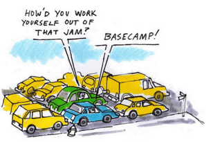
Basecamp is a cloud-based project management tool that keeps all of the “players” in the loop. They switch out the CTA page occasionally, but the conceptual design is always the same – a cartoon with some catchy text and then the following great CTA features:
- Enough white space around the CTA button
- The benefit of a 60-day free trial – value added
- Impressive value – 2,000,000 projects in a single year – this would be a great “group” to join.
- The text on the button is directly connected to the conversion
- One Suggestion: A/B testing has shown that buttons with rounded corners do better – they draw the eyes inward toward the text.
Quick Sprout Solves a Problem
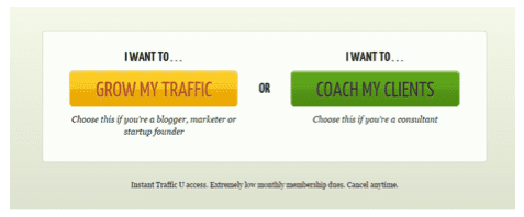
QuickSprout is a relatively simple site compared to Neil Patel’s other major headliners – Kissmetrics and CrazyEgg. It provides a free initial analysis of your website which is of itself great value. But it also offers training for both types of people in the business of increasing traffic - those “in the trenches” and those who consult on traffic issues. These dual buttons on the same page may depart from conventional wisdom that there should be one request only, but in this case they are effective because of the text.
- The value is clear – these CTA’s clearly will solve a problem for the customer – growing traffic or coaching clients.
- There is no “buy” or “free trial” here, but the customer is compelled to make a decision between two buttons based upon what he wants.
- There is a definite connection between the text and the conversion, and the customer is given clear instructions with a command verb – “choose,” based upon who he is and what he wants.
Crazy Egg – Giving Control to the Customer
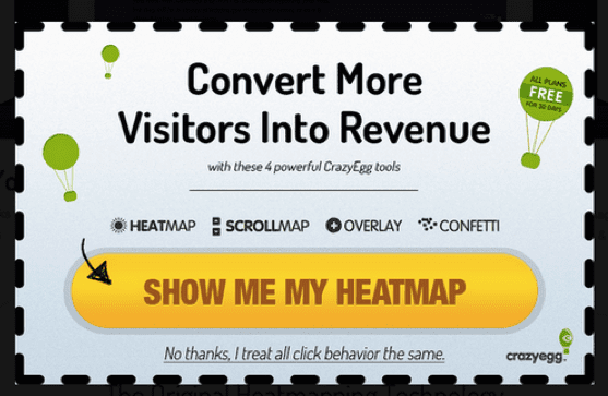
One of the big points that Crazy Egg makes with all of its marketing is that while other analytics tell you what your visitors are doing, they tell you why. All of their CTA’s offer a free initial example of what they do.
- Nothing to lose – you’re going to get something for free – great value
- Text totally connected to the first step of a conversion
- Some sense of urgency is established by the text below the button, plus the psychology of not wanting to be “stupid.”
- The balloon stating that all plans are free for 30 days is almost an afterthought, but because that is the only balloon with text, the visitor will probably read it. (it will also be repeated elsewhere)
- Text is allowing the customer to give the command – sense of being in control
Starbucks- Sleek and Simple

Notice the colors of this CTA – in keeping with the colors of the “brand” which maintains “familiarity” for the customer. Plus the following:
- There is definite value provided – rewards points that will result in discounts
- The word “Join” rather than “Get” is far more appealing. The customer becomes part of a group
- The word “Now” creates a sense of urgency
- The button text relates directly to the conversion
- Buttons are mildly rounded bringing eye into the text
Pinterest – Benefits and Value
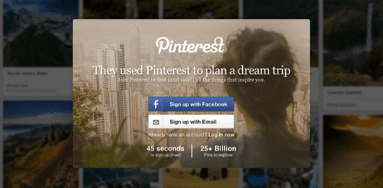
Pinterest has become quite the phenomenon, especially for women. Originally, on became a member by “invitation only,” but because the nature of the site itself has transitioned so much, Pinterest if looking to increase “membership” by user choice, not invitation. This CTA works well for the following reasons:
- While value is not placed on the buttons themselves, it is very nearby – signing up gives the new member access to more than 25 billion pins
- Nothing is being sold, so the only conversion is signing up. The buttons are obviously connected to the conversion.
- Pinterest’s goal is to get user information, and that is accomplished, not by clicking the button, but by the 45 seconds that it takes to actually sign up once the membership account set-up page is reached.
Wordstream – Value, Urgency, and Free Trial

From a physical appeal standpoint, this CTA is not the most exciting. However, Wordstream knows exactly what it is doing here:
- Value – The user can find AdWords errors quickly (nice touch with the clock).
- Urgency – “You can’t afford to wait!” Content marketers are now anxious to learn if any of the AdWords are wrong.
- Free Trial and “Try” button in contrasting color.
- No risk feature and the user gets something immediately
Mistakes to Avoid
Not being clear
You may know what your CTA is all about; you may completely understand what it is you want the customer to do. But you cannot assume that the customer understands it the same way you do. When there is this gap, your CTA does not tell the customer what s/he is getting for clicking that button. Take a look at the following Rich Dads Education site:
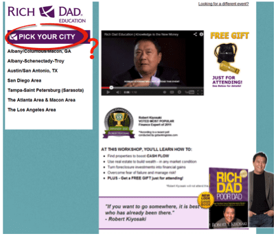
The author of Rich Dad, Poor Dad is now offering workshops on multiple means of increasing your income. Obviously, he wants people to sign up for these workshops. But look at his CTA – it is telling the customer to “pick your city.” Huh? The text on the button does not directly connect to the desired conversion, which is to get the get the registration. A far better button text would be something like, “Find a Workshop in a City Near You.” Now the text directly relates to the conversion.
Coming on too strong
Another CTA mistake is to come on too aggressively. Here is an example of that from the Zulilly website:
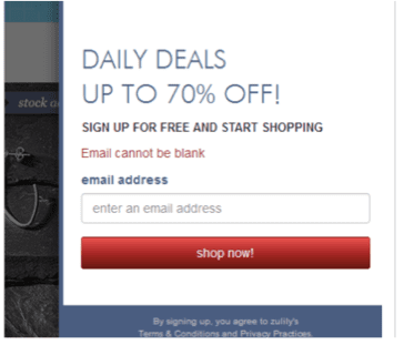 It’s great that this retailer is offering 70% off, and there is certainly urgency in this CTA. However, I can’t get into that savings without first providing an email address. This is far too aggressive a campaign, and many visitors will bounce rather than leave their email addresses – they want value and benefit, not a way for a retailer to fill up their inbox!
Giving No Value to the Customer – Focusing on Your Needs Only
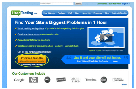
They ought to know better! Certainly, there are benefits listed on this page – finding problems in an hour, boosting conversions, etc., but they are not boosting their own conversions with a button that focuses only on what the company wants. No free trial, no example of what they can do, no value!
Contrast this with the BestEssay.Education. The predominant CTA is a “Start with Discount” button that is featured of every single page of this website. The value to the customer is the most important thing – not pricing quotes!
Here’s your Takeaway
CTAs can either motivate your visitors to take action or reduce their incentive to do so. Take a look at the criteria above and these examples and “test” your CTAs against them.

Thanks to
Julie Ellis for sharing her advice and opinions in this post. Julie is a professional writer and editor. Her wide experience in the field of education, marketing and psychology gives her the opportunity to help all people that are willing to make the marketing world better. Learn more about her and connect on
Twitter, and
Google+.


 Thanks to


