Culture and conversion Part 1 : 5 tips for designing for the culture of site visitors from different countries
Ever wondered why your baskets are bulging in Belgium but spring a leak in Spain? Why your checkouts are chock-a-block in Chile, but empty in Egypt?
Whether you are B2C or B2B business, cultural preferences play a big part in how people respond to your web design. This blog looks at how culture affects your online performance and what you can do to effectively manage an online presence globally.
'Just as nine-tenths of the iceberg is out of sight and below the water line, so is nine-tenths of culture out of conscious awareness. The out of awareness part of culture has been termed deep-culture.' – Edward T Hall, Beyond Culture
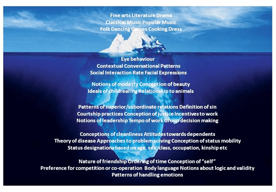
Managing Global web design assets
Managing global web design assets is not an easy task. No matter how hard you try and nail down corporate brand guidelines, someone will suggest a few locally produced off-message landing pages. So, what do you do?
At one level, global templates offer a neat solution - you maintain control over the core design, plus a consistent approach country by country. But you need to consider template designs may not be culturally appropriate for each market. Some elements of the template may be offensive, whereas others may find it acceptable, or in some cases favourable!
One solution for nervous Brand Managers is to have a partially localised template as this may offer some security (see the HP example below). Overall, the homepage is more or less the same across four languages and three alphabets, apart from the Hebrew homepage where it’s aligned left.
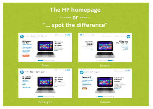
This form of localisation may not be enough to grab your target market online.
Example of UK vs French culture
Consider the following examples of two retailers – one based in the UK and one in France - selling the same electrical kitchen products.
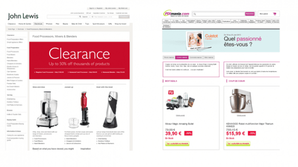
Overall, John Lewis has a clean, impersonal design focusing on beautiful product photography. Pixmania, France’s biggest electrical retailer, puts greater emphasis on the use of the product, including a family photo with the strapline 'what’s your passion?'
- French retail tends to feature much more prominent pricing. A large red font shouts '39 Euros' whereas British e-commerce is more coy about cost.
- French web design is often energetic, sprawling, bold with photography and clear with commercial details like prices and call-to-action. It’s likely to baffle British visitors the same way French shoppers might find the UK design too minimal.So, even with two affluent Northern European neighbours, web design has evolved with different cultural rules.
Hofstedes's 5 dimensions of culture
There is no single approach to managing culture as each country’s preferences and values vary. Anthropologist Geert Hofstede research into the '5 Dimensions of Culture' provides a scorecard for cultural factors to help professionals understand the similarities and differences.
These five dimensions are:
- 1. Masculinity V Femininity Index
- 2. Long Term V Short Term Orientation
- 3. Power Distance
- 4. Uncertainty Avoidance and
- 5. Individualistic V Collectivist societies.
Consequently, Hofstede has given each country a benchmark for each of these dimensions. Please see below for details:
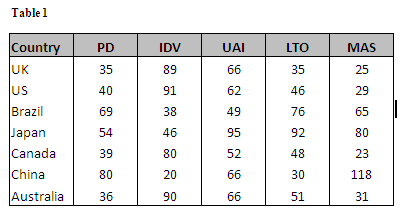
A culture like China scores very highly on Masculinity and Power Distance but very low on Individuality and Long Term Orientation. What this means is that Chinese web users may respond to:
- Photography of groups of people not individuals
- Prefer male subjects rather than females
- May be less inclined to look for a long term relationship with a brand
- Consequently less likely to become a registered user and is happy to cede authority to the web owner (e.g. by being trusting and perhaps less conscious of security)
Something to bear in mind is that culture affects all facets of your business including cultural attitudes to the industry you operate in. At GlobalMaxer we found evidence of this in our programmes of Multivariate and AB tests.
Colour differences across ethnic groups
In a site test for Hotcourses in Singapore, our research found a consistent factor,the colour orange across two ethnic groups.
Amongst the Mandarin speaking Buddhist majority in Singapore, orange is a holy colour meaning wisdom. Amongst the Hindi speaking Tamil minority, the divinity Krishna is commonly portrayed dressed in yellow or yellow orange, with yellow/orange highly prominent in the Hindi festival of knowledge, Vashant Panchami.
Consequently, our Hotcourses tests on prominent orange buttons generated a 134% increase in course applications
It’s important to note if a country has a strong brand image or is known for strength in a particular sector, facets of it may feed into the general cultural identity.
For instance, Germany is perceived to be strong in the engineering sector and brands such as Porsche, Siemens and Mercedes, certainly market themselves in alignment with this perception. In our tests for the global air charter company Chapman Freeborn in Germany, we found a strong preference for silver call to action buttons - something we borrowed directly from Mercedes.
Interestingly, the silver button outperformed green, orange and red alternatives. Data also revealed Chapman Freeborn’s German customers had a large aversion to the red coloured button. As you can see, researching cultural attitudes in your industry may provide existing cultural signifiers you can adopt into your own brand assets.
5 top tips for cultural web design
Here are my top five tips to build a successful cultural approach to design when launching into new markets:
Conduct online searches for local brands who offer the same goods and services as you. What is consistent about how they look or how they sell online?
What knowledge do your colleagues, partners and suppliers have of the local market? Chances are there will be some cultural snippets you can integrate into your own design strategy
If you are using a global template, which elements of your brand assets are flexible? Colours and wording are key, but factors like grids, templates and alignment can still be more effective if localised
- 4. Test everything - don’t make assumptions
In certain markets and industries, you might find your global template works best, but you won’t know unless you test it first!
- 5. Act on the data - your customers are always right
Have flexibility with your approach to web design. Make sure you use versions that have been proven to work the best

Thanks to Joe Doveton for his advice and opinions in this blog post. Joe is the Head of Client Services at
GlobalMaxer, UK’s leading Cultural Conversion expert. He has 17 years industry experience, working alongside a number of high profile brands including STA Travel, Manchester United, Vodafone, Sony and Panasonic. His area of expertise ranges from traffic driving disciplines (online advertising sales, ad planning and buying, ad networks, SEO & PPC) to site-side optimisation (web analytics, usability, conversion, AB and multivariate testing). Regularly speaking at conferences world-wide on all facets of multivariate testing and conversion, his ‘know-how’ on how conversion patterns vary across cultures is second to none. Editorial credits include UX Magazine and I Gaming Business Magazine to name but a few.Moreover, Joe recently worked on a cultural conversions chapter for the renowned CRO industry bible ‘Landing Page Optimisation’ by Tim Ash (2012). In addition, he is also one of the main speakers at Conversion Conference Boston 2013.


 Thanks to Joe Doveton for his advice and opinions in this blog post. Joe is the Head of Client Services at

