Examples and the Pros and Cons of Parallax Web Design
We are all more aware than ever that web design styles are shifting towards user experience as opposed user tasks and usability. Users demand to be engaged, entertained, educated and enticed into absorbing content online. Parallax web design, used in the right context, has the ability to deliver a really strong connection to an online brand experience, based on the interactivity of the website, the journey and the focus, realism and context given to the content or product.
Often, examples of Parallax web design focus on product examples, such as Google's Nexus 7 page, but I hope to show in this post that there are opportunities for other types of organisations such as B2B businesses or charities to use Parallax design for deeper engagement. The examples show that Parallax design can offer a more interactive version of infographics, better suited to communicating your core brand messages.
As Robert Yardy explains in his review of 2013, it's an approach we're seeing more often:
Parallax web design is a technique of using CSS to make different layers on the web page move at different rates. When a user scrolls down a page they will be presented with content, such as photos, videos, text etc coming in from different angles and not just all moving down the screen together.
Advantages of Parallax sites
Bring your brand to life
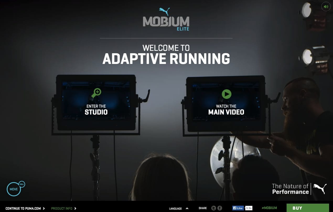
Parallex websites have a certain advantage over traditional websites in that they can provide a richness to a brand or product, difficult to execute via more traditional web design and build techniques. Branding online is less now about an identity and tone of voice, it's about engagement with content and the appeal and connection to the specific audience groups. This running shoe site from Puma for example creates a rich experience that delivers depth, realism, 360 degree product views and more for its shoe. More than that though it delivers a brand experience to users that Puma are innovative, have great content to share and are giving users the empowerment to discover their branded product in an interesting way.

Can Make Complex Information Accessible
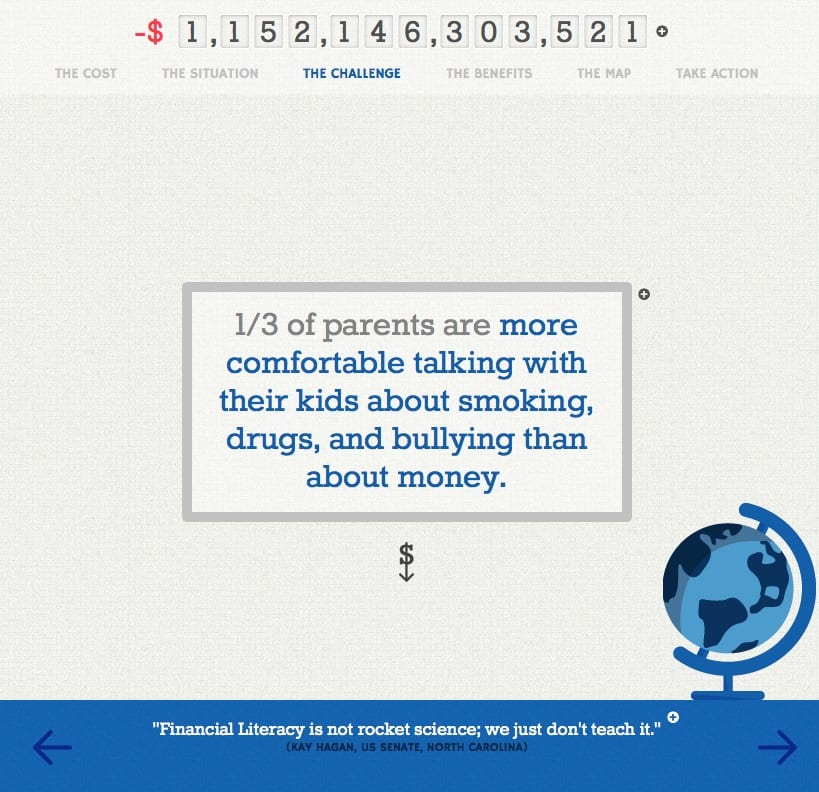
The web should make life simpler for people, not more complex. Parallax, done well can make complex information, through it's presentation, engaging and informative in bite size chunks. This website for the Council for Economic Education in the USA aims to inform students and stakeholders of the reality, risks, dangers and options available to them. There is lots of data on this website, related around key themes, and if presented in a more standard way, would probably not engage the user or ensure they take in the relevant information.

Tells a Story
Another great execution that Parallax scrolling offers, is the ideal setting to tell your story in an engaging and interactive way. Let your visitors take control and let them walk through your story at their own pace. The different layers that respond differently to the scrolling behaviour can create a sense of depth and even allow for multiple story lines. This clever example, Every Last Drop creates a highly relatable narrative, allowing room scenery to assemble and disassemble around the protagonist. Timed to perfection, the embedded facts are easy to read and digest, and are supported by the dynamic environment created by the multiple layers.

Disadvantages of Parallax designs
Slow Page Load Times
Patience is not a virtue that too many people have in today's online space. High saturation of broadband and quick to load optimised websites offer for many, a quick on-demand web experience. The bulk of images, css and JavaScript loading on one page can take a longer than ideal time to load, especially for that important "un-cached" first visit.
It's Simply Bad for SEO
Parallax website design simply, is not SEO-friendly. Due to the nature of parallax websites, all or in some cases most of your site content exists on one single page. This means that you can miss the opportunity to define important meta data and title tags within the site, which are one of the most important factors in determining page rankings in your favourite search engine.
Traditional websites of course offer the opportunity to target keywords by using meta tags on individual pages which communicate with search engines to establish your page ranking and thus increase the page specific relevance to the user's tailored search terms.
Additionally, in a parallax environment, we tend of see a trend for multiple H1 headings on the page, which compete with each other for the search engine crawler’s attention because they are on the same page. This does not help clearly establish what your site or page is about and ultimately hurts your page ranking.
It's Not Ideal for a Responsive Experience
Parallax scrolling websites are difficult to design responsively. Normally, separate mobile specific website that offer a completely different experience to the user are created for mobile, due to software, hardware , browser and connectivity issues hindering the similar parallax experience being deployed. This may not necessarily be a bad thing, for the more task centric mobile - user, but for brand consistency it is often a bit of a let down for the client and the customer! Not to mention this if you are in the client services industry, your client may not be happy with the added expense and administration requirements of creating a second "mobile only" version of their website.
What's best for your brand?
It's such a difficult question and the correct answer really does depend on the context and what role or roles your website plays in the brand journey for your customer, importantly in the marketplace and amongst the competitors you face.
To expand, if you are a new brand in the marketplace, that does not offer e-commerce or a specific online - centric function. nor has any immediate plans to; for your brand, awareness and emotional connection to the brand and what you stand for, is of utmost importance. With this in mind the storytelling, impactful and illustrative nature of parallax might just be right for you. It can be a head turner, an attention grabber and a brand - awareness vehicle well worth the investment.
In contrast if you are a company that needs a website to deliver high volume search traffic, online sales, requiring an intuitive, quick, responsive and highly accessible web experience for your user, then perhaps Parallax isn't for you.
There is though room for Parallax to be a "part" of your digital media mix at some point in the customer communication journey with your brand. For instance, if you do not wish to use the website style for your main customer or consumer website, you may still have a strong wish or rationale to deliver a campaign, event, or specific product mini - site in this format; it may just be right for that niche purpose.
The key thing to bear in mind when it comes to using this style of website design and user experience, is to weight up the pro's and con's and decide if it's right for you, most importantly in relation to your own sector, marketplace and amongst the competition. Perhaps most importantly and to conclude, do not try to find a place for parallax, simply because you like it. Start with your own business goals, the impact you may or may not have to make online and the specific online goals of your users before considering the most appropriate web experience.
I'd love to see other example of Parallax designs that support the goals of different types of business. Can you recommend any?


