Our new mobile responsive home page and customer journeys
22nd August update: New library search and other updates
It's nearly a couple of months now since we redesigned the site to update our design style and to make the site fully mobile responsive on smartphone and tablet. In this note I just wanted to let members know about another round of updates.
Since the original relaunch we have updated our blog page template to be responsive too, so you can access our updates "on the go" more easily. Thanks if you left a comment with support - it's been nice to get a lot of positive comments!
We did have a few support queries about mangled layouts with the previous updates - this can happen when the previous design stylesheet is in your cache if you have accessed a page before. A simple refresh of the browser should sort this, you may need to do this for the the new updates too.
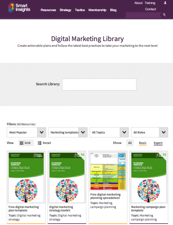
The main change I wanted to alert you to is for our digital marketing resource library page:

This library page is used a lot by members to navigate to our different types of resources in different categories, so we have had a few suggestions to improve. The main changes we have made are:
- Search box added
- Selection added to restrict to Basic or Expert member content only
- Detail view added to view more on screen with date updated info
- Usable at a sensible size on smartphone on tablet
- Speed improved
In the latest round of changes we have also updated our membership plan comparison and resources pages to help with usability too.
We hope these updates are helpful - do contact us via support if you have any problems or suggestions!
Original note on redesign
Just a short note to let members and readers know that you will soon see a new and hopefully improved look to Smart Insights. We're excited to get the new look live and hope you like it too.
There may be a little downtime on Monday 30th June and Tuesday 1st July as we push this live, so please bear with us if so. We’ll let you know when the new templates are in place.
As with many companies working on redesigns at the moment we wanted to move to a mobile responsive approach so that our content and navigation is clearer on smartphones. We first updated our online courses and some landing pages to mobile responsive around 18 months ago, but will be rolling out more changes in the remainder of the year starting with a new homepage, strategy pages and top navigation. We will then work on making other templates fully-responsive. We’re using the Bootstrap framework, originally created by a Twitter developer as way to rapidly build responsive, mobile-first sites.
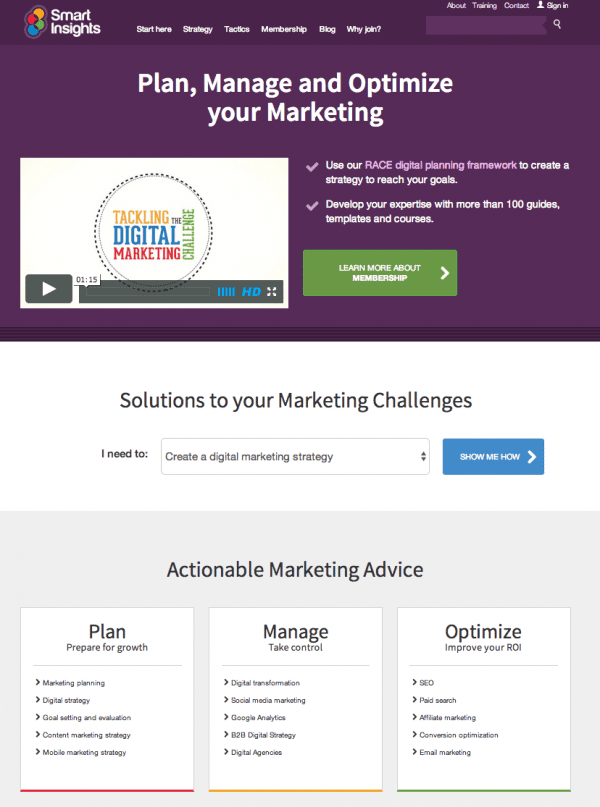
Here's how the new home page looks:

Our main aims in launching the new site are to improve these areas of the site / experience:
- More audience-centred. Customer journeys from the home page are based around challenges marketers and businesses face and our free content balanced with our membership options.
- Clearer online value proposition. Our mission is help marketers develop their knowledge of best practices and the latest developments to help their businesses compete more effectively. To do this we aim to cover all aspects of digital marketing, but with a focus on strategy and data-driven marketing, areas that are prominent in our 2011 Manifesto for today’s marketing.In the new design you will see on the home page that content in a short directory is structured around the key areas that marketers need to work on under “Plan, Manage and Optmize”.
- Mobile responsive - we probably should have acted to address this sooner, but it’s less urgent for B2B than B2C audiences and we have been working on other features such as our selector for all marketing resources. 89% of our visitors are desktop-based. Still mobile % does increase for first-time visitors, and of course first-impressions are important. Maybe members were deliberately avoiding our poor mobile experience!
- Improve typography and reduce clutter! While we get generally favourable comments via our Kampyle feedback system with rating typically 4 or 5 out-of-five, some people mention there is too much content on some pages, so we are reviewing all pages to reduce interface elements and introduce more space and cleaner typography.
We hope you like the new design so far and it makes using our content easier. Do let us know about anything you do or don’t like since we will be refining the site in response to feedback and analytics.
Thanks, Dave Chaffey


