A case Study showing how to use App Store listing testing to boost downloads
On my first day at work my CEO at CallApp gave me a compelling challenge when he turned to me and said, “We need to increase the numbers of users downloading our app on day seven (an acceptable measuring metric), as quickly as we can." The first thing I did was analyze the numbers in order to figure out where I should put my efforts in order to maximize the results and show improvement.
After crunching the numbers, I decided that the best place to start was in trying to improve our conversion rate in Google Play Store. I will try to give you an idea of why I chose this route and what store conversion is all about.
There are several options for downloading the app but the most common is through Google Play Store (for android users). In the Play Store, a user can search for an app by either using the app name itself or by using keywords. The search will result in a list of matching apps (if keyword search is used) or the app itself will be listed. Then the user has to decide whether they are willing to install the app and try it out. The goal is to convert the search into a download, getting the user to install the app on his device. Logic follows that improving this process will increase our downloads .
Google provides different testing tools for this purpose on the Google Developers Console. Looking at the options, I had to decide what to use in order to increase our install numbers. The options I looked at included:
1. Traffic to the store - User acquisition (paid or organic).
2. Store conversion rate.
3. On boarding process - The registration wizard.
4. App retention - Increasing app usage (by the users).
It is important to note that the above options don’t require the same resources and they each have their own time frames that need to be taken into consideration. For example, “onboarding” or “new features” requires significant development efforts (and app release), which, in comparison, can take more time since there are also different tests that need to be undertaken. So the decision I had to make was between a long cycle or fast store listing tests, which just needs a good designer and open minded product manager.
Let’s take a closer look:
Current situation is:
● Conversion in Play store page (store to install) - 25%
● Conversion in Reg (onboarding) - 50%
● Retention in day 7 - 30%
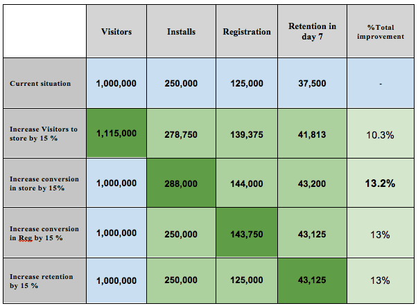
To summarize this part -
1. Improving conversion in store has a major impact on the number of users (it’s the highest number).
2. It does not require development resources.
3. It can be easily tested and monitored using Google tools
4. Changes can be made without the need to release a new version of the app (Google Play)
5. That`s the fastest way to test and changes in total conversion
Test in App Store
What we can test in the App store:
- 1. Feature Graphics - The top image on the page
a. Image
b. Text / message
c. Video - With / without
- App Icon - App icon design
- App name - App title (30 characters top)
- Short description - App short description (80 characters top)
- Full description - Long App description
- Screenshots
a. App screenshots - images
b. Screenshots order
All the tests are undertaken on the live version of the APP and the tests and the results can be monitored on the Google Play developer console, which allows you to test each of the elements as well as their impact on different language audience. There are more parameters that influence the user decision of whether to download the App or not but they cannot be tested without releasing a new version.
Use Case - CallApp store listing test
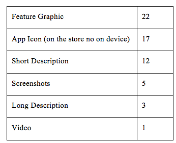
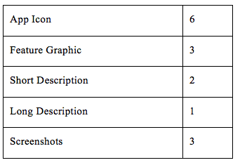
During the second quarter of 2016 we undertook about 60 tests in the store in an effort to tackle and analyze each of the elements. Eventually, we applied 20% of the experiments to our app's store listing on Google Play.
Our Method -
● Each test included only one tested parameter.
● Tests were made on different languages (to analyze the impact in different cultures)
● We repeated each test even in cases where the test was successful to double-check our results.
Breakdown test by category: Total 60:
Breakdown of applied tests: Total 15:
Test Case - App icon
We tested more than 20 App icons variations. User were able to view the icon in three places:
1. Google Play Store app list
2. App store page
3. After installing - On user’s device
App Icon tests are a very sensitive issue as they have far reaching consequences. Any changes made will have to be reflected in the company’s marketing materials and will impact the company’s overall branding efforts. Therefore we decided that any changes we made were to be minor changes to minimize the impact on our brand.
With that said, here was the agenda for the App Icon tests:
● Test different icon shapes
● Different icon colors and backgrounds
● 2D effects vs 3D
● Out of the box
● Add elements to the icon
● To announce a test as a winner, the significance level should be high (at the console you have it clear if a variation is a winner or not)
This is the original icon with which we started with on the store.

1. Test 1 Three variations - We added round shapes with different color backgrounds in the assumption that users are familiar with and like round shapes. We tried to highlight the Icon within the shape.
This didn’t go down well!

2. Test 2 - Next we tried a round shape with 3D Icon
Results: This received a positive response and the new icon was applied to the product version

3. Test 3 - We then wanted to see if using a rectangular shape would have a better response than the circle so we added a rectangular background.
This did not go down well either!

4. Test 4 - So we went back to the circles and tried a few more variations to the background colors.
This didn’t work either.

5. Test 5 - So we thought maybe changing the color of the icon itself would be a good idea. So we tried out a colorful icon, which seemed to be very popular among other apps.
Nope! That was not a hit with our users.
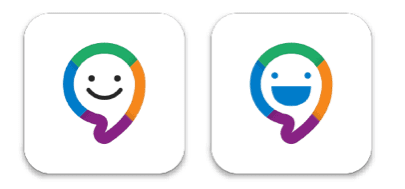
6. Test 6 - And then we tried our hand at round backgrounds with a 3D effect and also, since many apps use the blue color scheme, we tried to break it up a little.
No! That idea did not work.

7. Test 7 - Okay, so then we tried to elevate the icon by adding a winner’s badge. I mean, everybody loves a winner, right?
Wrong!

8. Test 8 - For our last attempt we went with a round background with the 3D icon which worked in our second test and added a white border.

We had a clear winner! The results showed an overwhelmingly positive response.

Conclusion
There are no clear conclusions as to what works and what doesn’t. But with experiments you get a chance to use data to decide what works and what doesn't, what I can tell you is that you need to implement some innovation and keep on testing all the ideas, no matter how big or small the ideas may be.What was missing? Possibility to perform an experiment by country and not just by language is essential because
What was missing? The possibility to perform an experiment by country and not just by language is essential because optimization and localization should be by country. For example, Spanish or French is spoken in dozens of countries, with different cultures. Two useful practices about running experiments
Two useful practices about running experiments are: test one thing at a time and second conduct assumption/hypothesis based testing. Google provides you with great tools, but don't forget the methodology as even A/B testing can be misleading, especially if you don’t follow the rules.

Thanks to
Liron Leshem for sharing their advice and opinions in this post. Liron Leshem is VP of Product at
CallApp. He has over 13 years of experience leading start-ups and multinational hi-tech companies products. It's all about simplicity. It's easy to say but hard to get, to give the best product and experience to your users who reflect product target /vision and possibilities. You can connect with him on
LinkedIn.


 Thanks to


