Including 4 practical tips on mobile optimisation

With 2015 fast approaching, we within the marketing industry start to ask ourselves, what’s next? When prompted about their thoughts on the digital marketing trends of 2015, a large number of industry experts gave a similar response as shown in our recent survey Digital Trends for 2015. The answers given by many suggested that mobile marketing is now, and will be the pinnacle of brands' marketing strategy.
There's a similar pattern in the Smart Insights poll of Digital Marketing Trends in 2015 with mobile marketing in third place behind content marketing and marketing automation.
Rand Fishkin of Moz suggested that:
‘for many consumer-focused tasks, mobile is likely to eat away at desktop share’.
Jason Falls suggests that ‘2015 will be all about figuring out mobile in some way, and Google will penalize you for not having a mobile optimised website’. This was confirmed in a recent advisory note from Google on the 16th November where mobile-optimised sites will be marked as "mobile-friendly".
With this is mind, we looked into some of our own analytics to see if this correlation was in fact true. Below are a set of results for total sessions running the full month of September 2014:
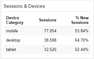
As you can see, the total amount of mobile sessions is more than double that of desktop and tablet. So what does this say about our client’s conversion results, and more importantly, will the session data show a correlation with the platform most purchased from?
Below I have evidenced the total percentage of revenue made per device for September 2014:
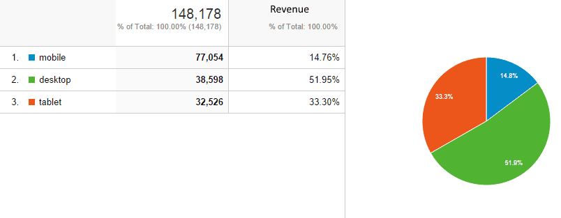
Looking at the data above, it is clear that even though desktop has less than half of total sessions, it still brings in over 3 times more revenue than that on mobile. Now why is this?
I think the reason for this pattern is a balance of convenience vs. security. Put briefly consumers have two preferences when it comes to purchasing, convenience, and security. Mobiles and tablets alike offer an optimal amount of convenience to the user, given that they can purchase anytime, anywhere. However, how many of you reading this can honestly say you would purchase something of a value over £100 using a mobile phone?
Especially with high-involvement purchases, consumers still tend to put their trust into the well-known and established desktop. Mobile e-commerce is still a fairly new concept to the industry, and thus will take time to build the trust that the desktop has already established.
This doesn’t explain then, why the high rate of mobile sessions? According to Mobify, there are 3 modes of mobile user experience: "Urgent Now – Repetitive Now – Bored Now".
Each of these suggests a different aspect as to why a user is browsing using a mobile, which could explain such the high volume of mobile usage at present.
- Urgent Now suggests the consumer is in desperate need of information related to location or activity
- Repetitive Now states that a user are seeking recurring real time information;
- Bored Now implies the user is in search of entertainment or distraction.
So how do these definitions help us? By monitoring your pages (tools and methods explained later), you can start to analyse what type of user is browsing your site. After all, Urgent Now users may be looking to your site for information to later purchase them on a desktop.
In fact, a further statistic measured by Mobify suggests that 90% of users move between devices to accomplish a goal. Further, John Rampton has suggested that ‘most transactions nowadays start on a mobile and finish on a desktop’.
This could, and most likely does explain the miscorrelation in our figures, as many users may have researched on mobile, and paid on desktop; think of it as an assisted conversion on desktop.
It is evident that for many mobile should play a large part of your strategy in 2015 if you haven't already addressed it. It isn’t just enough, however, to incorporate some shabby mobile site, after all, the majority of users will bounce if it takes any more than 3 seconds to load. So the real question now is, how do we optimise our site for both conversion goals and referral traffic to desktop? Simple; measure-implement-measure.
There are numerous ways you can look into optimising your website for mobile, quite frankly, there are too many to write about in depth, unless you wanted a mobile sequel to the harry potter books, so instead I am going to list the most important aspects to look out for when optimising your mobile strategy.
User experience is the bread and butter of building a strong mobile strategy. UX can be broken down into three key areas, design, intuitive navigation and relevant content. It is important to remember that Google as a search engine wants to please its visitors, thus you must design your UX to do the same.
4 Tips to ensure a good user experience
To ensure a good enough UX, you must first take into account aspects such as speed, responsiveness, retargeting and optimising your CTA’s, after all, if it is a conversion you are wanting, these 4 points need to be met.
1. Optimising page loading times
Page speed can have a devastating effect on UX, and ultimately the success of your mobile strategy. As I mentioned earlier, if your site doesn’t load in 3 seconds or less, users are likely to take their business elsewhere. So how do we look into our page speed and more importantly, how can we make it faster?
2. Google page speed insights
Google’s Page Speed Insights is an extremely convenient tool that measures both the speed of your mobile and desktop site. Within seconds of entering your URL, this tool will have crawled your whole mobile and desktop site and tested it for speed, as well as finding out what could be improved within the backend of your site. Below is a demonstration of searching for my agencies URL:
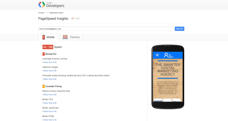
As you can see, not only does this tool tell you what you should change, it also shows how you can do so. There are also little techniques without using this tool you can use to improve the page speed, such as: optimising your images, using caching plugins, deactivating unused widgets and plugins, using a content delivery network (CDN), as well as choosing the right web host. For more detail around these areas, take a look at 5 tips to make your site load faster.
3. Creating a Responsive and User Friendly Site
Responsive web design is an aspect that should definitely be picked up on, however shouldn’t be seen as the only focus of a mobile strategy. Mobile devices are often constrained by display size and require a different approach to how content is displayed on desktop. There are a huge amount of variation in screen sizes, from tablets, iPads, mobile devices and even smart watches, meaning your website now has a multitude of platforms to display well on - hence responsive web design.
Tips for website responsiveness
There are a number of points to consider when making your site responsive. I have listed some brief points below:
- Keep it simple: use as much standard HTML as possible, veering away from complex JS or CSS3 systems for structure.
- Use media queries: set already sized styles dependant on what device the site is shown on. I.e. @image (min-width: 200px) @image (max-width: 640px).
- Define the breakpoints: every device has a common breakpoint. For example, first gen smartphones in portrait are <480px.
- Make layout flexible: use flexible grids, as these organize content, as well as use relative width to adapt the viewport size. This means you can be ready for any screen size, providing you tie in the Media Queries effectively.
- Optimising images: simply adjusting the width and style can make your pictures flexible to smaller screens too. Eg. IMG {max-width: 100%;} instead of IMG {width: 100%}.
- Linearize and skip non-essential content: linearizing mobile content (putting into one column) is essential in the low resolution style sheets. This can be simply done by overriding the width of every column bloc in your mobile style sheets. Also remember, not every aspect of your desktop site will be used in a mobile context, therefore refine what will be used, and apply a {.not_mobile} class to your non-essential elements.
- Check your meta viewport: one thing you do not want to be doing is squeezing your desktop version onto mobile through emulating the desktop site. This may be a powerful feature, however it does not help responsiveness. To make sure your site isn’t squeezing 1280px onto a 480px screen, set up device width in the head section. For example:
- <meta name=”viewport” content=”width=device-width”>
This will allow your site to realise the browser and set the width accordingly.
Of course if you do not have the technical expertise for this phase, you can always use generators such as HTML5 UP, as a way of generating coded templates that will provide you with a fully responsive, customizable and intelligent responsive design template.
4. Track and Measure Your Mobile Site
Hot Jar
Once you have fully optimised for a responsive design, and your page loading times have seen somewhat of an improvement, now it is time to track your consumer. By tracking, I mean literally looking at where there mouse’s are going on your page, following click by click the actions they take on your site.
By following in detail the traffic on your page, you can start to gain an insight into any alterations needed on the sight to improve UX and ultimately, optimise CTA’s and increase conversion rates.
Hot Jar is a brand new tool allowing you to do this. Even though it is still in its Beta phase, Hot Jar allows you to view a swarm of information, including Heatmaps, Feedback and Exit Polls, Online Surveys, Funnel and Form Analysis, Visitor Session Playback, Proactive Chat and you can even recruit possible participants for user research on your site.
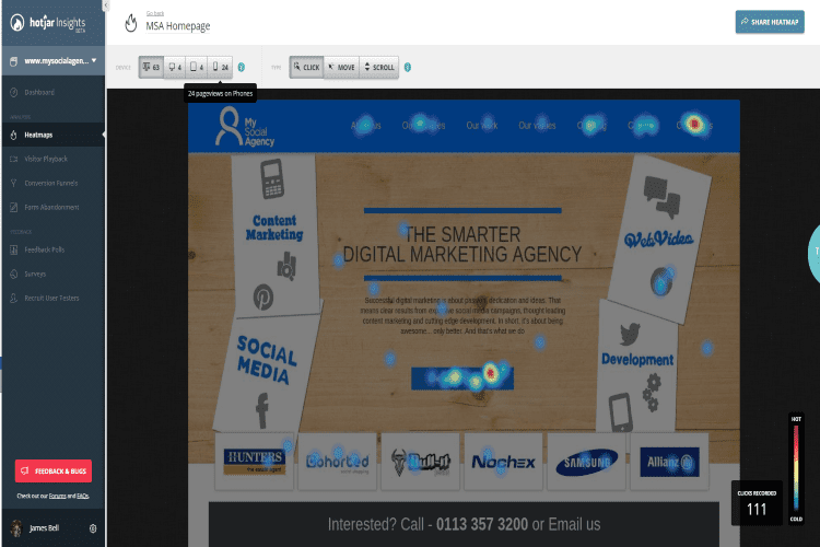
Below I have demonstrated a few examples of the tool in use:
This first image evidences the average scrolling habit of 111 visitors to our website. As you can see, the ‘above the fold’ section make ups has 100% visibility, however further down the page gradually starts to decrease, with a large section of the site not even being viewed on a mobile device.
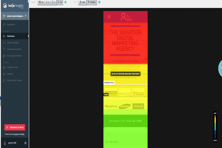
This second image represents where on the page receives the most clicks. As you can see, both our contact us page as well as our find out more have a high click through rate.
The final image is the playback tool. This presents the mouse movement and website navigation of people that landed on your site. You can see where there mouse has scrolled, as well as monitor their experience. It doesn’t take a brain surgeon to realise their potential benefit of having this information.
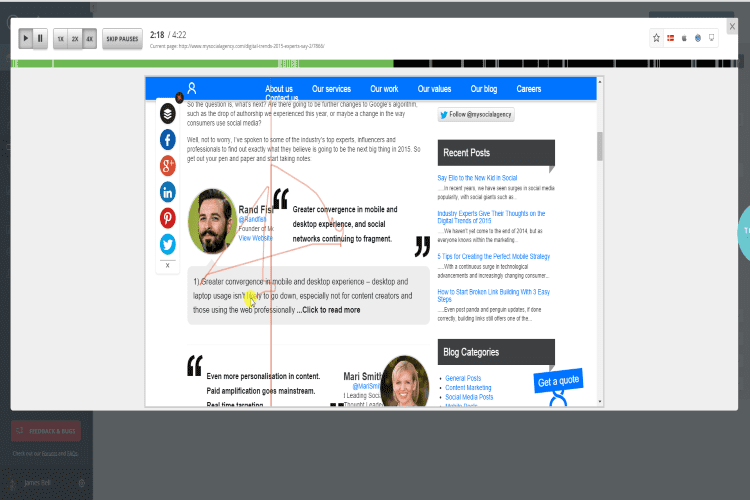
By having all of this information, you can start to put together a portfolio of evidence, regarding changing UX preferences and habits, consequently changing your CTA’s and overall website accordingly.
Optimizely Tool
Measuring with information you have gained is the final and most important step, after all, you need to measure exactly how your website is performing after you have made changes. We are all well equipped with the knowledge of A/B testing as a stand-alone method of reviewing changes and comparing different webpage designs. A/B testing, much like heat mapping, takes the guess-work out of website optimisation. It allows you to show visitors two versions of your site letting them determine the best.
Optimizely is a great tool to use that allows exactly this. They have unlimited resources that allows you to put everything you have learned using previous methods I have mentioned into action, and then test it. If you recall earlier, I said the best way to go about mobile optimisation is measure-implement-measure.
By using Optimizely and Hot Jar, you can measure different aspects of your mobile site, gain strong recommendations, implement them, and then use the tools to measure them again.
Content Management Tools
As Dave Chaffey rightly suggests, customer journey should also be something focused on as opposed to just looking at single page analytics. In his article 'Digital Marketing Trends 2015'
Dave suggests tools such as Adobe Customer Experience Manager, EpiServer and Sitecore for monitoring customer journeys across your whole website.
These content management tools provide a combination of web content management with customer intelligence, in order to provide you with the knowledge to drive real engagement.
By implementing these tools into your mobile strategy, as well as single on page element analytics, you can really gain huge insights into your audience, and provide the best UX possible.
One last note to take away; consumer behaviour is an ever changing element, so if you think you can measure once and be fine, you are so wrong! If you want to succeed in your mobile marketing strategy, I would strongly recommend abiding by a continuous circle of measure-implement-measure.
Image/Copyright: Bigstock.com and My Social Agency
 Thanks to James Prideaux for sharing his advice and opinions in this post James is a Digital Marketing Executive at My Social Agency. He works within varied aspects of digital marketing, however, primarily in content writing, SEO and social media management. You can follow James on Twitter or connect with him on Linkedin.


 Thanks to James Prideaux for sharing his advice and opinions in this post James is a Digital Marketing Executive at


