Google Analytics have rolled out their latest change to the tool's user interface. This post explains 8 of the changes they've made, along with screengrabs comparing old vs new.
If you've used Google Analytics for any length of time, you'll know that these updates usually take one of 3 forms:
- A large series of user interface tweaks, all at once.
- Introduction of individual (or small groups of) functionality changes.
- Both together.
This time the change is largely user interface tweaks, though there is also a couple of neat little functionality changes.
Change 1: Left Navigation
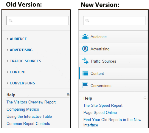
The left navigation (the main way of accessing all reports in Google Analytics) has been updated. All of the categories within this are the same, but the layout is a little cleaner, and they've added icons here:

This is purely a visual thing, and there is no recategorisation of reports within this area. 'Advertising' still sits strangely on its own, outside of traffic sources. There is still an issue whereby if you've opened two or three of the left-navigation tabs, the system becomes a bit unwiedly. Having said that, it feels much cleaner than it did.
Change 2: The Loading Bar
This has been spoken about a few times over the last few weeks, but is now active in all of the accounts I have access to:

Whenever a report is loading, the bar appears, giving you an idea of how much longer you'll have to wait. This is a tiny thing, but it's really useful. There's a slight caveat here in that when using 'advanced segments', you're still waiting a while after the bar has completed before the report loads.
Change 3: Top Navigation
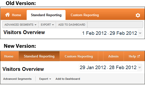
The top navigation has been significantly cleaned up, and they've reordered it so that the 'date' & 'report title' now sit above the 'Advanced Segments | Export | Add to Dashboard' navigation:

Changing the anonymous cog icon (top right) to 'Admin' is a very, very sensible move, and the addition of the 'Help' icon is useful for newer users. The old 'help' area (which is still present) often drops off the bottom left of the screen, underneath the left navigation.
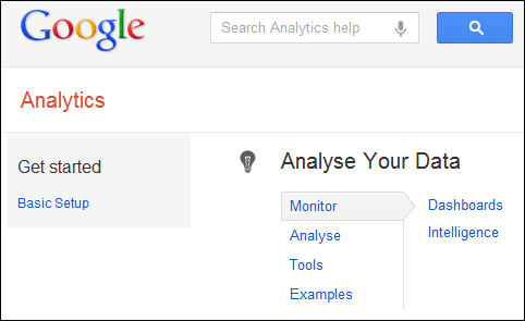
Opening up 'Help' takes you to a useful wizard type system that's both organised by topic, and allows you to search:

Change 4: Graphing Options
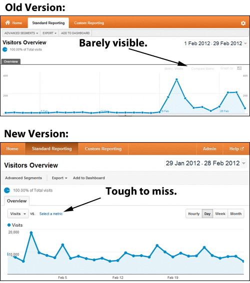
This is a minor change, but will be useful for anyone new to Google Analytics. Previously, the 'graphing options' were barely visible, and I'm sure many people missed them.

This is useful, as graphing and comparing different metrics is a key analysis tool. You'll also notice they've highlighted the 'Hourly / Day / Week / Month' options as buttons, rather than making you click a dropdown before selecting them.
Change 5: 'Fast Access' Precision
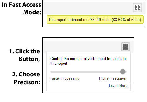
Here's a very, very nice feature. One of the gripes of Google Analytics is that often you're given a report in 'fast access' mode, meaning the data is limited to only a portion of the visits you actually want to see data for.
When this now happens, you're given the option of 'faster processing' or 'higher precision'. If you choose 'high precision', you get all of the data you're looking for:

The option appears on the top-right, and appears most when you've applied 'advanced segments' to reports.
Advanced User Note: There are 2 small caveats to this. Firstly, they now sample data more often than they used to (it kicks in at a threshold of 250,000, where it used to be 500,000). Secondly, this is not limitless. For example, in 'high precision' mode, I got the message "This report is based on 973440 visits (69.86% of visits)." so I believe the upper threshold is 1m.
Change 6: Shared Dashboards
Often when I start doing GA/optimisation work with a new client, one of the first things I'll do is set up dashboards for them. This has been a painful process, as you have to set everything up manually each time and you have to set it up for every user (ie. if there are 10 users, and you want them all to have access, you have to set it up 10 times or give them a shared login).
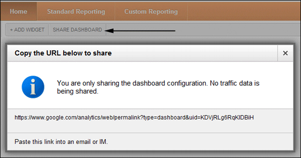
Thankfully (!) there is now a 'share dashboard' link in the top navigation when in the dashboards area:

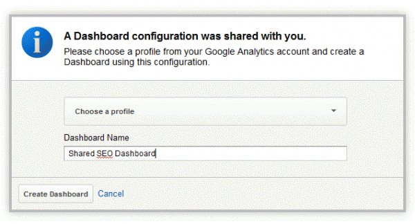
Paste the URL into any browser, and it allows you to choose which account/profile to add the dashboard to:

You'll have to tweak dashboards to fit the specifics of profiles if you're copying them to use for completely different sites (for example if you have an SEO dashboard that filters out brand terms, you'll have to remember to change the filters if the new account uses different brand terms). Even so, this will save any GA consultants a lot of time and hassle.
Change 7: Cached Reports
Previously, if a particular report took 30 seconds to load, and you visited it twice, it would take 30 seconds to appear both times you visited that report.
Now, after a report has been loaded once, it is saved in memory, so that the second time you visit it, it loads instantly.
To give a little control over this (in case you want to refresh the data), every report now tells you when it was loaded, and gives you the option to refresh the data.

Again, this sounds like a tiny thing, but it really makes it feel faster when you're viewing large amounts of data.
Change 8: General Cleaning
There are lots and lots of minor user interface tweaks, including:
Graphs now appear a little cleaner, especially over longer periods:

Topline numbers associated with any report have been tweaked in terms of look:

Tool tips now appear when you move the mouse over certain elements:

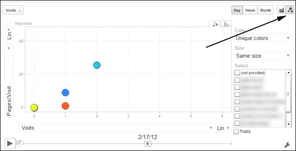
Bubble charts have been surfaced in more of an obvious way:

What hasn't been fixed?
There are always gripes with these things, but in this case they are largely around things that still haven't been fixed since they were removed as part of other recent Google Analytics updates. These include:
- Major: Still no PDF downloads. This was a standard feature in the past, now to access it you have to click 'Old Version' to jump back to the old version of Google Analytics.
- Major: The 'Not Provided' issue, which is not directly related to Google Analytics, but very much affects it, is still there.
- Major: There is still no way to set up regular email reports. (other than 'Intelligence' alerts). Again, to do this you have to jump to the 'Old Version'.
- Minor: In old-old Google Analytics, when comparing 2 date ranges, you'd get a 'percentage change' note. That's still not reinstated here.
Alongside these, there are plenty of other little foibles that will niggle advanced users, like having no easy way to track Kindle Fire visits, the report filter not allowing regular expressions as standard, et cetera.
Summary
The changes here are largely to the user interface, and will make Google Analytics both easier to use for those who are new to the tool, and feel much faster for pro users.
Often when they make user interface updates like this, it's to allow them to launch new functionality that could not fit within the existing UI. Hopefully that will prove to be the case here, and there'll be more to come.
Have you played around with it yet? If so, do let us know what you think in the comments.


