7 Tips for more effective mobile emails
Email and mobile together are already functioning as a team, whether we as marketers want them to or not. The customers and consumers have voted with their usage. They’re not sitting around waiting for marketers to get their act together, but as I write this between 20-60% of your database will be reading your marketing emails on their mobile device.
If designed and planned well, email and mobile together, will, in the forthcoming years, form a formidable marketing force. So marketers, a question: Will you be leading the way and profiting from your competitors lack of preparedness? Or will your competitors be profiting from yours?
Challenges
Many marketers get stuck here and go no further. In no way am I trying to minimize the challenges that lay ahead for a marketer to optimise the mobile email journey – however they are certainly not as insurmountable as they first appear.
The obvious challenges are: designing for smaller screen, many distractions from being ‘mobile’ and not sitting at home or in the office, slow network – often 3G, short battery life of mobile devices and the user is often multi-tasking – i.e. reading your email whilst continually checking to see whether the train is arriving.
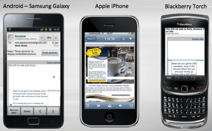
And of course not forgetting the rendering challenges for the multiple devices, an example of a Eurostar email being shown below, courtesy of Striata.

There are more subtle challenges, such as understanding that due to all the above challenges, the buying journey is different, however, depending on how you look at it, you can easily also read this as being a benefit, to be taken advantage of by the savvy marketer.

Want to know more about designing emails for mobile devices? Then join myself and Dave Chaffey at the virtual
International Email Marketing Summit on May 16th, as well as a host of other internationally reknowned experts – it’s free to attend!
Opportunities
The opportunities are plentiful. On the flipside of the coin of the consumer being distracted by the goings on around him outside the office or home, there is also the benefit that on many occasions the consumer will be looking to ‘kill time’. Here they’re looking at their phone to be a distraction, and entertainment –to engage them somehow.
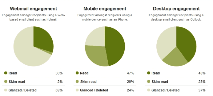
Norman Nielsen’s Usability Newsletter Report 2010 calls this the killing time Factor and attributes the fact that many reports have found mobile email users to be more engaged than either web or desktop users, primarily due to this fact. An example of this can be seen below using Litmus’ analytics tool.
 Embrace the change
When combining mobile and emails, a marketer now has the ability to be with the consumer/customer/subscriber 24/7. Some questions a marketer should ask are: is it relevant? is it personal? is it contextual? Be aware that they could be reading your emails in bed, whilst watching TV, in the bathroom (yes!) and whilst waiting (in a queue, for a train/bus, in-between meetings) as well as in the local café or whilst having dinner with friends!
7 tips to improve your mobile emails
- Get their attention – use the subject line wisely. Whilst the iPhone truncates the subject line you have the advantage of being able to also use the pre-header to gain their attention. Regardless of which email client or device is being used, it’s wise to front-load the subject line with the imperative information or words.
- Simplify - simplify your design and content. Remember the email doesn’t have to do the conversion – your landing page can take care of that – just focus on getting them there by removing as many barriers as possible.
- Design for touch – think fat thumbs. Ensure Call To Actions (whether text or buttons) are thumb-friendly.
- Design for immediate action – Design for the 80/20 rule. Users spend 80% of their time looking at information above the fold therefore place the Call To Action ‘Above the Fold’ (i.e. in the first screen of the device), where it can be easily seen and acted upon.
- Use Alt Tags - Only the iPhone and iPad automatically download images – Blackberry, Androids devices don’t, so ensure that you use descriptive and persuasive Alt Tags. And of course don’t hide a Call To Action behind a button!
- Test the rendering of your email – in multiple devices. Don’t assume that all will be ok – ensure it is. If you don’t have multiple devices, then use a third party service such as Litmus or Return Path.
Finally - don’t forget to optimise the whole journey
In my next post I’ll be looking at optimising your landing pages for mobile, for as we all know, in 99% of cases, the purpose of the email it to ensure that you arrive at the landing page, where the conversion will take place. So don’t forget to design, test and optimise this imperative step.


 Want to know more about designing emails for mobile devices? Then join myself and Dave Chaffey at the virtual


