A discussion of best practices for email capture using popovers
The question on every marketer’s lips if they're considering a implementing a pop-up or popover for capturing email addresses or promotions should be:
Will using a pop-up help us achieve our goals as well as keep our customers happy?
In this article I will focus specifically on using popovers to drive subscribers - here are a few top-line tips on how to get started on achieving the right balance between your marketing objectives and customer satisfaction.
Access Expert Member resource – Lead capture and audience profiling module
In this topic we’ll give you a structure to review and improve the types of insight you collect which will enable you to develop more relevant web and email personalisation to encourage conversion to sale.
Access the
1. Consider your audience
Your potential customers don’t care what conversion rate you want, what targets you’re trying to meet or when you need to achieve them by. They care about their own experience and what’s in it for them. Think about why they’re on your site in the first place and what might make them want to give you their details and come visit you again.
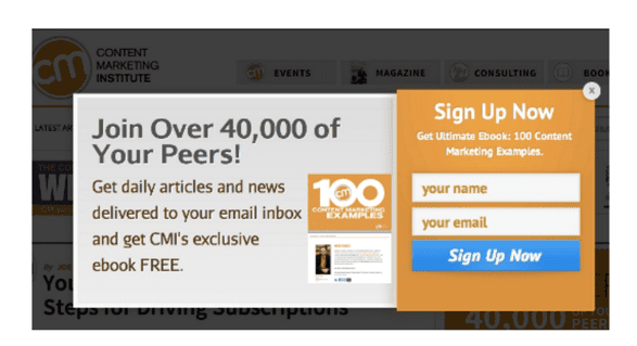
The Content Marketing Institute have taken heed of this and really highlighted the benefit to the customer – focusing on what it is they’ll get in return for signing up, as well as using some very compelling Social Proof to encourage you to join.

2. It’s all in the timing
There’s nothing more irritating than being unapologetically interrupted, and that’s essentially what popovers do, digitally. So minimizing the interruption, by identifying the optimal time to approach, is imperative.
The beauty here is that it’s actually the very intrusiveness of popovers that make them effective, particularly for email acquisition purposes, so the key is zoning in on the optimal time for your customers to engage with the popover.
Naturally, this will vary depending on your site and business offering so testing thoroughly is the best way to ensure you gain the best results for both you and your customer. You can also arrange to show pop-ups on a user action like scrolling down or moving the mouse, so enabling to read some content first.
Furthermore, make sure your technology tracks users that are already signed up, for example using cookies. It’s not a good idea to interrupt your existing subscribers with a ‘subscribe now’ request - you definitely won’t be making them feel valued or demonstrating that your brand cares about its customers!
3. Don’t be shy, show them what’s in it for them
Content is key. People want to know what they’re signing up for and why they should give you their details. This is where I believe we marketers need to apply a bit of elbow grease and do the hard work for our customers. As popovers should be kept clean and simple, you only have minimal copy space to get that message across.
So be direct, remember to focus on what will pique a readers interest, succinctly convey the key elements and highlight the value to the customer.
The rule of three is a great technique to follow here. Based simply on the premise that people tend to remember three things more than two, four or more. A premise that has been employed famously throughout history: ‘ Blood, sweat & tears’ – General Patton, ‘Stop, Look & Listen’ – Public Safety message, ‘The Good, the bad and the ugly – film title, ‘Veni, vidi, vici’ (I came, I saw, I conquered) – Julius Caesar.
So, the simple thing to consider here is, what are the three things I want my potential customers to know and remember?
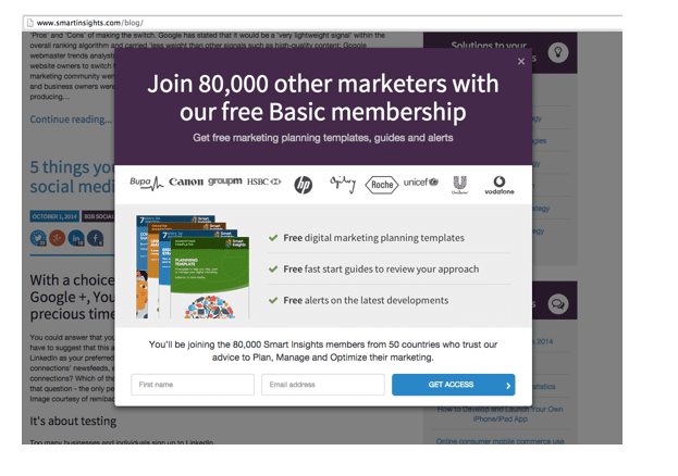
In fact, SmartInsights.com has a great example of employing this tactic, with positive affirmation ticks to boot and a pinch of Social Proof thrown into the mix.

I asked Dave Chaffey about the impact of implementing this and he told me that he had resisted pop-ups for years as a way of encouraging subscribers to the Smart Insights enewsletters. Instead, they used targeted calls-to-action contextual to each section. So, in the email section of the site there is a guide giving tips on email marketing, in the content marketing section and tips on that and so on.
They also used a less obtrusive pop-up bar at the bottom of the screen. But seeing increasing use of pop-ups on other marketing advice sites like MarketingLand, Content Marketing Institute and even Harvard Business review he said he had to agree with colleagues to at least test it. He was also persuaded by this test on pop-ups on subscriber conversion from Hubspot's Dan Zarrella which shows significant increases in conversion to subscriber to over 3%.

So a test was set up with two different treatments and a control. These didn't use a standard pop-up service or template, instead, a designer was briefed to create a pop-up in line with the site style and brand. What was the impact on Smart Insights? Well, it wasn't as large as this since prominent CTAs were in place, but it did give a growth in subscriber conversion rates of over 40% to around 2%. That's a significant number of leads and there wasn't a significant increase in bounce rate.
4. Don’t ask for too much information
Your purpose is simple, you want their details, but you don’t need all of them at once. In fact, your main objective is simply to gain permission to market to them – you can always get further information at a later stage.
Asking for too much initially will discourage people and make them close the popover and leave. Focus on the essentials, name and email address, the rest can come later once they’re registered with you – this way you’ll be making the most of your acquisition budget and growing your list.
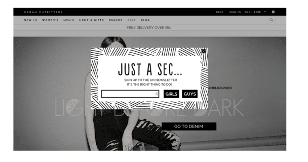
There are possibilities for tailoring the details requested to suit your company without expecting more of the customer though. Urban Outfitters offer a good example of this by cleverly including gender segmentation in their acquisition popover while keeping the customer input minimal.

5. Keep the journey flowing
They’ve done what you’ve asked and signed up, now show them you care by welcoming them properly. The initial popover will only have provided limited information about what they’re signing up for so it’s a great opportunity to showcase your brand and it’s value to them.
Don’t let the lead go cold - with automated technology so easy to implement, there’s no reason not to ensure your welcome email or sequence of emails are ready and waiting when a subscriber signs up.
If they sign up and then hear nothing from you they’re going to wonder why they bothered and more than likely not bother with you again, if they even remember. Who wants to be forgotten? A study by BlueHornet found that 79% of consumers expect a Welcome Email.
6. The key to success
It’s simple; the secret to success is testing, thoroughly and continually.
Some obvious factors to test are timing, placement in the journey (upon arrival and exit), placement on the site, title, benefits, offer types, CTA – just to name a few.
The tips above are just a snapshot of all the elements that need considering when implementing a popover to increase conversions and they, along with others, are key to developing an effective popover campaign. Without testing them though, there’s no telling whether you’ll have achieved that sought after balance between business needs and customers wants.
So, when analyzing and selecting your content, timing and everything else, be sure to remember to test, and then test again. The popover must aim to improve the customer experience not impede on it.
As well as that though, when testing, remember to measure the effectiveness of the conversion popover as a customer acquisition tool for your company. While looking after the customer and their experience should result in you achieving your business objectives too, testing and monitoring its effectiveness is the only way to know for sure and will also allow you the opportunity to make adjustments if subscriber rates aren’t increasing as expected or desired.
If you’re keen to find out how popovers and lightboxes can help you to increase not only your list but also your revenue, please download our FREE Guide: How to use popovers to Increase conversions


