What makes the perfect email call-to-action (CTA)?
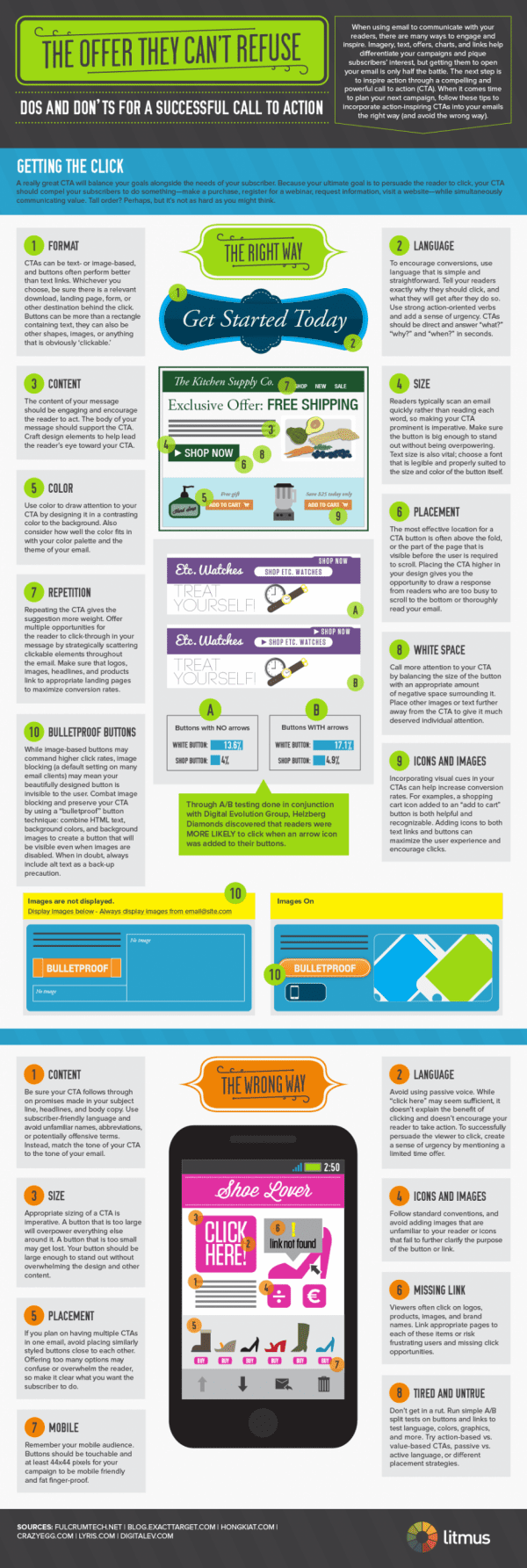
The recent post by Kath Pay discussing what makes an effective call-to-action in marketing emails showed how it's easy to get this wrong. No excuses now! Check out this new + useful infographic from Litmus that shows every issue about CTAs you could possibly want to know about.
A lot of the ideas are obvious, but the obvious isn't always obvious, particularly when there are other design constraints. Of course, colour and size get a mention, but did you know there is even a law to back this up; this Fitt's Law states that:
"The time required to rapidly move to a target area is a function of the distance to the target and the size of the target".
I also enjoyed the snippet that showed that buttons with arrows encourage more clicks than those that don't - collectively these small tweaks can make a difference. Another "old chestnut", showing the value of the click to the clicker is also covered in the how not to do it section.


