10 Delightful Email Design Trends to Flatter Your Subscribers
You've got mail! The design is quirky, colors bright and beautiful, and there’s an oh-so-amazing GIF. You love it at first sight!
Psychologists have researched to find out that we take 1/10th of a second to form an impression, and only a long term experience is capable of altering it.
So the point is… YOUR EMAILS MUST HAVE THE WOW FACTOR.
People love novelty, and more engaging the novelty, the merrier. Email marketers, the smart ones, have always gone with the flow, embracing new discoveries and paying heed to new age demands.
That's why I'm presenting some amazing email design trends that I feel will having a big impact this year.
Roll Out the Red Carpet for These Delightful Email Design Trends
- Long live the GIF: How many GIF emails did we see in 2016? Countless. A GIF gives movement to a static image. And with multiple animated frames combined together, a GIF is not resource heavy either. Moreover, it is supported by most email clients (providing a fallback will help to deal with those who don’t). These unique qualities made GIFs the apple of marketers’ eyes. Marketers will continue to use them but probably a little less frequently.
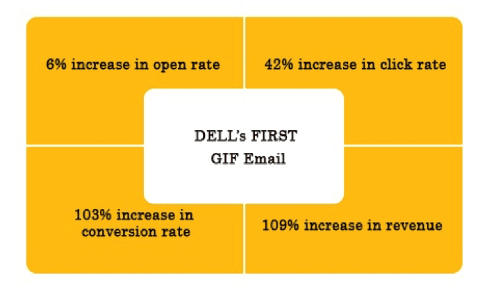
Here’s how DELL succeeded in its first product launch GIF email:

Source: Marketingsherpa
- Minimalism is in: Simple, distinct email designs made the rounds in 2016. With reduced attention span, it was expected. And as the attention span sinks further, minimalistic designs are here to stay.
- Out-of-the-box idea: A research has shown that unexpected events delight the human brain. We all love surprises, in our inbox too. That explains why unconventional email designs have always surprised us.
- Cheer for video: 50% of internet users prefer to see a product/service video before they actually visit a store to make a purchase. Video is thus the future of content marketing. Apple pleasantly surprised us by bringing back HTML5 video in its iOS10 launch, as embedded videos are going to rock emails in the times to come. Background videos will also make waves as they are supported by Apple mail, Chrome and Safari (web versions).
- Quirky Pointers: We have been using the standard, boring bullets in content for ages. But now that visual marketing is taking a huge leap, email marketers can experiment with this simple yet powerful tool. Designing original pointers to go with your content or service can amuse your subscribers.
- Cinemagraph magic: Seamless looping in a still photograph creates an illusion of a video, which does not fail to entice and engage subscribers. Moreover, cinemagraphs have a good support across email clients and the file size is way smaller than that of a video. You always have the option of a fallback image for the less progressive email clients.
- Flat design in email: The recent UI changes observed in both Android and iOS accelerated the use of flat design. Flat design is about colors and icons and it eliminates extra elements like shadow, gradient, texture. The clean look of it facilitates eye scan pattern while reading an email.
- Go dynamic: As personalization takes center stage, dynamic content gains great importance. More targeted and personalized the email content, higher are the chances of getting better clicks and conversions. Segmenting your list on the basis of geographic location, gender, search and purchase behavior can help you create and send dynamic content.
- Interactive elements: Adding an element that drives subscriber engagement is a trend that is gaining momentum. Hamburger menus, accordions, carousels, search, forms, are few of these elements. It’s a win-win for marketers because it helps the subscriber find the exact thing they are looking for and this, in turn, helps to reduce the time taken by subscriber to make a buying decision.
- Keyframe animation is the key: Frame changes that are less perceptible make keyframe animation special; the whole animation effect is quite smooth. As far as emails are concerned, the icing on the cake is the support keyframe animation enjoys across Android and Apple devices. You can change object size, move it along a straight line or rotate it about an axis.
Wrap-up
We’re dealing with the millennials. They believe in less is more and have a special fondness for oddly attractive stuff. So concise and flamboyant is what your emails need to be in order to stand out. I hope this comprehensive list of trending email designs helps you win them over.

Thanks to Kevin George for sharing their advice and opinions in this post. Kevin is the Head of Marketing at
EmailMonks, one of the largest Email Templates production company which specializes in converting PSD to email templates & designing email templates. He loves gadgets, bikes, jazz, and breathes ‘email marketing’. He is a brand magician who loves to engage and share insights with fellow marketers. Feel free to connect with him on
Twitter.


 Thanks to Kevin George for sharing their advice and opinions in this post. Kevin is the Head of Marketing at


