Some practical tips for email and web copywriting
Chunking is breaking your copy up into easily scannable paragraphs. Chunking is more effective for your online readers, here’s why…
This is how non-chunked copy looks to your readers

It’s a mountain to climb…
This is how chunked copy looks

I can manage this!
Usability expert Jakob Nielsen wrote the definitive study showing that most users don’t read online, they scan. Until recently you had to read his classic 1997! study, but now these sketches give better proof.
Thanks, to Mark Brownlow of Email Marketing Reports for saying we could share the sketches from his original copywriting tip on Smart Insights.
More chunking tips
To add to Mark's original, some tips that I’d add to make your chunking in email marketing more effective are that:
- The first 2-3 words matter most. As a user scans a web page or email it’s the first 2 or 3 words at the start of the paragraph that grab your attention, so adding good ‘hooks’ there will encourage them to read more.
- Add hyperlinks to the start of the chunk. The example below shows this and many of these points.
- Use subheads. Sub-heads help chunk too, so it’s best to group content under subheads.
- Use bullets. Bullets are nicely scannable too.
- Use bold or italics. Using bold for emphasis can work nicely too.
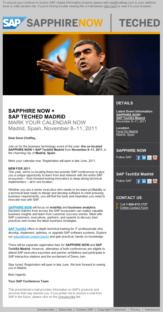
Here's a recent example of a B2B mail which illustrates many of these, but is it too long?


