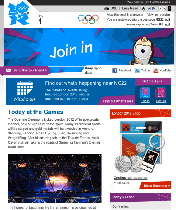
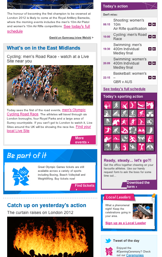
London 2012 template shows Enewsletters don't have to be boring
While this email template didn't entertain me as much as Danny Boyle's opening ceremony I thought I'd share it as an example of "state-of-the-art" email marketing.
It shows all these features well:
- Dynamic content insertion for relevant events/images for days based on location
- Multi-column design style
- Accessibility and mobile support through text version
- Simple social media integration
It also ticks many of the boxes in a previous post giving other Enewsletter examples and a 24 point creative checklist.


Maybe something to show your agency when you're next briefing them - it shows a style that could work for both B2C and B2B email templates.
I'm not sure who's behind it, but I was discussing it with Tim Watson and he though from eDialog. Not sure how. Tim?


