Practical ideas to test in the often neglected preheader
The small kid with glasses that gets picked last for the football team? That was me.
And that's the email preheader, too...
At least that's what it often feels like: it's there to tick the box on the "what goes in an email?" checklist, but it doesn't get much copywriting love.
In case you're wondering, the preheader is the line or two of text, usually in a smaller font, right up the top of an email. Here's the preheader at the top of a National Express mail:

It's one of the elements I cover in the email module of the Smart Insights online copywriting course, and its potential value stems from two plausible marketing roles.
First, while an inbox display typically focuses on the from name and subject line of each email, it may also include the first text encountered in the email (usually the preheader).
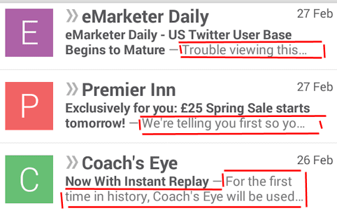
Take Gmail, for example. Here's how unopened emails look in the Android Gmail app:

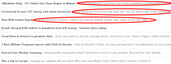
Note how short subject lines mean more of the email's actual text is included. Here's what those emails look like in Gmail on a desktop (I deleted the from lines):

Clearly that appended inbox text influences your ability to grab attention, raise interest and get people to actually look at (and act on) your message.
Second, you can use the preheader as a piece of copy in its own right...communicating valuable information or drawing the reader into the main message of your email.
So what approaches can you take?
1. Reinforce the subject line
The preheader can supplement and support the subject line, for example by:
- Expanding on a benefit expressed in the subject
- Rewording that benefit using alternative hotwords that might catch the recipient's eye
- Highlighting a second benefit
If you have two strong alternatives to use as a subject line, perhaps one might be repurposed as the preheader?
Here's the subject line for a Premier Inn email:

And here's the preheader, which reinforces and expands on the premise of a spring sale:

2. Sell secondary content
If you have attractive secondary content or offers that are not addressed in the subject line, you might promote them in the preheader. Harland Clarke Digital take this approach for their multi-topic B2B content newsletter:

3. Use a standalone CTA
For simple, powerful messages, you could test placing an actual call to action or link in the preheader. The Premier Inn example above does this, and here's another example from Sports Authority:

4. Highlight functional links
For example...
"View online"
Many marketers use the preheader for a message along the lines of "If this email does not display properly, then click here to view it in your browser":

This preheader approach is a form of insurance. If the display environment handles the email badly, subscribers can always hit that link and see a nicely-formatted version in their browser.
The popularity of this preheader stems from the pre-smartphone days when HTML email often did not display very well in email clients. It's still a legitimate option, but has its drawbacks:
- It doesn't make a big impact in the inbox
- The link is likely not used much if you have a well-designed and robust email template
If you do use this approach, keep it short. Long-winded explanations of what might be wrong with your email's display take up valuable space and don't leave a positive impression.
An unsubscribe link
An unsubscribe link right at the top of the email seems counterintuitive, but many marketers now share Jeanne Jennings' view that it demonstrates transparency:
I see a prominent unsubscribe mechanism as a sign of confidence [...] make no apologies and make it easy for people to remove themselves if your email has become "bacn" to them.
I've heard of examples where it's cut spam complaints considerably, so it certainly has promise if you're concerned about the quality of your address list or disinterested subscribers. Whatever you do, though, still keep an unsubscribe link down in your footer where people expect to find it.
"Forward to a friend" or "share with your network" links
Here's an example from a Litmus newsletter:

Permission reminders
These are messages along the lines of "You're getting this email because you signed up to receive it at the ABCDEF website". This might be an option if you haven't mailed people in a while and are worried they forgot they signed up.
A request to "whitelist" the sender
Some senders use the preheader to encourage people to add the sender to an address book, safe sender list or equivalent to ensure inbox delivery. Here's an example from jetBlue:

Be sure to use subscriber-friendly language in any such message.
You can mix and match, of course, and combine several concepts in the preheader space. A preheader with solely functional and administrative links and copy seems like a missed opportunity, though, particularly in terms of inbox displays.
Dynamic preheaders?
Another option, of course, is to adjust the preheader according to the recipient, just as you might do with other copy or content. A whitelisting request or permission reminder might only make sense for a new subscriber, with "older" subscribers getting a more benefits-oriented approach. Or you might personalise a preheader call to action with a first name.
But...
Not everyone is a fan of preheaders. Some consider it disturbs the aesthetics of the email. And overloading the preheader with text might distract from the main message (and push that message further down the page). As always, testing will give you an answer for your mails and audience!


