Examples and best practices for converting your subscribers to click and take action
Continuing my 3-part series on increasing email marketing conversions - Open > Click > Convert, in this post we’re looking at the second step in this process.
This step is the most obvious one you'll want to acheive and often most resource and attention is given to it and if we fail at this step, then we will also fail at achieving our final conversion. The conversion we hope to gain at this step is to drive them to the landing page, where the final conversion takes place.

Leverage the strengths of email and minimise its weaknesses
The aim is not to keep the readers engaged with your email and reading it at length in the inbox, but to convert them to the next stage – the landing page.
Email is a push channel and as such we need to be aware of the reader’s mind-set and encourage them to move onto the landing page ASAP and in to the pull channel part of the journey- where they’re more focused and less likely to be pulled away to read a new email. The inbox can be a busy place and we don’t want the reader to linger there too long as their attention may be diverted away to the next new email that arrives. Instead we want to harness the power of the push channel to drive them to the less distracting pull channel such as a landing page.
So to make the most of this channel’s strengths and to minimise its weaknesses, keep your email succinct and engaging with the purpose of getting their attention and hooking them within the email, so they want to click through to the landing page.

Write like a Journalist
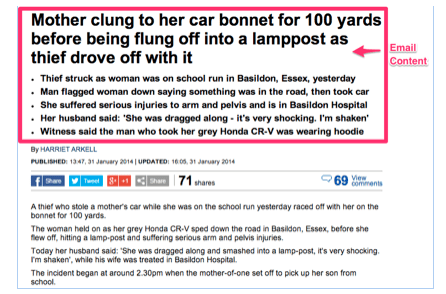
Your email should read like the headlines and synopsis of a newspaper story. Remember that the email is simply the vehicle to drive them to where the conversion happens – therefore you don’t have to tell them everything in the email!
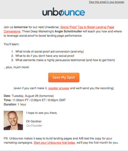
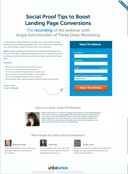
The aim of the email is to hook them with enough information to make them want to find out more and then reveal the full story on the landing page.
A great example of this in action is the email and associated landing below from Unbounce.


Engage them emotionally
Today, people tend to pride themselves on making “rational” decisions, carefully analysing all the available information before determining the best choice. But, like it or not, people subconsciously make purchasing decisions based upon emotion and then rationalize the purchase by coming up with explanations for the decision after the fact.
As Douglas van Praet writes in his book, Unconscious Branding, “Influence is born by appealing to the emotions while overcoming rational restraints.” In fact, he claims that according to recent research, we make 90% of our decisions without consciously realizing we’re doing it.
So while buyer education about your products or services is important, marketers must focus on engaging consumer emotions. There are a variety of ways this can be done—through the use of images, storytelling, persuasive subject lines, and compelling copy. Once you have persuaded potential buyers emotionally (albeit unconsciously), they will rationalize that choice on their own.
With email being a push channel – using tactics such as emotion is all the more important as we need to work harder then pull channels such as websites who are working on converting already interested consumers who are in essence trying to complete a purposeful mission they initiated themselves.
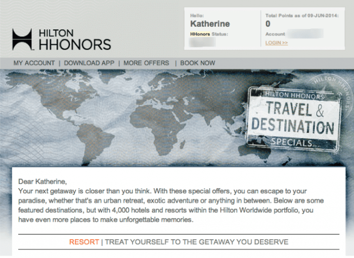
A good example of this is an email from Hilton’s HHonors program. The text is evocative and persuasive – “Exclusive Travel Specials,” “escape to your paradise,” “unforgettable memories,” which then leads to the call-to-action: “Treat yourself to the getaway you deserve.” This email example uses persuasive and compelling text-copy aimed to trigger an emotional response from the reader.

Use Direction Design Cues
Many web usability studies have shown over the years that readers only skim read pages looking for relevant information as opposed to reading word by word. To enable conversions, designers are faced with the task of providing explicit and implicit visual cues, not just to help guide the reader to find the content they need, but also to influence them to take action.
Explicit directional cues are usually more obvious, often taking the form of an arrow, line, or curve that creates a visual pathway¬–leading the viewers’ eye directly to the objective of the email. Implicit directional cues are implied and they include cues such as line of sight, colour, shape and size, and prioritization through visual weighting.
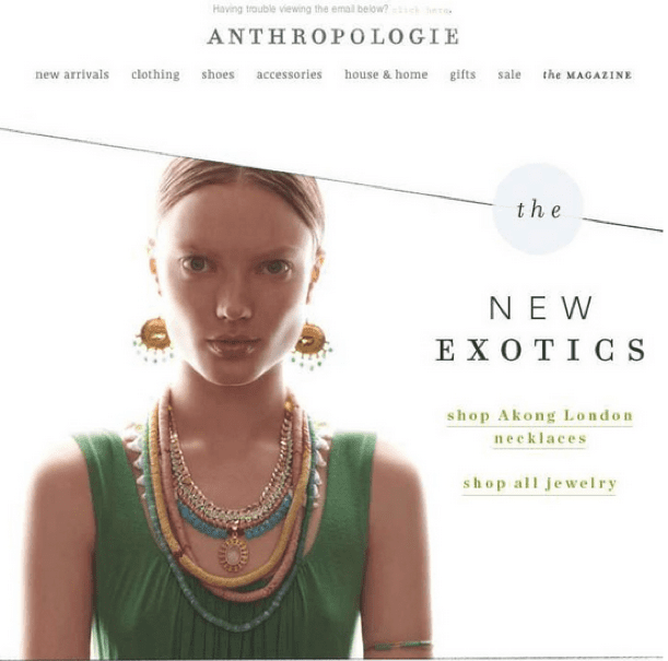
In an example that uses both explicit and implicit directional cues, this email from Anthropologie draws the reader to the calls-to action—to shop a specific category of necklaces, or shop all of the retailer’s jewellery offerings.
From a design perspective, you can see the explicit directional cues that visually guide the buyer to the call-to-action. A viewer’s eye is first drawn to the model (and her necklace), and then will follow the diagonal line, which is an explicit directional cue.
In the west viewers read from left to right, and will instinctually follow the line to the right and arrive at “the”, where the implicit directional cues of text style, and weight help move the viewer’s eye down to “New Exotics” to then finally land on the call-to-action.

Use Loss Aversion
At the most basic level, there are two main drivers of human behaviour – avoiding pain and experiencing pleasure. These are key to every action we take. When people are faced with either limited availability, or a limited opportunity to get the best deal, they are more likely to buy. This is why buyers tend to act quickly when they are told that a product or special offer won’t last long.
In fact, studies conducted by Amos Tversky and Daniel Kahneman in 1992 have shown that buyers are more likely to act based upon loss (avoiding pain) than benefit (gaining pleasure) because gains are fleeting while losses linger.
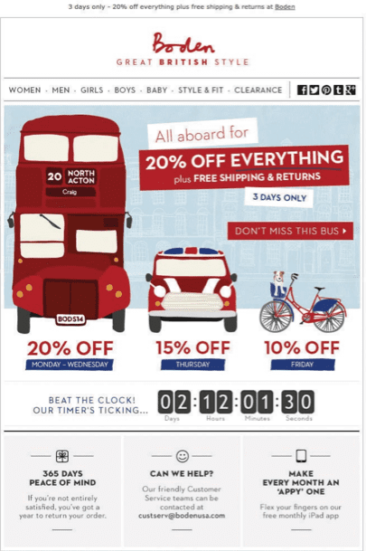
In the below example from Boden, they’re leveraging the loss aversion factor by limiting the offer to 3 days only and then reinforcing it by applying an animated countdown clock to their email. Very effective and they work a treat.

Join me tomorrow to discover some tips on how best to convert your subscribers to your objective and final conversion – whether it be to register for an event, purchase a product or solution or download a whitepaper.
If you’re keen to discover more on how to leverage psychology in your email marketing, check out a ‘Leveraging Psychology in Digital Marketing’ ebook produced in partnership with Marketo.


