How to use personalised product recommendations to increase Ecommerce sales
The importance of effective product recommendations cannot be ignored. When done correctly they can heavily contribute to the success of a website, both by increasing the quantity and the size of orders being placed.
Studies of personalisation have revealed that, when recommendations are made intelligently, those products being recommended can enjoy conversion rates over 900% higher than sitewide averages. Amazon have famously leveraged this technique to attract a huge customer base and vast revenues - a look at their homepage will reveal a site committed to personalising its shopping experience around the needs of each and every individual customer.
Today, the importance of website personalisation as a method for boosting conversion rates is recognised by most digital professionals. An Econsultancy report recently named website personalisation as 2014's top digital priority by business-to-consumer marketers, and high profile acquisitions of personalisation companies by ecommerce giants Staples, and AOL, add further support.
Yet despite this emerging awareness, widespread adaptation of quality personalised content is still absent across our internet. An effective method of product recommendations, it seems, still eludes many marketers.
When viewed from this angle, it makes a curious puzzle.
From my experience the answer appears to derive from two predominant factors;
- Many marketers possess an incorrect belief that an effective product recommendation method is already in place on their site;
- Often marketers harbour an anxiety that the task of installing an intelligent product recommendation engine is a complex one.
In this article I intend to help you improve the success of your website - both in terms of conversions, and average sale value - by covering some simple guidelines on how to employ product recommendations more effectively.
I'll offer some practical advice to help you to assess your current system, and hopefully dispel any concerns you may have involving the complexity of making improvements.
The Recipe For Success
It sounds simple - but for product recommendations to work effectively, the system in place needs to really know your customer. Your website must identify what these people are likely to want at specific points in the conversion funnel, and address it. You'd be surprised at the number of marketers who fail to do this.
Context and quality are the two key factors here - showing useful recommendations at the most appropriate point in the buying cycle. Let's consider them:
Context Is Key
Website owners and marketers frequently throw recommendations onto a page without fully considering what a customer really wants at that given moment.
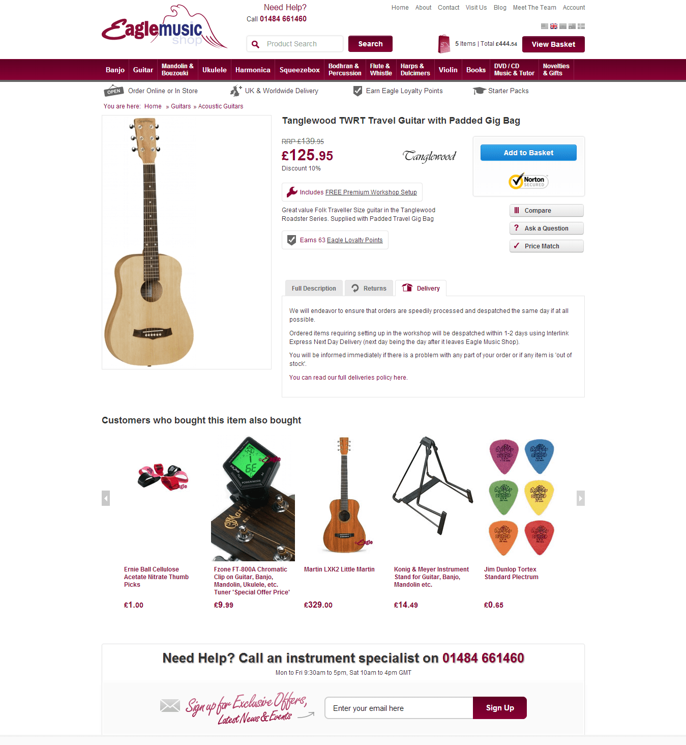
Take the example below - a musical instrument retailer. Let's say I'm on their site shopping for a guitar, and I see a model that takes my interest. At this point in the conversion funnel I'm considering what guitar I wish to purchase, nothing else.
However, the 'Customers also bought' section is recommending products that I'm not (yet) looking for - in this case a guitar stand, a tuner and plectrums. These may actually be damaging the website's conversion rate, by distracting my attention from the task at hand (shopping for a guitar) and pulling me out of the 'guitar' conversion funnel.

The recommendations in this example are out of context - they should be helping me find a guitar, not accessories.
It may sound like an obvious observation, but this is one of the most common mistakes that I see.
At this stage in the buying process the site should instead be assisting me in my task of finding a guitar. Consequently, recommendations in this context should be other guitars of a similar style, colour, price point, or whatever factors play an important role in my decision to buy. That way, if the model I'm looking at here isn't quite right, the recommendation engine may prevent a lost sale by pointing me in the direction of an alternate product that is.
Cross Selling
However, this isn't to say that you shouldn't recommend accompanying accessories - 'cross selling'. They just shouldn't be recommended in this context.
Only after the customer makes his or her decision to buy should the website switch to recommending complementary products. The obvious way to identify that key event is when the customer adds a product to their shopping cart.
So, let's now assume that I've found my ideal guitar and have made the decision to buy - I add it to my cart. At this point the website should now recognise the potential to cross sell and take action.
After the 'Add to Cart' Event
When done correctly, cross-sell product recommendations shouldn't be received by shoppers as an intrusive, pushy effort to increase sales. Rather, they should be a natural, helpful extension to your service, welcomed by shoppers for their ability to reduce browsing effort or forgetfulness. For you the retailer, larger average order values and happier customers will be the bi-product.
Effective cross-sell recommendations can also improve customer retention and extend the customer lifecycle - let me explain how;
Imagine a woman buying a new TV and Blu-Ray Player. She may need a HDMI cable to connect them, but may not have considered this. Without effective recommendations the order value will be less, and she won't be able to use the products immediately upon receipt - a frustration that may lower her overall satisfaction, and possibly jeapordise the likelihood of her returning in future or leaving you a good review.
In the former example, where I was looking for a guitar, I may have forgotten that I need a guitar strap or plectrum. The lack of good recommendations in this context could have had a similar effect.
So where are the best places to recommend complementary products? The answer, is anywhere at which the customer hasn't demonstrated a specific intent. These are the key areas I've identified:
-
The Shopping Cart
Your shoppers' intent while on this page depends largely on how your e-commerce system behaves when the 'add to cart' button is clicked.
If it automatically redirects shoppers to the cart, then many may arrive without a specific intent. In this case your cart will make one of the most effective areas to cross sell. You should use the opportunity to show products that compliment the one they've just added.
If, however, your 'add to cart' button doesn't redirect them, and your shoppers' only way to access the cart is by clicking a link to it, then these people will probably be arriving with the intent to check out. Under these circumstances you do not want to distract them with recommendations, but rather help them through the checkout process as quick and easily as possible.
As with most areas of conversion rate optimisation you should split test major changes you make to these areas, particularly in the latter circumstance.
The Cart Update Notification Page
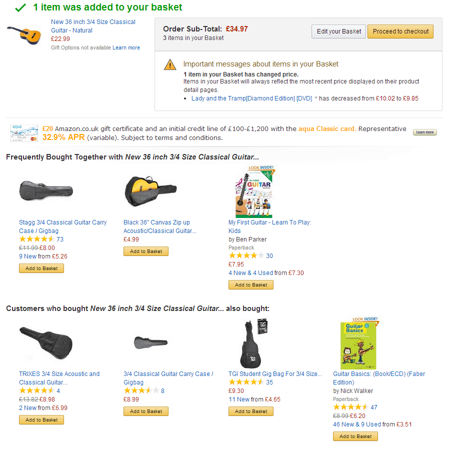
The best place to see a cart update notification page in action is on Amazon.
Instead of taking you to your cart when a product is added they instead show you a page confirming so, present you with a clearly labelled button to go to the cart if you want to, and (of course) take the opportunity to cross sell to you with a large selection of recommended products that compliment the one you just added.
This solution is excellent in every scenario, and means Amazon can avoid cluttering their cart with out-of-context recommendations when you finally do arrive on it with intent to check out.

Amazon uses an 'add to cart' notification page to cross sell complimentary products, rather than cluttering up their shopping cart itself.
If your site supports a notification page then I'd recommend keeping your cart uncluttered and free of these distractions - use the notification page to do your cross selling instead. If your 'add to cart' button doesn't automatically redirect customers anywhere then I'd highly suggest you consider putting a notification page in place, and split testing it.
-
The Homepage
Unfortunately very few marketers use their homepage to its full potential. However, this can be looked on as a great opportunity for improvement.
During the consideration process it is very common for shoppers to leave your site, only to return at a later date. When they do, these people will often land back on your homepage.
Instead of showing the same generic offers and content as it did before, your site should recall the shopper's browsing history as recorded in his or her previous visit, and use that intelligence to show content that's more likely to be helpful. Homepages therefore make an excellent candidate for cross selling - again, one look at Amazon's homepage will support this theory.
If a returning shopper previously abandoned their shopping cart then the homepage should show complementary cross-sell recommendations, based on the products they already added. If their cart is empty, on the other hand, then the homepage should recommend products similar to and including those they were previously looking at. You should also attempt to alter page elements, such as banners, with behavioural targeting.
Recommendation quality doesn't have to mean complexity or cost
Many of the areas covered here may sound complex to carry-out. Without assistance, the process of recalling a customer's browsing, order and shopping cart history, then turning that data into accurate product recommendations, on a per-visitor basis, is a formidable challenge.
However, if you consider the use of a product recommendation app such as Bunting, the process can be made remarkably simple (akin to installing Google Analytics), allowing you to sit back and enjoy the benefits.
If you do want the challenge of implementing your own solution, then watch this space - I'll soon be writing a detailed article on the subject.
However whether you decide to use an app or not, just be sure not to ignore the power of effective product recommendations. And, at all costs, try to avoid missing sales due to an untested belief that the recommendation system you have in place is already adequate.
Personalisation is one of the most effective methods today of increasing your website conversion rate, and one that no marketer can afford to ignore.

Thanks to
Stephen Tucker for sharing his advice and opinions in this post. A former
fraud victim turned entrepreneur, Stephen brings over 10 years e-commerce experience to the website personalisation industry. He is the founder of
Bunting, an easy plugin app that increases sales of growing businesses with dedicated web personalisation technology. You can connect on
LinkedIn and follow on
Facebook or
Google+.


 Thanks to


