Recommended design patterns and best practices for online retail Product category pages
This is the second in the series of posts from me in which I hope to give you ideas to consider for testing improvements to page elements on retail and other ecommerce sites following emerging best practices. In my first post, we covered best practices for ecommerce homepage designs.
If you work in an ecommerce team at a retailer, or are involved in design for your client’s accounts, then I hope these templates and tips will help generate ideas for testing page enhancements.
Key Ecommerce category page wireframe requirements
In retail, 'product category page' is the general term referring to pages listing the range of individual products. But you may know Category pages as Hub, Department or Division pages. Then there will often be sub-category pages too depending on the information architecture for the catalogue.
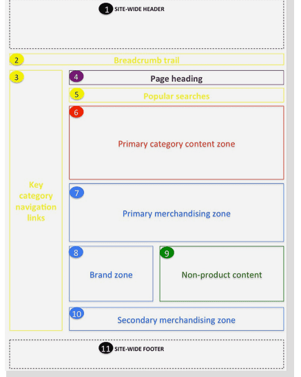
The key core elements of a category ecommerce page are summarised in this wireframe:

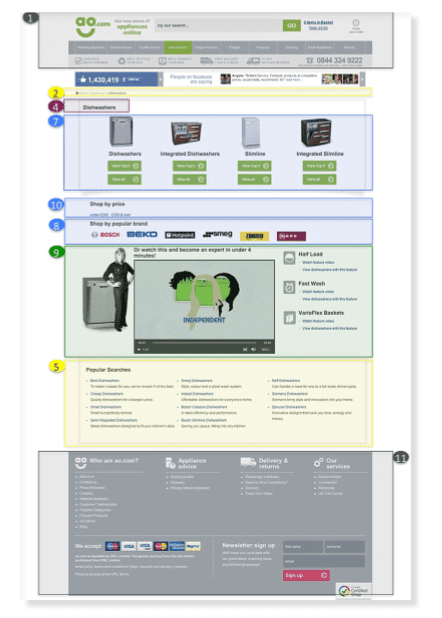
Here is an example of a page layout for the Dishwasher category at AO.com. Other examples are included in our Ecommerce Bible with more detailed requirements for each page component.

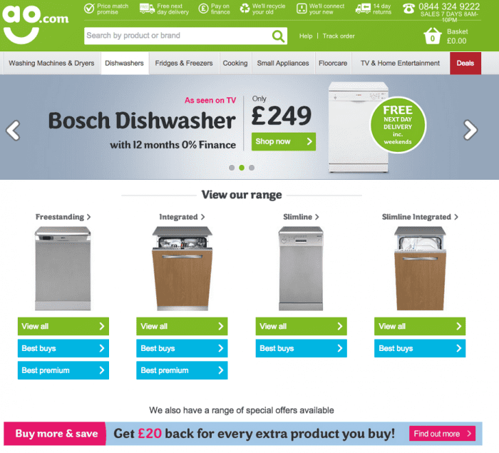
We selected AO.com as one of the retailers to feature in the guide since they are constantly testing new approaches and category pages are no exception. With a view to simplicity and merchandising, they have now produced a simpler top-level category page:

Rather than just listing all products, a common approach with simplistic category pages, this category page gives choice to help customers decide on the right product for them by featuring:
- 1. Main sub-categories - types of dishwasher.
- 2. Best buys
- 3. Premium
- 4. All products in category
This is an interesting approach since it is much simpler than most category pages including their previous design and so has the benefit of helping the customer on their journey and merchandising by clearly featuring best buys and premium.
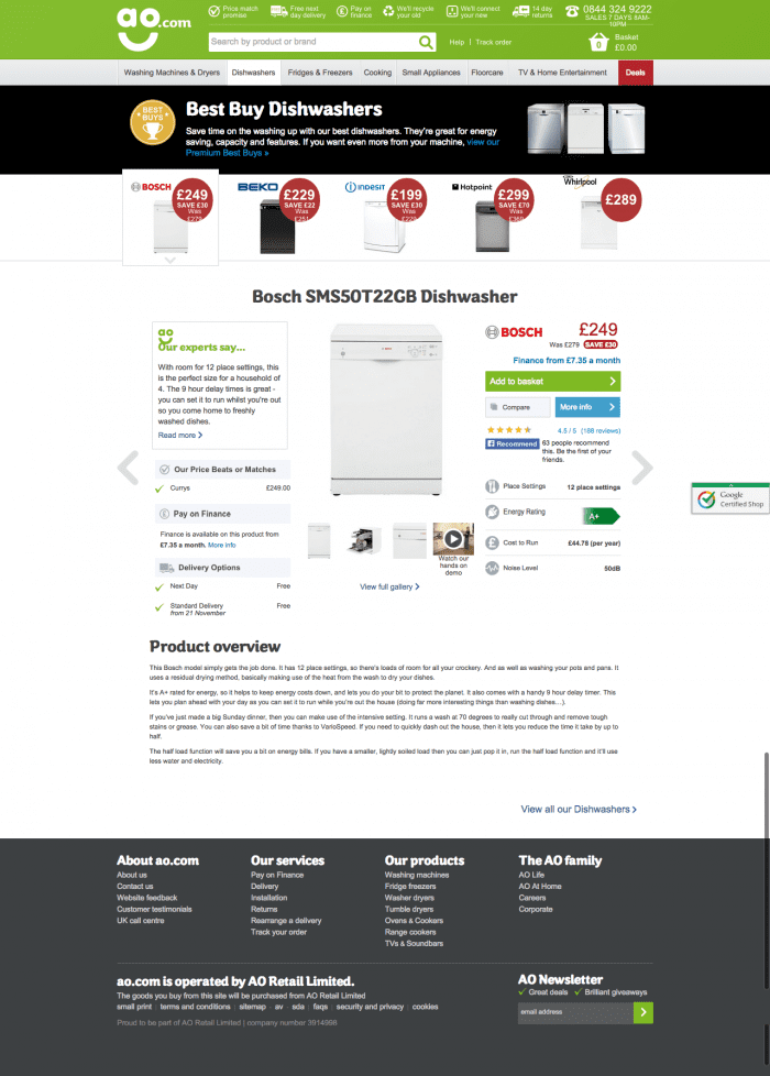
Here is an example of the best-buy category page. It also features an innovative approach since it features relatively few products in a horizontal scrolling carousel, rather than a more conventional grid of product images and descriptors.

Additional requirements to consider in your category page
In the full guide I go into more detail on individual page elements and look at more examples of how these apply in practice from UK and US-based ecommerce sites.

Recommended Guide: Ecommerce Design Patterns
Use our wireframes and examples to test and create more persuasive Ecommerce designs to boost retail sales.
Download our Ecommerce Design Bible.


