5 examples of retail home page good practice
Great ecommerce websites are likely to be based on personal preference. But many would agree there are common practices for persuasive design that should be tested, if you're not using them already.
In this post, I take a look at a range of less well-known small to medium business ecommerce websites where I have deconstructed the practices to suggest a shortlist of 'must have features' for the homepage. It's part one of a series of posts, next I'll be looking at category pages. Of course, in a blog article there is a limit on what can be sensibly covered. See the relevant Smart Insights guide for more details.

Recommended Guide: Ecommerce Design Patterns
Use our wireframes and examples to test and create more persuasive Ecommerce designs to boost retail sales.
Download our Ecommerce Design Bible.
Home page feature 1. Clear Navigation covering sufficient product categories
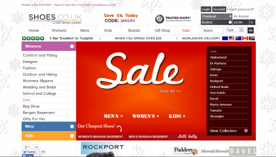
Browsing is a core user activity on the home page. So your site menu / navigation should be simple enough to be clear to the user, yet allow them a more comprehensive choice of browsing than top-level categories alone. For example shoes.co.uk has a very clear top level navigation - womens, mens, kids etc. It then breaks out the top categories into sub-category options along a left hand menu. In addition there are clear navigation options for the advertised sales products, so allowing the user a wide choice in how to navigate the site.

Home page feature 2. Ensure On-Site Search is prominent and sufficiently sophisticated
Search is another key home page behaviour. Users today are less patient than they ever were, particularly if they are in the 'Hunter' stages of the conversion path i.e. ready to convert. Ensuring that they can get straight to the product they want with no confusions or diversions can mean a large difference in conversions therefore ensuring that your search box is a clearly visible navigation option as soon as they hit your site is a good call!
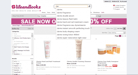
However it's not just the visibility that's important- it's also the functionality. Providing a search option that churns out 200 results with no further way of filtering adds complexity and reduces conversion rates. So ensure that you take steps to make your search more user friendly through predictive search suggestions and filtering options on search results pages as seen below on lifeandlooks.com

Home page feature 3. Define strong Value Propositions and personalised customer service messaging
Many great home pages are now using personalisation to really 'hook' their customers- this is back to old school sales techniques. If you can build a rapport with your customer, you are more likely to achieve a sale. And if you can show the customer what it is that they are looking for (right time, right place) even better! The likes of House of Fraser welcome you by name when you arrive on their site - and if they don't know your name they have a likable 'Hello Stranger' quip.
Smaller ecommerce websites are continuing to increase their usage of customer service messaging nicely too. In the below example some small customer service touches such as detailing free delivery and returns work well. Remember it is a customer that converts, not a web page!

Home page feature 4. Use distinct Calls to Action for primary paths
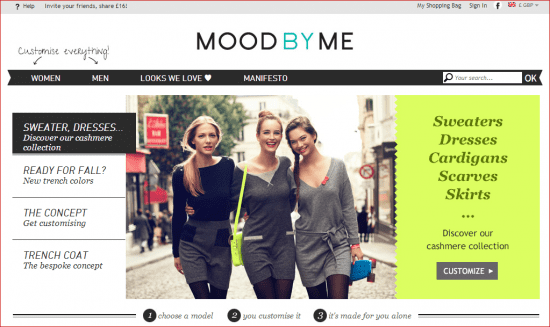
Too many website designs rely on customer interpretation of their prompts rather than having a very clear call to action. Customers are not mind readers! Make your call to action so clear that it leaves them no choice but to understand the message and then the visitor will need to resort to the menu less often. I came across this nice example recently from uk website MoodByMe- a website that allows you to customize your very own cashmere clothes, which they tell us clearly on the home page. Multiple times:

Your home page is one of the most important pages on your website to get right. Not only is it your 'shop window' it is also a high footfall area. A snapshot of 10 Ambition Digital ecommerce clients shows that on average 17% of a websites' page views will be concentrated on the home page. So show your home page some love and ensure you create a better ecommerce website!


