7 examples of online merchandising
Online merchandising is an ever-changing task and the following examples highlight some current methods but are by no means exhaustive.
Central to most of them is the idea of giving the customer the opportunity to choose the direction their visit will take; whether that might be choosing a trend, narrowing down the products they see or choosing their own add-on products.
Or in other words: Personalisation. Using browsing history, trend data or customer data, these retailers are able to deliver a different experience for different user groups or indeed users.
With so many different options available it would be easy to be overwhelmed; so here are 7 examples from great ecommerce websites of online merchandising execution.
1. Collection pages - example from Dunelm
A common problem faced by lots of retailers selling online is how to sell multiple products from the same range. This is especially true for Dunelm, where Bedding collections have multiple products e.g. pillowcases, curtains, bedspreads. Dunelm have got a great 'collection page' template, which enables them to display a range together and increase order size through add-on products.
Here we see a bedding collection, which has all of the members of a range plus a duvet, pair of pillows and extra bedding in neutral colours. The customer can easily select their size requirements and one click will add them to their basket.
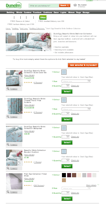
Don’t make them think: the customer can’t buy the entire range, if they can’t see it and they more than likely won’t go looking for it.
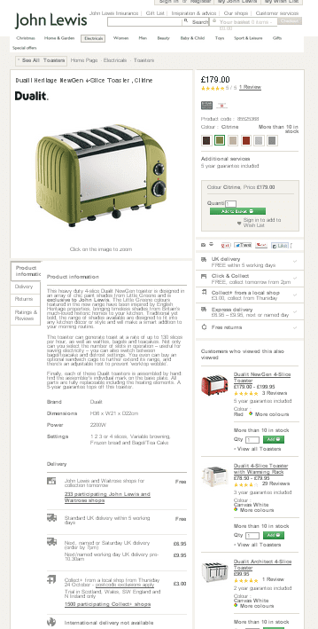
2. Product recommendations - example from John Lewis
John Lewis has 5 different sets of product recommendations on their product pages, all of which are dynamically generated according to your viewing history and the product you are currently viewing. This could feel like an overload, but in this instance they are cleverly named so the purpose is clear and confusion is avoided.
However, they are also cleverly thought out, on this one page the customer gets:
- Items already viewed – makes the customer rethink a product they may have previously given up on.
- Items similar to those already viewed – exposes similar items based on personalised viewing,
- More items to similar to current product page – acknowledges that this product may not be ideal but demonstrates more of the range.
- More from the brand currently displayed – highlights that they sell more of the brands products.
- Links back to the toaster category – gives the customer easy access back to the category.
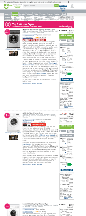
3. Grouping products - example from ao.com
This is a great example of a different approach to grouping products together and displaying them to the customer.
It works particularly well for this kind of infrequent purchase, where the customer may feel as though they are traversing a minefield of information. AO.com has made it easy for the customer by displaying all of the information that you need on one page:
- Product name/information
- Promotions/Price
- Reviews/Ratings
- Imagery/Video
- Delivery Information
This page works hard to ensure the customer has all of the purchasing decision information that they need, but in a way which doesn’t feel overwhelming. It also explains clearly the reasons to buy from this AO.com e.g. delivery information and options.
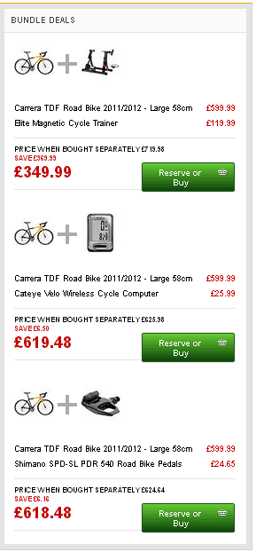
4. Bundle deals on product pages - example from Halfords
On the Halfords product page they offer a cross-sell mechanism that is combined with a customer’s favourite thing – a discount. The 'bundle deals' put together the type of items a sales assistant in-store would suggest, applies a small discount and offers an easy, one-step add-to-basket option.
The customer is happy with the convenience and discount and the retailer is happy with additional add-on-sales.
 5. Left hand navigation - example from ASOS
ASOS offer an easy to use left hand navigation, which helps visitors narrow down their options from a big list of products.
The added bonus is that multiple refinements can be selected at one time, giving the customer even more control and flexibility.
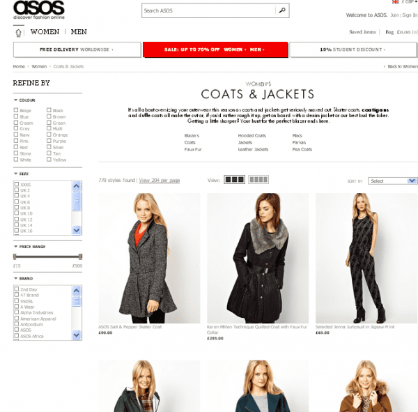
E.g. From the list of 707 items, the customer could select black, size 10, between £15 and £250 and get a much smaller list of products.
Letting the customer choose their view of a list of products like this is user friendly, and can only aid online sales.
6. Content Merchandising - example from Argos
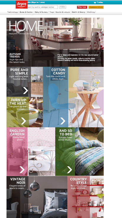
Content Marketing is talked about more and more, and retailers are increasingly spending budget on creating online content. This example is more about content merchandising, where Argos have segmented their home range into trends, and once the customer has selected the trend they like, the relevant products are displayed.
7. Use of roundels - example from M&S
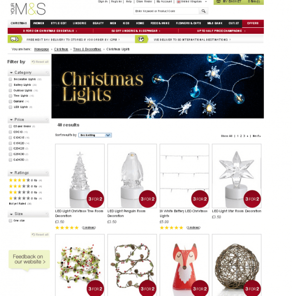
This is a really simple idea, which works well visually and does make a difference. Marks & Spencer use a roundel device to highlight products which are part of a promotion, and what that promotion is.
These act as a really useful signpost for customers when faced with a list of products. There are many different ways to do this visually – find the method that works for your brand.
The list of possible examples is endless, but follow these tips, start small and you should be on the right path:
- Put the customer first – make sure what you’re doing has a customer benefit not just a company benefit.
- Use data to drive decisions – use the information you have to make smarter choices with your merchandising e.g. product selection, grouping and display.
- Do the hard work for the customer – modern ecommerce customers won’t work hard to purchase online (and they shouldn’t have to!) make it easy for them, and your numbers will show the benefit!

Thanks to
Siobhan McMullan for sharing their advice and opinions in this post. Siobhan is Head of Online Trading at
Lakeland. You can follow her on
Twitter or connect on
LinkedIn.


 Thanks to


