Recommended design patterns and best practices for retail Home Pages
This is the first in a series of posts from me in which I hope to give you ideas to consider for testing improvements to page elements on Ecommerce sites following emerging best practices. In each post I will provide a wireframe summary of a typical layout showing key design elements, to give you a toolkit to review and optimize your pages.
In this first guide, we have focused on Desktop and tablet design and merchandising elements since in today's era of mobile responsive and adaptive web designs, the smartphone experience is usually simplified in style and content - so it needs separate treatment which we cover in our mobile marketing guide.
If you work in an ecommerce team at a retailer, or are involved in design for your client's accounts, then I hope these templates and tips will guide you along the design/re-evaluation process to maximise results your pages.
Key Ecommerce home page wireframe requirements
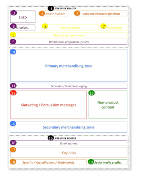
The key design elements of a home page are summarised in this wireframe:

The template above outlines the core elements of an ecommerce homepage. Please note that the UX/UI design patterns used will, of course, vary from site-to-site and the extent to which each component is used (e.g. how much content is put into each component, how far it scrolls down and across the page, what images & copy are used etc.) is dependent on the unique requirements of each website.
For example, niche premium retailers most often have a cleaner design that is focused on the brand in comparison to large catalogue retailers who adopt a stronger merchandising focus.
The template is intended to act as a good practice framework for you to understand the key elements of an effective ecommerce homepage that you can then discuss within your team or with agencies to adapt to fit to your business and audience needs.
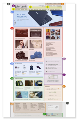
Here is an example of how different page elements varies for John Lewis. Other examples are included in our Ecommerce Bible with more detailed requirements on each component.

Additional requirements to consider in your homepage
In the full guide for members I go into much more detail on individual page elements and look at more examples of how these apply in practice from UK and US-based ecommerce sites.

Recommended Guide: Ecommerce Design Patterns
Use our wireframes and examples to test and create more persuasive Ecommerce designs to boost retail sales. Guide newly updated for 2016by James Gurd.
Download our Ecommerce Design Bible.
Other critical questions to consider in order to run tests for the home page include:
- 1. Have we defined and understood the goals for the homepage?
- 2. Do we know who are core visitor groups and personas are?
- 3. Have we defined the core content components for our homepage to enable goals/satisfy key personas?
- 4. Have we identified web analytics requirements?
- 5. Have we defined content personalisation requirements?
- 6. Have we defined the navigational elements?
- 7. Do we have clear contact information?
- 8. Is it clear what we do for new visitors?
- 9. Do we give people a reason to shop with us?
- 10. Do we use persuasion techniques to influence visitors?
- 11. Do we have a mega menu to deep link people to relevant product pages?
- 12. Is the site search bar clear and easy to use?
- 13. Are we promoting our current marketing campaigns?
- 14. Are we promoting our current offers?
- 15. Do we provide relevant content to help visitors?
- 16. Have we made it easy for users to sign up to our newsletter?
- 17. (Multi-channel only) Is it is to find our local Stores?
- 18. (International only) Is it easy for users to select the store/currency for their local country?


