New Research - The SimpleUsability Online Experience Index for the top 5 Mobile Phone Companies
This post summarises new research from SimpleUsability who reviewed the quality of customer experience delivered by 5 leading mobile networks / telecoms retailers: Three, EE, O2, Virgin and Vodafone. This builds on previous research covering online appliance experience and clothing retail experience.
Key findings from the research of telecommunications websites
- Good brand positioning and OVPs, 'though navigation could be improved.
- Lengthy checkout processes, with a mix of poor and good information support.
- Good product selection filters.
- Most websites had a search function, though presentation could be improved.
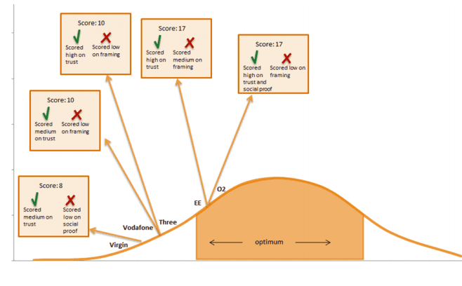
- Persuasion, Emotion and Trust (PET) techniques were low - Proof and Trust shown by only two companies.
Methodology for researching the ecommerce websites
To score each site’s overall experience rating, a panel of expert UX professionals assessed the site in the context of a core user journey of browsing a new mobile phone..
The examiners rated the site on over 120 key touchpoints, which were tailored to provide a thorough, representative picture of the user experience, from the homepage to checkout.
The findings were weighted across multiple touchpoints/facets throughout the journey and scoring included measurement against the use of PET, which are shown below:
The Index, by facet – Individual website ratings
Considering each facet of the user journey in turn, SimpleUsability found a variation of design usability across the websites that is highlighted through their individual ratings. The following diagrams illustrate the best and worst individual ratings by facet of the user journey
Website Homepage
The homepage represents the store home page and the 'brand and purpose' on this page was best portrayed by Virgin. Virgin achieve this by displaying their products as sections in the main navigation.
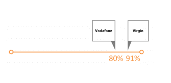
Navigation Home page
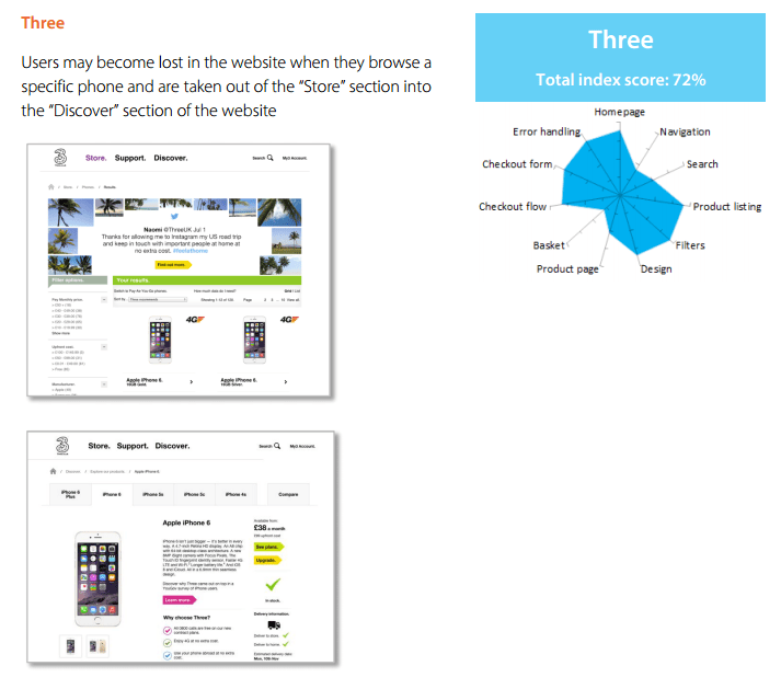
Across the websites, the main top level navigation was consistent, including breadcrumbs and clear titled pages. Though, Three's navigation became confusing as browsers left the main homepage.
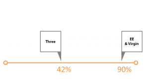
Search Function
This function is used across all sites, excluding Virgin. For some sites, the search was not displaying accurate results or provide flexibility for results to be refined/re-ordered.
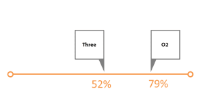
Product Page
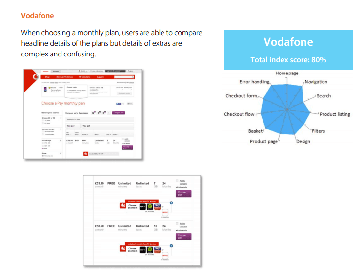
Buying a mobile phone can be a composite purchase, where the decision includes choosing the mobile phone and network plan, or purely the plan. Three, Virgin and EE provide both sets of information on a single page, whereas Vodafone and O2 split this. It's balancing reducing the steps vs reducing complexity vs making the online experience simple!.
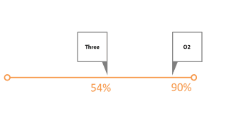
Checkout Flow and Layout
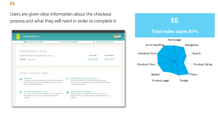
This final step will take longer than other consumer purchases, as the network providers require upfront payment which in turn will request a credit check. EE manage consumer expectations by explaining the process upfront and others omit this. However, Three and Virgin's checkout process shows a 'progress bar'.
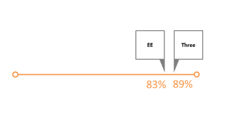
Diagram showing the PET Scores for the network provider's websites
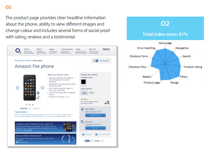
Scores ranged 8-17, indicating low PET adoption. O2 were most successful at using social proof (reviews, ratings, testimonials and social media links) where EE used 'trust techniques' , by explaining the use of personal information.
UX Index Scores for the ecommerce sites
The findings are presented well in diagrams, derived from the individual ratings, to show the user experience along the online customer journey on the retailer's websites.
Three - Total Index Score 72%
Vodafone - Total Index Score 80%
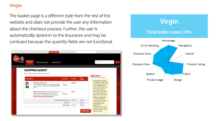
Virgin - Total Index Score 74%
O2 - Total Index Score 81%
EE - Total Index Score 81%
![]()

Thanks to Guy Redwood for sharing his thoughts and opinions in this blog post. Guy is the MD and Founder of
SimpleUsability. Guy has nearly 20 years’ experience managing and directing a successful media business. Guy has spoken at a range of conferences about X research methodologies and is recognised as a pioneer in the application of neuro-research techniques. You can connect via Twitter at
@SimpleUsability or
Facebook.


 Thanks to Guy Redwood for sharing his thoughts and opinions in this blog post. Guy is the MD and Founder of


