4 online appliance retailers rated for the best overall online experience across 150 mobile and desktop touchpoints on the customer journey
Simple Usablity recently reviewed the UX from 4 leading e-commerce sites (Currys, Argos, Appliances Online and Appliances Direct), to find out how they are focusing on the customer experience. The companies were assessed across 120 touchpoints along the customer journey from homepage to checkout, and 30 touchpoints to rate their mobile experience.
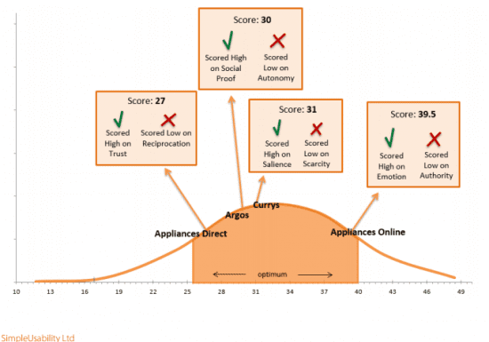
PET Assessment - Persuasion, Emotion and Trust
Retailers were assessed on this and other criteria including social proof, salience and gamification. Appliances Online ranked the highest on 'Emotion', Currys on 'Salience' (how they influence what visitors pay attention to and how they interpret the meaningfulness of the information) and Argos on 'Social Proof' (customer reviews and ratings).

Mobile Strategy
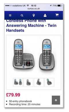
All three retailers, except Appliances Online were evaluated across 30 touchpoints for their mobile customer journey. Curry's ranked the highest, for a seamless experience through their responsive design, a simple homepage and one area for improvement was for more interaction with their product pages. Argos seemed to have grasped product interactiion via 'pinch and swipe'.

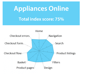
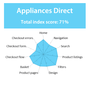
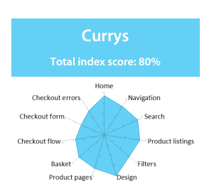
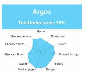
Index Ratings of the Customer Journey from Home to Checkout
Comparison of sites:

Appliances Online review:
- One page from 'home' to 'basket checkout' for ease of purchase.
- Distraction with the row of products.

Appliances Direct review:
- The navigation is not helpful and difficult to know which part of the site you are in, and some sections do not corespond ie 'Cooking'.

Curry's Review:
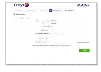
- Lack of security symbols, as user is taken to external url for payment.
- Poor navigation to return to previous page.


Review of Argos's site:
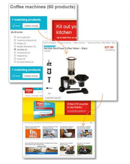
- Good experience as the visitor filters by category and then in one click, is taken to the selected product.
- Poor navigation and breadcrumbs, as the visitor doesn't return to the previous page of the listings.

More details are available in the download in the full Appliance Retailer Online Experience Index Report.


