What a difference a CMS makes
Wex have been a leader online camera retailer for over a decade, benefiting handsomely from the rise of eCommerce since their founding in 1997. But with over 17,000 products, a clunky interface built on brittle code and a lack of mobile responsiveness, the current site had seen better days. Starting to look outdated, and losing traffic due to Googles 'Mobbilegeddon' algorithm update, the site was in desperate need of a significant update. By working with CMS provider Episerver they were able to greatly improve the design and aesthetic whilst maintaining elements of the interface popular with customers.
The Problem
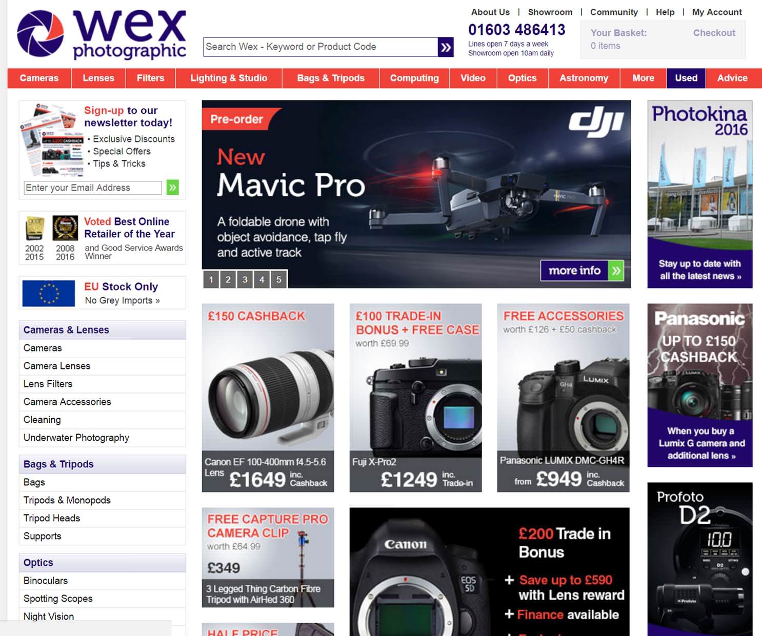
Wex's previous site was very busy, with competing calls to action and offers. The code it is built on is poorly designed and hard to maintain. This was standing in the way of the businesses goals and leads to frustrated users. Worse still, the site is not mobile responsive and there is no mobile version at all. The complicated site was next to impossible to navigate on a mobile device, so even though Wex get 25% of their traffic from mobile users, they were unlikely to convert.
The way content was managed on the old site is also a major issue. The fact many changes require input from IT professionals to publish due to the overly complicated nature of the content management system delayed content marketing efforts and attempts to improve the site. All these problems are a result of the site being bespoke developed over the past 8 years. The end result is a site which would have looked at home in 2008 but now looks horribly outdated.

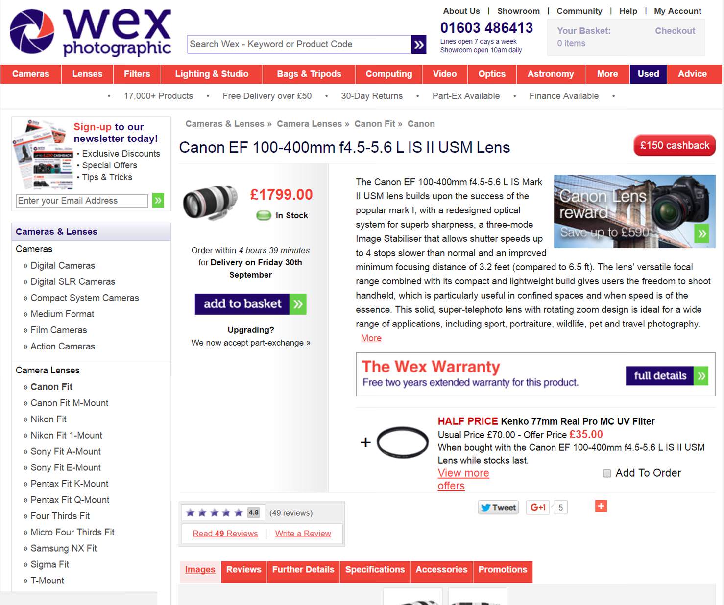
The home page (above) is a dazzling mess of different offers and calls to action, whilst the product page (below) has a tiny image of the product and competing offers jostling to take the users away from the all important product page.

The Solution
Wex has been working with CMS provider Episerver to develop a better and more responsive site. Although on the back-end the platform is complete overhaul- removing all the old and brittle code that caused so many problems - Wex deliberately opted to maintain some elements of the original design that users had found useful. After all, they were voted by the customers as online retailer of the year in 2014.
The new platform allows further changes to the design with relative ease, which is crucial because without constant optimisation projects websites are always destined to fall behind. Integration with tools to provide A/B testing, ratings, reviews and feedback will help Wex with this optimisation process, and the ability to personalise content will let them delight their audience like never before.
The New Design
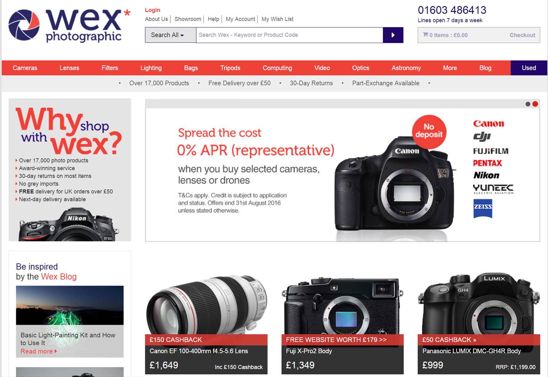
The new Wex site is now live, and Smart Insights had been given a preview of the new design. As you can see from the image below, the new home page is far cleaner and less bamboozling with competing offers vying for your attention. Better still, the new design is fully responsive, so will let Wex attract and convert more mobile users, as well as boosting SEO.

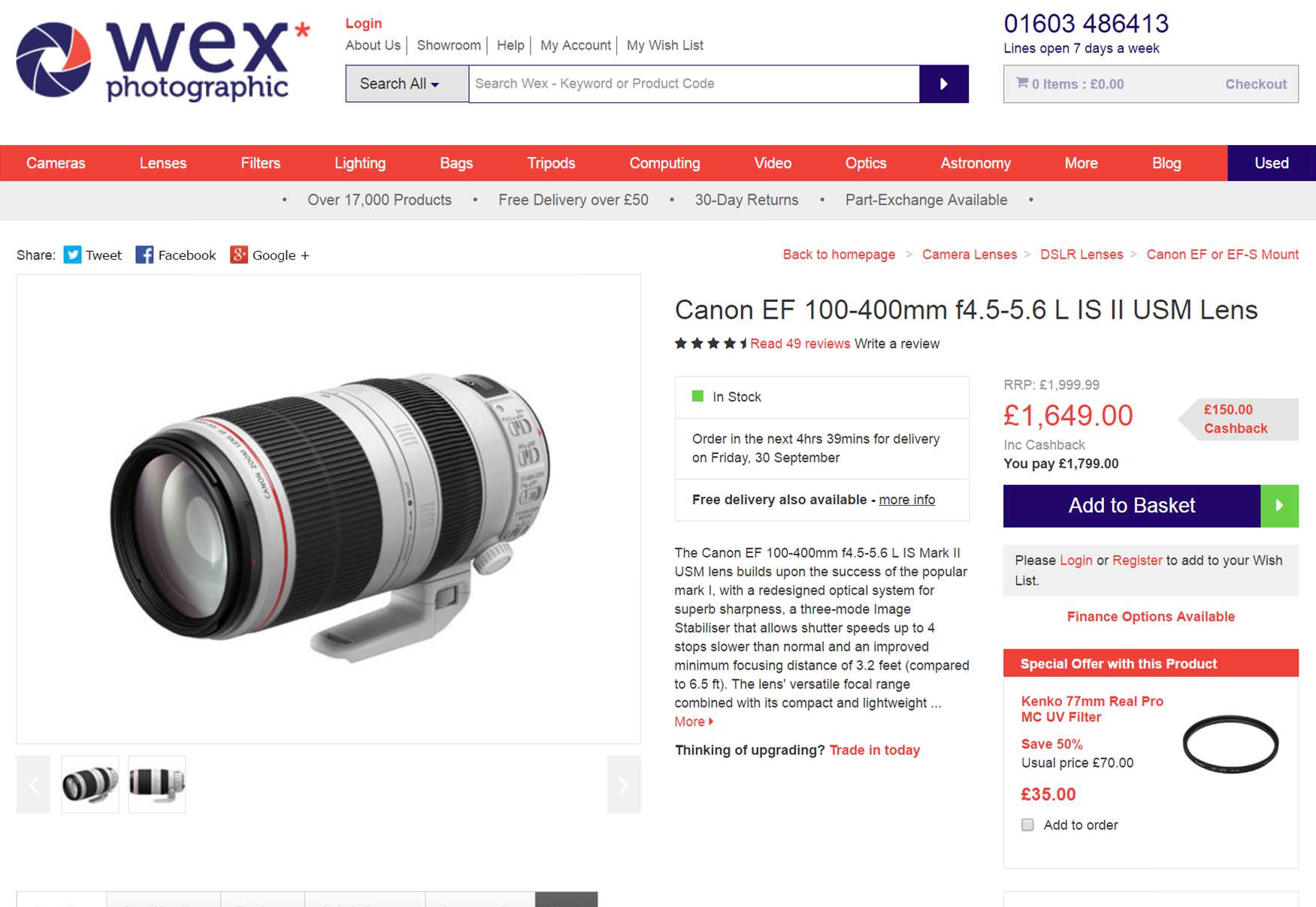
The product pages have also been overhauled, with a far greater focus on the all important product image.

When comparing the new product page to the old, the difference is stark. Multiple, high-quality images replace a single image which was far too small. The offers are clearer, the product description does not dominate the listing, and the social share buttons look far cleaner. Taken together it is a huge improvement which is sure to boost conversation rate considerably.
Takeaways
Wex successfully transformed their site from one which looked outdated to one that can be continuously optimised, by taking a big leap and changing their CMS. By using more in-depth testing, analytics and utilising greater personalisation, Wex will be able to further tweak their site for better results in the coming months and years. Making a such a huge change to a site is never easy or cheap, but if done right the investment will pay off handsomely. For any eCommerce store your website is your most important asset by a country mile. Never make the mistake of neglecting it.


