Web users are becoming paralysed by the psychology of indecision as a result of being faced with too many options to choose from
I believe digital marketers are offering too many choices to their website visitors. Visit almost any web page these days and you will be faced with a myriad of choices. You can choose to read something, or sign up for follow-ups, or perhaps watch a video. Alternatively, you could choose something else to click on, look at an advert or go to the menu and choose something else. What are you expected to do? There are just too many things to think about.

The situation is worse in e-commerce stores. You are faced with row upon row of products to choose from, probably from a selection of a dozen or more different categories.
Website owners and digital marketers appear to think that providing so much choice is fantastic. Never before have we been offered so much variety. Never before have we had so many things to choose from. Never before have we been so confused.
People find it hard to choose
When human beings are faced with a choice, they actually find it difficult to make a selection. The ease of choosing decreases as the number of choices rises. Research from Erasmus University, Rotterdam, found that our satisfaction rose as we were offered more choices but fell dramatically when those choices became “too many” for us to cope with. Interestingly, the study showed that there were some personality differences in our response to choice. Some people love a lot of choice, whereas others are satisfied with only a limited selection. Even so, these two extremes of preference had significant overlap, with the number of choices being “too many” being pretty similar for both extremes.
What this really means is that stores like Amazon could probably sell even more than they do if only they reduced the choice available. It is counter-intuitive, but the research is pretty consistent – the more you offer people, the more difficult they find it to make a decision. Indeed, that is the entire thesis of the book, The Paradox of Choice.
Digital marketers, however, know the value of “The Long Tail” which would appear to conflict with the notion of there being too much choice. The Long Tail theory shows that the Internet has helped niche products sell thanks to the greater availability of choice. Plus websites with vast arrays of choice, like Amazon, Google or even Facebook, appear to be doing rather well. Surely if humans had real difficulty with selecting from a vast amount of choice, such websites would not succeed?
In fact, the Long Tail Theory and the Paradox of Choice are saying pretty much the same thing. We love variety, but we find it hard to distinguish between assortments when there is so much of it. The Long Tail allows us to find small selections out of thousands, even millions of options. At the same time, the Paradox of Choice suggests that we find it easier to choose between the possibilities when there are so few of them.
Multiple small choices are better than one big choice
In practical terms, what this means for digital marketers is ensuring that whatever customers are faced with it is “drilled down” to only a small amount of choice.
Imagine you sell pencils. There are thousands of different options of pencils. You can have pencils with rubbers, without them. There are hard pencils and soft pencils. You can have round pencils or triangular ones. You can have wooden pencils, propelling pencils or even pencils inside plastic. You can have one pencil, five pencils or a hundred pencils in a pack. I could go on and on. One popular stationery supplier online showed me 326 different pencils. Another had 356 of them. How are you meant to choose?
Breaking down pencils into categories helps. Our brains love to categorise things; it is a fundamental part of the way in which we can cope efficiently with the world around us. So, as soon as a website offers us categories, we find it easier to choose.
Hence, if I typed in “pencils” into a stationery website instead of it offering me 356 different options, it would be better to ask a question. Do you want wooden pencils, propelling pencils or pencils made of plastic? In other words, it gives me three choices – not 356. No longer is a visitor like me suffering from “analysis paralysis” but they have simple choices to make.
Let’s imagine that I want wooden pencils. So I click on that choice to be faced with another array of choices such as whether I want round pencils, triangular ones or the hexagonal type. I might choose “round”. Then I am faced with more choices, such as “hard”, “soft” or “medium”. I select “hard”. Then all I’ll be able to choose from is the 12 different options available to me. Instead of having to sort through 356 and getting confused, a visitor like me is now left with a clear choice.
The Long Tail has enabled such a wide variety of pencils to be available online, but without this “drilling down” approach to selling, the choice would be overwhelming.
Far too many websites make it difficult to choose. That leads to high bounce rates as well as loss of business. Limiting the choices you provide will increase sales, not decrease them.
Reduce your choices to sell more

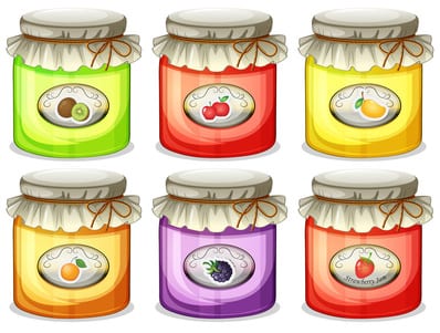
In this classic, oft-quoted study of the sales of jam, psychologists from the University of Columbia offered people the chance to get a discount coupon if they sampled the various jams on display. On day one there were 24 varieties of jam available. On day two of the study, there were only six varieties of jam available. There was a dramatic and significant difference in the amount of jam sold. When there were 24 varieties on offer only 3% of people used their coupons to buy some jam. However, when there were only six jams on sale, 30% of people bought some.
The notion of reducing choice also extends to web pages and their design. A Finnish-based hardware store, Taloon.com, decided to test the effect of removing social sharing buttons from its web pages. What they discovered was that sales conversions went up when social sharing buttons were removed. Sales went up by almost 12% when the social sharing buttons were absent from pages. The reason for this is choice confusion. The website visitor doesn’t really know whether they are meant to share the page or click the buy button. Too many options on a web page just leads to choice paralysis.
We might think we all want as much choice as possible, yet study after study confirms that when we are faced with choices we find it difficult to make a decision. From a marketing perspective, this is a problem because the more choices we have available, the less likely we are to be able to sell them. Yet consumers continue to demand more choice.
There are two other factors that cause a problem for marketers. One is known as “preference uncertainty” which essentially means that when people are faced with a wide assortment of choices, they begin to doubt what they wanted in the first place. In other words, when you provide potential customers with a large number of choices, they are less likely to make a decision to buy because they have started to doubt that what they wanted in the first place was the right thing.
The second issue is what is known as “anticipated regret”. This occurs when we fear missing out on something, so the more choices we have, the more we get concerned about the negative consequences of not buying one of those choices. The result of that is we find it easier not to buy anything because if we do make a selection we worry about what we missed out on by not choosing one of the many alternatives.
Digital marketers and website owners want to offer as much as possible to their visitors because of the need to be seen to offer a wide variety of choice and to have that “long tail” of goods and services. Serving up all that choice at once is working against companies. Far from increasing sales, the ever rising availability of choice on websites is harming businesses. It is time to start reducing the choices available to your website visitors.


