Best practice tips and examples for optimising your checkout
This article explores the variety of checkout options available, as well as common consumer pre-conceptions of registration, best practice tips and recommended approaches in order to optimise your checkout for new customers looking to place their first order.
Before I press ahead into the meat of the post, lets set-out a few reasons why marketers should bother investing time and effort in getting new customer checkout 'right'.
- Abandoned checkouts have always been a huge problem for many brands, and they continue to be so
- Once you have a new customer, you open up many more ways to engage with them, nurture them and encourage them to ultimately spend more and increase their lifetime order value with brand
- You may well have invested significant amounts to acquire the new visitor/prospect to your site, and the more new visitors convert to customers, the better your ROI on acquisition spend
- A satisfied new customer, who has had a simple, intuitive and issue free checkout experience, is more likely to spread the word about your brand and the customer experience you provide
- You are more likely to have success in on-going marketing activities, both online and offline, when you are marketing to existing customers who have a had a good brand experience
- If social networking and online communities are a big part of your brand proposition/customer engagement strategy, then new customers will more likely engage with some of these activities/communities
New customer checkout is more challenging
As is well recognised in the retail industry, and as can be seen in the conversion rate statistics below from the Fireclick Index, its generally harder to convert 1st time visitors to become customers compared to returning and existing customers, and so everything should be done by the retailer to make the customer experience as simple as possible.

- A comparison of conversion rates between first time and returning visitors
Background
As I am sure you will have experienced yourselves over the past 10 years of online shopping, retailers have used a variety of page designs and techniques to handle the checkout process.
One area that I have a particular interest in is how retailers handle new customers, or to be more specific, how retailers encourage (or still in a lot of cases discourage) new customers to place their first order.
Before I continue, I must stress that well recognized, trusted brands such as Amazon, ASOS, PC World, Next, Topshop and Argos have much less to worry about than smaller, less recognized brands. The degree to which consumers will themselves overcome concerns and frustrations when going through a checkout process for the first time is a lot higher in my experience than when the retailer isn't well known.
Quick Tip
Even the big credible retailers should do everything they can to assure wary, first time shoppers that completing their purchase is safe, secure and easy - remember your competition is still only a few clicks away
How checkout experiences have evolved
Over the past 10 years I have seen and used a variety of techniques in order to make a purchase online. I would say that very few retailers now use solution 1, with most retailers using solutions 2, 3 and 4, with a few using solution 5:
1. Just One Option:
- Guest Checkout
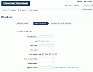
Even if you want to shop with the retailer again, when you come back you have to enter all your personal details again - there is no register or login facility. There don't seem to be many retailers adopting this approach anymore, although Carphone Warehouse could do with making their account login option clearer when you get to the first page of checkout. It doesn't appear that you can login within the main focus area of the page, which could be confusing for returning customers who don't want to type all their details in again.

- Carphone Warehouse don't make their login facility clear for returning customers (click to enlarge)
2. Two Options:
- Register/Create Account (for first time shoppers)
- Login (for returning registered customers)
On the one hand this was good for returning customers as they could simply login to retrieve their personal information, although for first time shoppers, you were forced to register in order to complete your purchase (more on this later)

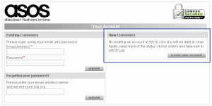
- ASOS force new customers to create an account to place their first order

- Topshop force new customers to create an account in order to be able to checkout

- PC World don't mention anything about registration until the next page

- Without warning PC World force new customers to register in order to place their order
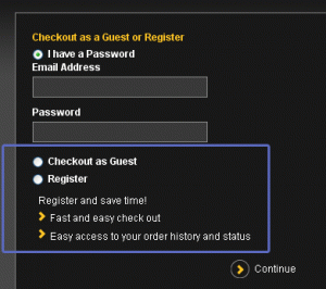
3. Three Options:
- Register/Create Account (for first time shoppers)
- Guest Checkout (for first time customers who don't want to register)
- Login (for returning registered customers)
These 3 options improve upon technique 2 by adding in the ability for new customers to simply make their purchase without having to register, whilst still keeping in the register option and of course the ability to login to retrieve your details.

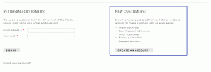
- Skins provides 3 options at checkout - login, register or guest checkout
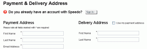
4. Two Options:
- Guest Checkout (for first time customers whether they would like to register or not)
- Login (for returning registered customers)
This newer technique provides the visitor with less choice (2 routes rather than 3 above) and doesn't make a big splash about new customers having to register or not. This works really well as new customers aren't forced to register in order to checkout, although you still provide them with an option later in the checkout process (or on the actual order confirmation page)

- Speedo provide 2 simple options for new customers - login or provide your details
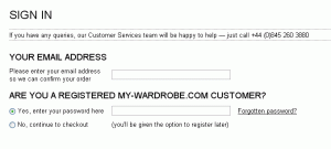
5.One Option, With A Simple Question
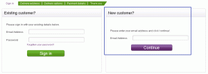
- Enter Your Email (then choose if you have a password already)
This latest solution removes almost all the decisions the visitor has to make, so rather than 2 different areas to look at to decide which route to go down, the visitor simply enters their email address then clicks a radio button to confirm whether or not they already have a password for this e-commerce site (and therefore would like to login)
Quick Tip
Try to ensure it is immediately obvious to both new and returning customers what they should do at your checkout gateway page - remove as much ambiguity as possible

- My-Wardrobe.com provide a simple choice for new customers, not forcing them to have to register to checkout
Forcing registration - why you shouldn't
There are many reasons why I strongly recommend retailers don't force new customers to register in order to checkout, including:
- A new customer may have absolutely no interest in your products, they are simply making a one-off purchase for a family member or friend
- The word 'registration' more often than not conjures up the feeling that there are lots more pages/forms to complete
- Even if a new customer is interested in shopping from the retailer again, if they are in a rush they may not feel they have the time to complete a lengthy registration process
- Some shoppers simply don't like the fact that you are forcing them down a route which they may not be comfortable with
- If there are no clearly set-out benefits for them by registering (apart from a line of text that says register today for a range of benefits) then why should they register
Quick Tip
Don't use the word registration - instead use account creation. Although they mean the same thing, from my experience registration has many more pre-conceptions and therefore immediate barriers and concerns for consumers.
Registration - consumer pre-conceptions
You may yourselves have had some of these pre-conceptions about registration, but below are the 3 biggest pre-conceptions which we have experienced at PRWD during user testing and user research sessions.
- Registration will take ages to complete
- I will have to provide lots more information
- I will be bombarded with marketing 'guff' from the retailer
1. Registration will take ages to complete
The consumer rationale
Just the word registration is associated by many people as a process which is long winded, complex or just plain laborious. Perhaps part of the pre-conception comes from traditional offline situations, such as registering for a home shopping catalogue or registering to receive some free product samples.
The reality
Registration, if handled correctly, should be as simple as the new customer having to choose a password in order for them to be able to login on their subsequent visits. Providing you don't put strict formatting restrictions on the password field, this should take your new customer a matter of seconds to provide.
2. I will have to provide lots more information
The consumer rationale
Similar to the idea that registration will take ages to complete, consumers I have asked to think-out loud during test sessions, or consumers who have taken part in focus groups and customer research activities, quite simply presume that in order to register they will have to provide lots more information. This includes personal preferences, email marketing choices and other information not specific to them simply 'checking out' to make their purchase.
The reality
Consumers already provide a significant amount of personal information when they complete a standard checkout process (personal contact details, address details, delivery preferences, payment information. This is in addition to the products that they have ordered, the categories they have looked at and the products they have added into their basket during their shopping visit.
All this information and analytics insights can be valuable to the retailer, and therefore the idea that the retailer should be asking the consumer for lots more information in order to 'register' is completely wrong.
Quick Tip
Don't make a 1st time shopper have to decide on opting in or out of email marketing preferences during checkout. Instead, simply encourage them to create an account by choosing a password, then following the completion of their order, provide them with immediate access into their new 'my account' area, where they can choose potentially more targeted email and marketing preferences - rather than just a simple opt in and out of your generic brand marketing communications.
3. I will be bombarded with marketing 'guff' from the retailer and other third parties
The consumer rationale
Most consumers will have in their lifetime registered or signed up for something, which in turn has led to them receiving by post or email a stream of spam mail or marketing both from the company they registered with and from third parties then never specifically provided their details with. It is therefore understandably that consumers will expect the same thing to happen if they register with a retailer when they shop their for the first time even if they choose to opt out of receiving marketing communications.
The reality
No brands should bombard their customers with marketing 'guff', and no brands should share their customers information with third parties, especially those that may abuse the fact that they now have another consumer with which to target.
Quick Tip
Where you do ask a consumer to make a choice about email preferences, make it absolutely clear what the implications are, rather than leaving the consumer wary of what they are committing to. Also ensure it is always easy to opt out of and unsubscribe from marketing communications, both in the footer of emails and within their account area of your e-commerce site.
Best practice recommendations
So getting your new customer checkout right is pretty important! Below are my key recommendations for brands looking to improve their new customer conversion rate:
- Don't force new customers to have to register in order to checkout
- Ensure you emphasise the benefits of registration clearly to new customers
- Consider not using the word 'register' and 'registration' during checkout - instead use the likes 'account creation', 'my account', 'customer login' and 'join'
- Make the first stage of your checkout as simple as possible - either with 2 clear options, login or guest checkout, or with the starting point being entering your email address then choosing whether or not you already have a password
- Promote account creation at the end of the checkout process on the order confirmation page, ensuring it is presented to be the primary action on the page
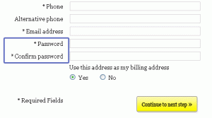
- When you ask for the customer to choose a password, provide clear information on how many characters the password should be (ideally between 6 and 20 characters) and whether or not it needs to include alpha-numeric characters - please, please don't hide these instructions until after the customer has tried submitting their new password!

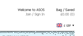
- ASOS use the term 'join' rather than 'register', providing a more customer friendly word

- Made.com don't provide visitors with any instructions on what format their password should be in - simple line under the password field label is all that is required
So which checkout solution is most recommended?
If we look back at the different solutions that retailers use to deliver the first page of checkout, I have ranked the five main solutions in priority based on my experiences and from what some of the industry leaders are doing.
- Solution 4 - Guest Checkout or Customer Login - with the option to register/create an account later
- Solution 5 - Enter Email Address then choose if you already have a password
- Solution 3 - Register, Guest Checkout or Login
- Solution 2 - Register or Login
- Solution 1 - Guest Checkout only
A common theme you will see for my top 3 recommended approaches is that none of them force the consumer to have to register in order to checkout - but keep in mind that this doesn't stop big brands such as ASOS adopting this approach. Remember brand credibility and awareness give larger retailers a much higher chance of converting 1st time customers even if they force the consumer to register as part of the process.
Testing and optimisation
I'm delighted to see that more and more brands are embracing the concept of testing and optimisation, using both split testing and multi-variate testing. I am a complete advocate of using these types of testing to demonstrate the actual commercial benefits and impact from making changes to the customer experience on e-commerce websites (and lead generation sites of course).
Testing different versions of pages within the checkout process would always be my recommended approach, although from experience with both small and larger retailers, I appreciate that technically it isn't always as achievable to set-up and deliver split tests and multi-variate tests within checkout due to the complexities of backend systems.
Quick Tip
Testing isn't a case of doing it all in one go. Test in one area/on one page at a time, and test often, so that you are making regularly improvements to conversion rates from one page to the next - whether this be a landing page or your checkout gateway page.
Further checkout best practice tips
There are many more best practice recommendations to optimize checkout processes which I look forward to sharing on future posts. The great thing about these is that they apply to both existing and new customers alike, whereas this post has focused specifically on encouraging new visitors to make their first purchase and begin what will hopefully become a long term customer/brand engagement.
Useful links
Below are a few links which you may find useful in relations to checkout conversion rate optimisation:
So, how do you encourage new customers to buy?
I'm really keen to find out how you encourage new customers to complete their checkout process, and whether any of these tips and techniques could be adopted on your e-commerce platform to make the customer experience even smoother and barrier free.
Of course there are many more ways you can encourage new customers to buy from you throughout the whole buying process, including intuitive navigation, good quality images, relevant cross-sells, clear delivery and returns information and many more techniques that retailers can use to deliver a great customer experience.
In addition, the more positive feelings you can create by having a smooth, intuitive shopping experience, the more confidence and patience new consumers will have to complete your checkout process. By therefore ensuring you remove as many barriers and potential issues as possible during checkout, you increase significantly the chances of converting new visitors to customers!
I'd love you to provide some of your insights on the following...
- what options do you provide new customers on your checkout?
- what benefits or incentives do you use to encourage new visitors to make their purchase?
- how important is getting new customers to register/sign-up with you?
- are you looking to build an online community with your customers?
- what are your preconceptions when you are asked to register with a retailer?


