Recommended design patterns and best practices for retail Search Results Page
This is the 5th in the series looking at key Ecommerce pages, we hope it gives you some ideas for testing and improving your on-site search page. It's a key page on retail sites, since a high proportion of sessions can involve a search and typically average order is higher when a search takes place.
In the context of different types of user journeys, this page can sit in different places in the conversion path. It may support early stage research to help visitors learn more about your different product categories or services or it can be an end-stage conversion driver to match people to specific products as they search for specific product names, types and product labels/SKUs.
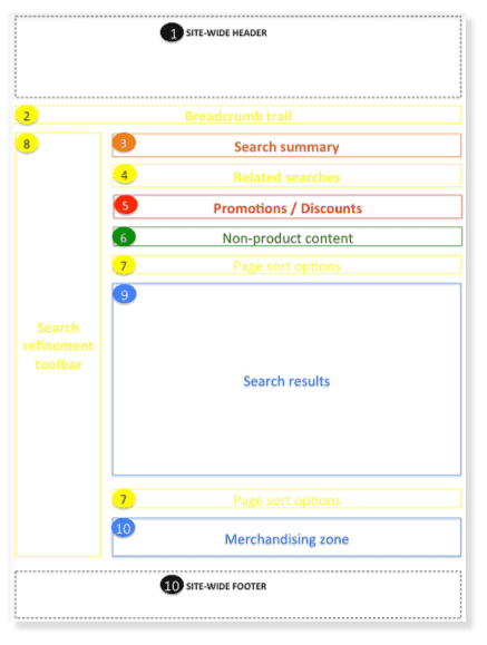
Key Ecommerce Search Results Page Wireframe requirements
This template provides an outline of the core elements, with colour coding definitions referenced in the Guide. UX and UI designs can vary across sites according to your business and audience, so it's designed as a good practice framework. Site-wide components are also covered in part 1 of the Guide.
Typical Site Search Results Page elements
You can see that there are a surprising number of elements to place before the results. We recommend testing how many of these are desirable since they can increase friction.

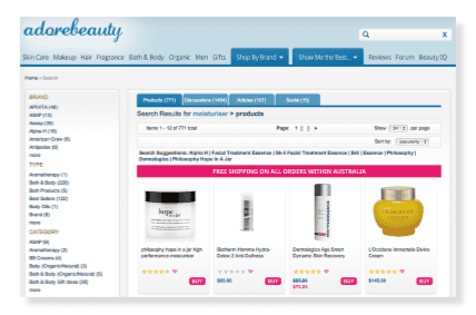
An Example from Adore Beauty Website - Search Results Page
The choice to surface non-product content below the product results is surprising. Arguably it’s a better user experience to let users switch between different content types (take a look at the Adore Beauty website screenshot below for a neat use of tabs), rather than having to scroll to find the inspiration and advice content.

Key requirements checklist for your Search Page
These are key questions to consider when designing, creating or reviewing an on-site search page.
- Q1. Have we defined and understood the goals for the search results page?
- Q2. Which of our core visitor types/personas will visit the page?
- Q3. Do we know how they will use the page?
- Q4. Have we defined how we want the search algorithm to work?
- Q5. Have we defined which data fields will be used to power the search index?
- Q6. Have we identified web analytics requirements?
- Q7. Do we want search results pages to be indexed by the search engine?
- Q8. Are we integrating non-product content into the page?
- Q9. What redirects do you want to create for specific keywords?
- Q10. Have we created a zero results page?
- Q11. Have we defined the navigational elements?
Additional requirements to consider in your Search Results Page
In the full guide for members I go into much more detail on individual page elements and look at more examples of how these apply in practice from UK and US-based ecommerce sites.

Recommended Guide: Ecommerce Design Patterns
Use our wireframes and examples to test and create more persuasive Ecommerce designs to boost retail sales.
Download our Ecommerce Design Bible.


