How to increase sales by improving your product pages?
If you review the analytics for an ecommerce site using the content drill down in Google Analytics you will often see that product pages have the greatest "footfall" measured by total number of pages viewed by page type. This shows the importance of making the design, copy and calls-to-action on product pages as good as you possibly can. You can really reap the rewards of small changes across page templates for all product pages.
To give you ideas of what you can test and improve, here are my 6 recommendations on how you can improve sales by improving your product pages.
1. Split testing
Split testing, for me is a fundamental element of ecommerce, as it allows you to accurately reflect on multiple pieces of content or designs. Also, given the simplicity of some of the A/B testing tools available (especially Google’s content experiments) ecommerce professionals have no excuse for not testing.
From experience, I would recommend testing the following parts of your product pages using split testing:
- Product Content Layout
I’ve often seen that having bullet points (which outline the benefits of the product to the user) and digestible written content delivers the best results. I also prefer using tabs to segregate different types of content.
- Product Images
Images are arguably the most important part of your product page, which is why you should be testing types of images (real-life shots, standard manufacturer images etc). I would also recommend testing the order of the images on the page
- Buttons
Testing the colour, text and positioning of the buy button is a must, as it can have a big impact on how many people convert from your product pages.
- Product Content
You should test the content on your most popular products on a regular basis, so you can get an idea of how your customers respond to different types of content. You should be outlining the specific benefits to the user, but you need to find out which benefits they respond well to.
Here are some other split testing tools that you can use:
2. Auto-scrolling images
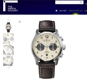
Setting your product images to scroll automatically is a great way of grabbing the reader’s attention, whilst also selling the product more effectively.
If you’re lucky enough to have different types of product imagery, this also allows you to show the potential customer different benefits, like we’ve done for The Watch Gallery.

Automatic scrolling
3. Videos
The inclusion of videos on product pages is a tactic being adopted by online retailers more and more every day, particularly since companies like Zappos and Amazon have released incredible case studies.
In this post on Reel SEO Zappos are said to have attributed an increase of between 6% and 30% to adding video content to their product page. Zappos went on to create well over 10,000 product videos, so they clearly see it as a good commercial move.
4. Proposition-driven content
Despite being frequently over-looked, content is a huge factor in product page conversion rate optimisation and it’s really important that you provide the reader with an enticing proposition.
In order to deliver an effective proposition within your content, you need to understand the following:
- What kind of people are going to buy the product?
- What issues will the product solve?
- How will the product help the customer?
- What are the key benefits of owning the product?.
There are lots of ways to gather this information, but I’d recommend either having a feedback form on your website (specifically focused on obtaining this info), sending out emails to your customers or doing real user testing (the best option).
Then, once you have this information you know what you need to be writing about and what needs to be included as part of your proposition.
5. Benefit bars
Benefit bars are designed to install trust in your customers and add value to your overall proposition. A benefit bar is simply a bar containing value-adding words or phrases that will entice the user to buy from you.
Benefit bars have become quite common over the last year or so and are highly regarded by ecommerce professionals.
Benefit bars can be used throughout your website, but I think they certainly add value to product pages but displaying key selling points for your website or brand.
6. Speed / performance
Although load time optimisation is something that would affect the whole website, it’s something that will really improve the user experience for product pages. We’ve been working on this a lot recently and in addition to the basics, we’ve have had a lot of success from the following:
Mod pagespeed is an apache server module that will help to improve the performance of your website. For websites that we’ve worked on, we’ve seen increases of around 40% of product pages, 25% on category pages and 10-15% on homepages. You can find out more about Mod_Pagespeed.
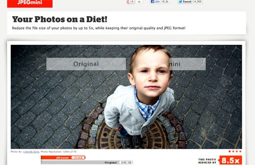
JPEG Mini is a super image compression service that will help to significantly reduce the load time for images on your website. We’re in the process of building a Magento module for this, which will make implementation easier. The other option is to use their API.

Although we’ve not yet finished working on full page caching, we’re expecting to see some significant improvements as a result of using it. Inviqa, a London-based PHP agency, have done a great job with full page caching so if you have any questions about this, you should send them their way.
If you have any questions about any of the topics I’ve discussed, please feel free to leave them in the comments below.

Paul Rogers is currently Head of Digital Marketing at GPMD, a London-based ecommerce web development and online marketing agency. Paul is extremely passionate about ecommerce and marketing and has previously worked in-house for an online retail company and for a PR agency. You can find Paul on LinkedIn and Twitter and connect on Google Plus.


